
Black As a Color Is Absolute, 2016
Acrylic on panel
38 x 38 inches
I met Truong Tran when we both identified as poets with an interest in making art. In the years since then we’ve each given more time to our art practices until now the balance is effectively reversed. In Truong’s poetry I admired the clarity and specificity, the vulnerability that never veered into the maudlin, the recombinatory structures that wove different contexts and intensities into new wholes.
Truong has transposed those poetic sensibilities in an art practice that takes the detritus of our manufactured lives–overstocked plastics, leftover house paint, discarded porn–in works that go beyond the juxtaposition of collage or assemblage. These pristine works may attract us first with their brightness and precision, but the meaning of these pieces is borne in the unsettling and unresolved questions that motivate the work. Truong’s art brings us a language by way of objects.

Truong Tran with
Black As a Color Is Absolute, #5 and #4
(opening reception for In These Times,
Working Space Projects,
Jan. 2017
Photo: Alan Bamberger)
Truong: This is my new exploration. It’s house paint. I need to ask you about how to preserve things like this because—someone reminded me of the character in the Kurt Vonnegut novel where he was painting with house paints and he sold his paintings for millions of dollars, and then at one point all of them started deteriorating.
Articiple: Well, a lot of paintings made with house paint have held up pretty well. Pollack and Rothko used house paint!
Truong: It’s a strange space between controlling and letting go. I use ketchup bottles, squeeze bottles.
Articiple: So you have your whole palette of colors lined up in bottles, and you just grab and squeeze?
Truong: I buy the squeeze bottles and I do it right in my kitchen. I don’t use a brush, so I feel like I have more control. There’s an idea of somehow being able to control it. But then, even when you think you have controlled it, you walk away and come back and something’s changed. Sometimes you like it, and sometimes you go, aghh, no. There’s always that anticipation of control, how much you put on or whatever. And then the surrender of it, because it’s never going to fully follow your will.
At some point, something will ultimately get screwed up in the process. I’m always like, what is that moment? Do you try to cover up your mistake or do you just let it exist? And I find that if I leave it alone and walk away, usually when I come back, that’s the art.
Articiple: Exactly. Finding the shift in your expectations.
Truong: Each one of these has a different feel. I did one last night that I kind of fucked up. And then looking back at it, I think I’m ok with it. Because, looking back at some of these pieces, there’s some hemorrhage.
Articiple: Is that what you mean when you say fucked up? Where the paint bled, instead of staying in perfect circles?
Truong: Yeah. And I kept adding more to try to fix it, within these really clean areas there were a couple places that just felt wrong.
But there’s something really meditative. I don’t know how you work, but I love finding methods of working that allow me to meditate while I work.
Articiple: So you’re not planning every move, you’re kind of repeating a technique.
Truong: Everything is done instinctively in some sense. And with the butterflies it was muscle memory. You sit there and cut and after awhile your hand just moves through it.
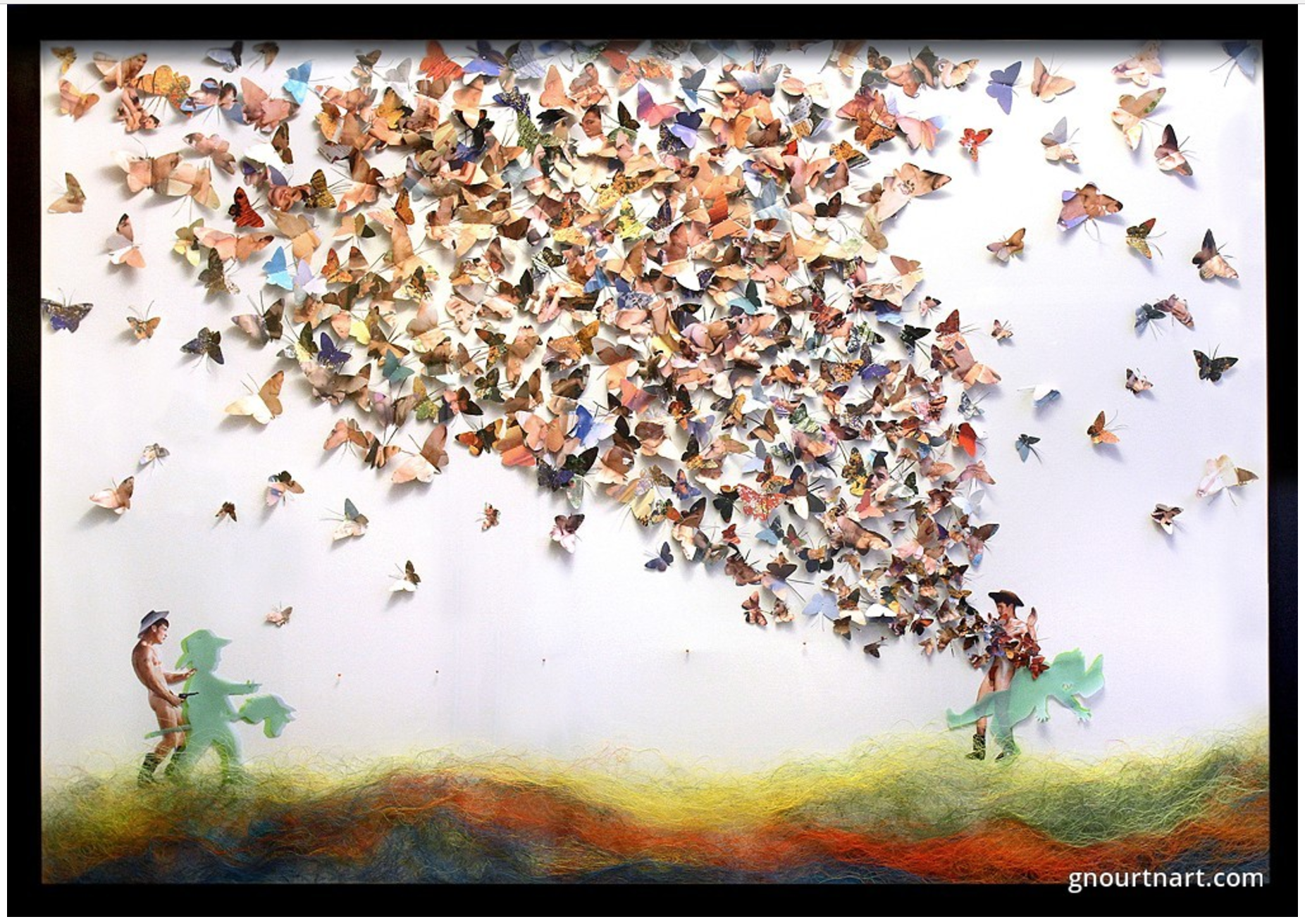
Summer Bliss, 2014
Mixed media
49 x 69 inches

Summer Bliss, 2014
(detail of butterflies cut from vintage pornography)
Truong: You know, that probably is my favorite part of making art, you spend all of this time thinking about an idea. And then when you get to the work, it’s almost like you turn off that part of yourself. In poetry, it doesn’t happen like that for me. It feels like every word has to be thought through. In art, it’s almost like there’s this movement through the work.
That’s the beauty of allowing your hands and the act of making guide your thinking. The thinking is evolving as it happens.
Articiple: And using your eye. Your physical relationship to it, moving back, stepping away, coming back.
I can see that in a lot of your work, the hands take over. You’re not rethinking every move, you’re kind of playing out something from an idea you had before you started.
Truong: And with these paintings, it’s just the dropping. After awhile you just automatically think through the process.
Last night I didn’t like what happened. I was trying to scrape off some paint and it was kind of a mess.
Articiple: You’re probably very sensitive to the little variations that someone else won’t notice.
Truong: Yeah, people won’t fully understand that.
Articiple: I like the fact that there is variation. It shows that it wasn’t completely planned—that there was some surrender, like you said.
That’s what I like screen printing. I use it as an improv technique so there are always surprises. I don’t ink the screens perfectly, I don’t make perfect contact between the screen and the canvas or whatever. I control certain things and let other things just happen.
What’s the substrate for the paintings?
Truong: It’s birch panel. And before I paint, I go over the wood with probably six coats of black India ink. I’m trying to get the blackest black.
Articiple: Right, the totally absorptive black, like the ‘Vantablack’ that Anish Kapoor got the rights to.

Two identical bronze casts, one painted with Vantablack
(image: Surrey NanoSystems)
Truong: Yeah. That’s the starting point. The idea is, I wanted to start the point of entry with the color black as the surface.
Articiple: And totally matte.
Truong: Yeah, almost like you sink into it.
This was one of my first prototypes. The one I’m working on now has text on it.
Articiple: And you use press-on type for the text?
Truong: I use Letrasets, which is how graphic designers used to do all of their work. It’s all contact. I have thousands of them, I just started hoarding them, because I knew it was going out. At some point they’re not going to have any more. So I just grabbed all that I could. I have a giant box.
I incorporated the lettering because I can control the lettering. What I don’t get in trying to control the paint, I can get with the lettering. It’s very precise.

Black As a Color Is Absolute #5, 2016
Acrylic on panel
25 x 25 inches
Articiple: And there’s so much signification associated with text. It makes a good counterpoint to using color by itself.
Truong: It was also really interesting to work with letters as an art material, as opposed to language. I love that part of it, and the different font sizes and all that.
I started working over the summer with thread. I created a landscape with it. I also tried to do a little embroidery. I embroidered the first poem I memorized. It’s a Robert Frost poem. I could never teach this poem, but somehow it felt ok to put it in a piece of art.
Articiple: Language takes on a different quality when it’s used visually. It doesn’t have the same pressures of analysis.
Truong: It doesn’t have the same scrutiny.
Articiple: Like, it’s ok to use the word ‘eden’ in a piece of art.
Truong: Yes!
Articiple: And this is on velvet?
Truong: Yeah, like an upholstery fabric. J-Ha (writer Jennifer Hasegawa) helped me with this a little bit. She started it. But, being that I’m a control freak, I was like, oh, I’ve gotta do it myself.
The first half of the summer I was completely immersed in doing this Mylar work. These pieces light up.
I always have to figure out the best lighting. Flourescent lights are the best. They give off the best light. LEDs are problematic. I used LED strings for these.
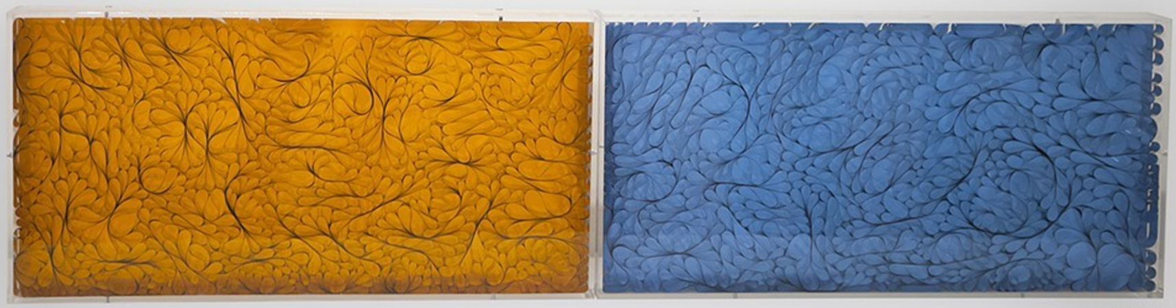
Solids, 2013
Mixed media
12 x 48 inches
(early pieces with mylar and light)
Articiple: That looks great, light catching all the surfaces.
Truong: I did an experiment last year where I made these pieces, these light sticks. This was when I was over at the Norton Factory Studios. At the time all these things were happening to me in the world and in the art community that I was kind of thinking about as I was making them.
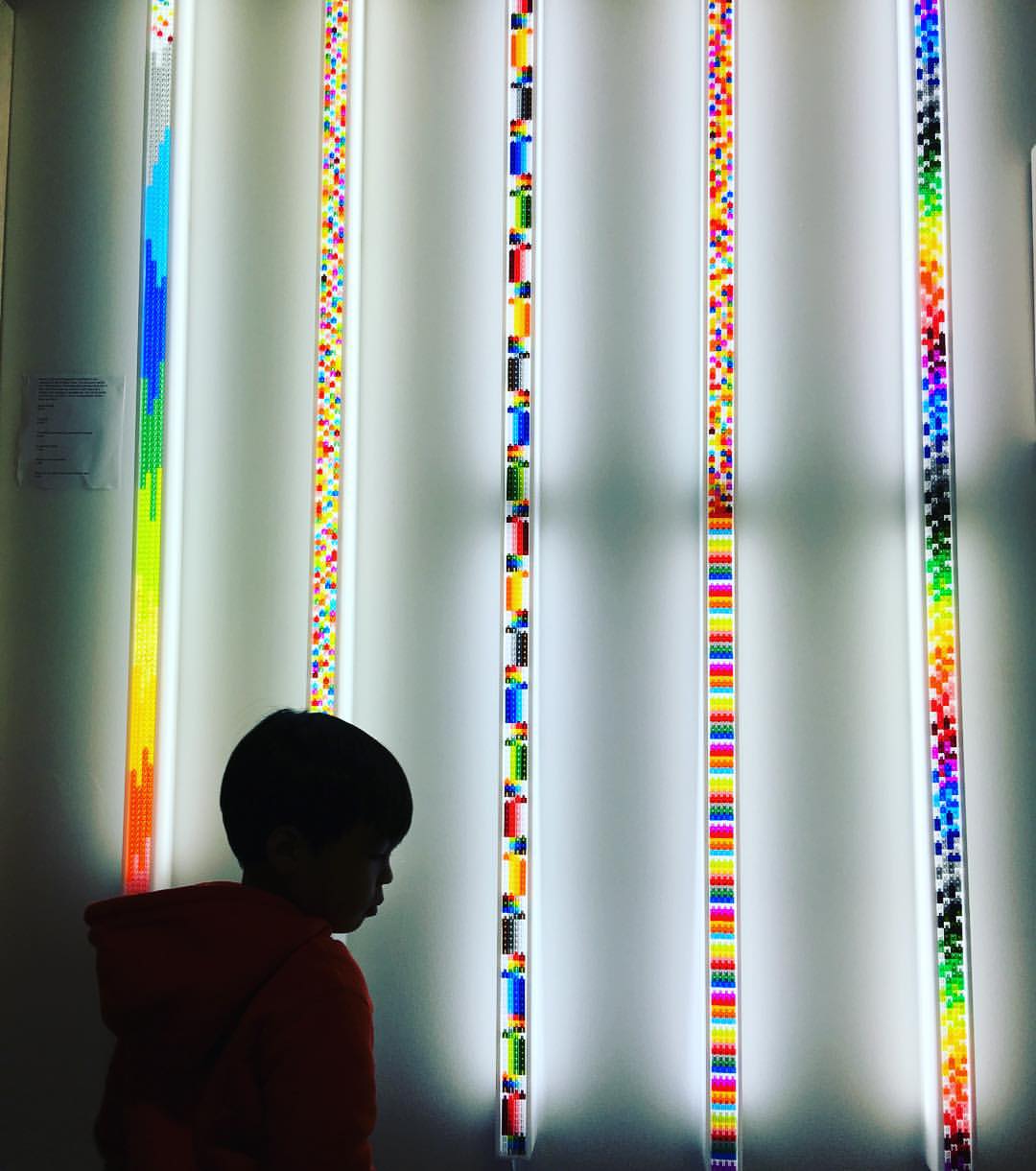
Installation view of light sticks, 2015
They’re made with these things called pixel blocks. They’re these tiny pieces of translucent plastics, they look like pixels. And it was a great design idea, you could use it to build three-dimensionally. But it became a choking hazard for kids. And it’s not very conducive for people who have bad dexterity. So it came and went in a heartbeat. I discovered it and I started playing with it. I did a series of them.
And then I had that moment at completion, I was trying to figure out what to do next with them, do I name them in a way that gives people entry into them? Or do I just let them exist? Because that moment when I name it—I think Mark Bradford does this in his work, names it in such a way that frames the thinking of it. It’s a really interesting way to work, because his work is completely abstract. And it’s beautiful. But he always gives it a title that guides the thinking of it.

Mark Bradford
Lights and Tunnels, 2015
Mixed media on canvas
84 x 108 inches
(from the solo exhibition Scorched Earth,
Hammer Museum, Los Angeles)
Truong: I was thinking about that in my work. Do I give that name to it, or is it an undermining of the visual endeavor of it?
Articiple: And did you end up giving them titles or giving them a context?
Truong: I did give them titles. I gave them titles that framed the thinking of the time for me. But part of me always felt that that undermines the visual endeavor of the work.
Articiple: There’s always the question of how much of context you want to create for the work. Do you just want to say ‘untitled’ and put it out in the world, or give it more back story?
Truong: And that’s the fear. If I say ‘untitled’ the work becomes decoration.
Articiple: I think titles really are part of the work for me. Naming a piece is part of figuring out what’s at stake in it. It’s a process of drafting and revision, just like any kind of writing. And like any writing, I might throw out a lot of ideas as I go along before I get to the final version.
It’s the same when I’m looking at someone else’s work. A title gives another way to enter into the context of the work. You can get context from a lot of sources, like knowing about the artist’s process or the issues in their work. But maybe since I’m a writer I like it when some of the context comes as a piece of language.
Truong: But sometimes it feels very false. I watch a lot of Art 21, I use it as a way of studying techniques. But I also got to a point where I feel like those artists, those 1% artists, I’ll call them, because I think they’re the epitome of success—they have all that rhetoric. And it’s almost like there is an obligation on their part to speak to the kind of social condition that frames their work.
Articiple: And it’s sometimes like that obligation is only in the title or in the artist statement. The work itself can be filled with ambiguity, but the title might have a much more explicit or direct political message.
Truong: It’s not resolved for me. I always feel as though I’m at risk of being invisible if it doesn’t have a statement that frames it to guide your thinking around it. I feel like people will see it as decorational…
I look at Rauschenberg and you know, a can of paint, a goat’s head, a tire, and it suddenly is this great work of art. But I don’t think I could do that.

Robert Rauschenberg
Monogram, 1955-1959
Mixed media
42 x 63 x 65 inches
I don’t think I could ever create something from that perspective of pure aesthetics or whatever, and put it out there and get a pass. I feel like there’s going to be a questioning of how I position myself in relation to that art. I think that happens for everyone. It happens for women, it happens for people of color. I think the white dudes in society still get to have that pass. They still get to do this thing based on ‘innovation and inquiry’.
It’s almost the same in writing. Too often I see how writers of color or women writers are framed within the context of existing as that being that reflects and documents history, as opposed to getting to innovate. ‘Innovation’ is still somehow handed to white men.
I always have that struggle when people look at my work and they see the image in my work. And often it’s the found image of the male body. There’s always the question of, where are you in it? As though somehow, if I put images of people of color in that framework, then somehow it eases the tension of questioning my relation. Because they see a person of color as a representation of myself in the work. I get that question all the time.

Butterfly Boy, 2009
Mixed media
57 x 42 inches
So I guess my response is, as a gay Asian man walking around this world being very conscious of who I am, I don’t think that ever is outside of my consciousness. It’s always a part of my work. I make very specific decisions about how to work with my materials. One, I don’t feel comfortable cutting into the image of a person of color and fragmenting that, sometimes. And two, more often than not, when I go looking for images, and looking as a response to the expectations, I end up in this framework of fetish. You go into a store to buy this material. There are several vintage spaces in the city where you can buy this material, if I get to that point. They’re all categorized by fetish. This is found material. I’m not working to seek out a fetish.
Articiple: The representations are already packaged as products. You’re repurposing them as a commentary on what you’ve found.
Truong: Reproducing the problems of it too. It’s problematic. It’s just really interesting to me that people, when they look at the work, they want some resolution.
I’ve had several occasions where people approached me about the butterfly work and wanted to buy it but asked that I do an edit on it.
Articiple: To remove the porn?
Truong: To make it more rated R, as opposed to rated X. I was like, you want me to go through and pinpoint the pieces that you think are not appropriate?
Articiple: I want to shift gears a little to talk about the issue of displacement–which of course is closely related to hierarchies of representation and control. Artist displacement in the Bay Area has become part of the city’s narrative. You were one of 70 artists who lost space at Studio 17 in the Mission in 2015 when the owners decided not to renew the artists’ leases. You were very involved in publicly advocating to protect the artist space. (KQED reported on the eviction and the aftermath.) How did that all play out?

Redlick Building,
former site of Studio 17
17th and Mission St,
San Francisco
Truong: We got kicked out on the premise that they were going to retrofit the building because it was unsafe for us, but they never offered us a way back in. And as soon as we vacated, they moved over the rest of that tech company that was lurking across the hall.
Articiple: Without even renovating?
Truong: Without renovating. Because it turns out it was an optional retrofit.
I went to the Arts Commission and said, hey, can you help us? Is there anything you can do or speak to, to advocate for us? And they said very clearly, we’re a city organization, so therefore we can’t get involved. We have to take a neutral position. And then, on the day of the hearing at which the Planning Commission votes to approve it, someone from the Arts Commission shows up and speaks really fast—they read off a statement that was so fast that you couldn’t even pick up on it, but basically they said, “We’re here to support whatever decision the Planning Commission arrives at. We want to say that we have already been in touch with the developers. We’re here representing the artists, trying to get them these things.”
I’m like, hold up. You never talked to us about this. You’re not representing us. The question is, how much did they pay you? Because that’s really what it comes down to. Someone’s pocket was filled. That’s the thing, in city politics. It was almost like they pulled a fast one on us. They wanted to do it really fast, hoping nobody would even notice it.
And sure enough, that’s happening all over the city. Back in the 60s and 70s, artist studios were zoned as PDR spaces (Production, Distribution, and Repair). And now they’re all being rezoned as office spaces. And everyone is making the same argument, which is that they’re trying very hard to accommodate the artists. So they’re finding other spaces to offer to the artists. But those spaces that they’re finding are all spaces that once belonged to non-profits or the service industry or mom-and-pop stores. These folks just disappear overnight.
Articiple: It’s this folding over of the city fabric.
Truong: Because it’s easier to talk about supporting the artists than it is to talk about displacing the larger community in the city. Take away the services to these communities that need them and sure enough, they start to move out. Because they don’t have the services to support them.
I almost compare the art scene now to the Truth commercials for cigarettes. All those damn commercials are made by the tobacco industry.
Articiple: As their fine for defrauding the public for decades.
Truong: They make these really shocking commercials, but they’re the ones making them. And the nonprofit arts community is doing the same thing. They do shows about displacement with one hand, but then you see support from the tech companies on the other.
