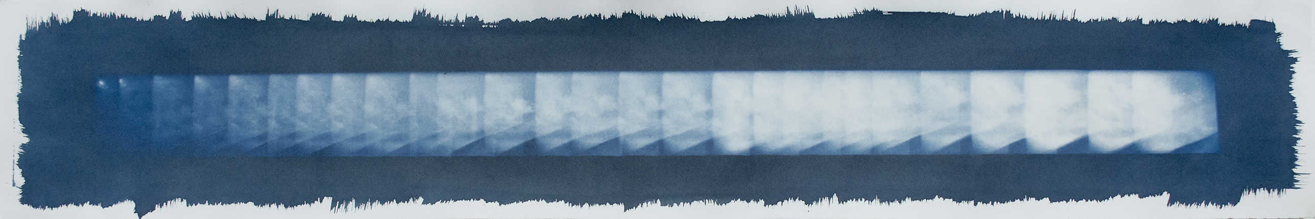
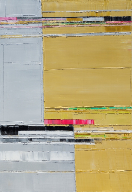
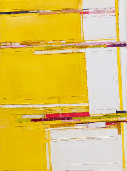
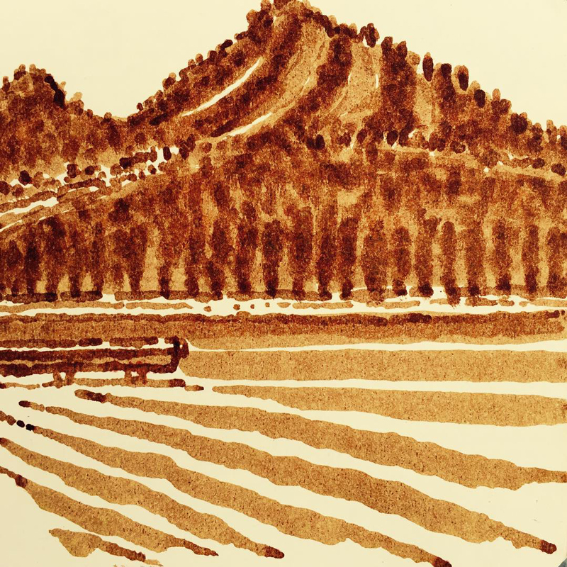
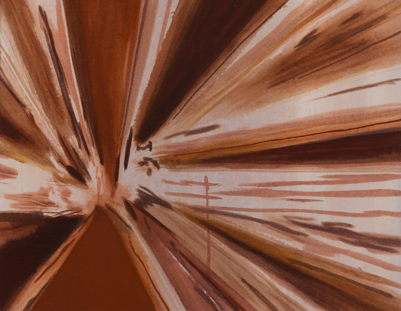
Attempt to Cross 24, 2016
Oil on canvas
40×30 inches
Maya Kabat
Maya Kabat is a Bay Area artist whose abstract oil paintings stand out for their thick, visceral color fields, created with scrapers and other tools of the drywall trade. Maya mixes colors directly on the painting, covering and uncovering layers to build intricate surfaces balanced between tension and rest. Her practice also includes ink drawings, loose, delicate explorations of fluidity and chance.
Maya is represented by SLATE Art in Oakland. Past exhibitions include the SFMOMA Caffe Museo and 5 Claude Lane Gallery in San Francisco. She was a founding member of Mercury 20 Gallery in Oakland and President of the Oakland Art Murmur Board of Directors from 2010-2011.
I met Maya at her Berkeley Cedar Street studio in November 2016 to see recent work and to hear about her very busy year, including a solo exhibition at SLATE, a month-long residency in London, and a trip to Machu Picchu. We started by looking at some of her new ink drawings.
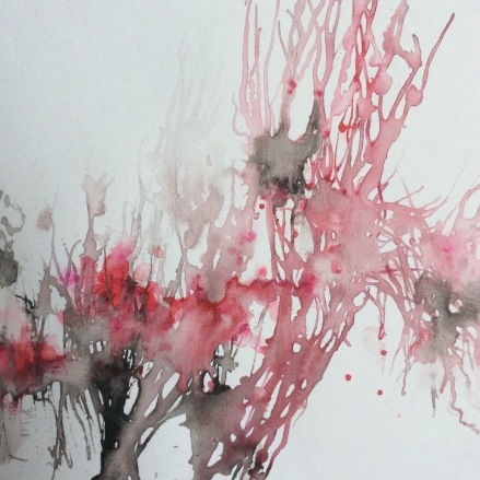
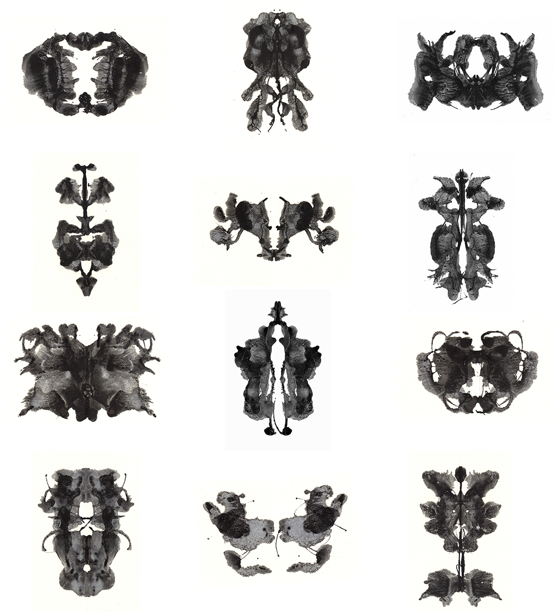
Regrowing, 2016
Ink on paper
12 x 12 inches
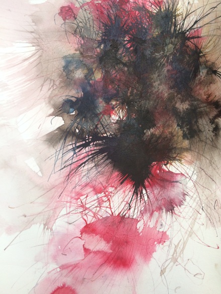
What I knew, 2016
Ink on paper
14 x 11 inches
Articiple: These are really nice. They’re so different than the oil paintings. How do you feel about the relationship?
Maya: I’ve had a lot of different phases over many, many years. So most people don’t know the whole trajectory and all the paths and strains of my working methods and history. When I first started making, I was a knitter. My grandma taught me and I was just kind of obsessed with knitting. I was one of those kids who knit in class in high school. It was a very calming activity. So I kind of grew up using my hands. I just liked making things and that’s where it started. As the years went on, my interest in making things did progress into drawing and other forms of artmaking. But I was always drawn to textiles and thread and texture. I seem to have a really heightened sense of touch. It seems to be very important to me as I look back over my life. So texture is a big part of what draws me to making art. I respect but I don’t love ceramics, or glass. They’re just too hard for me, and I can’t relate to them, in a certain way.
Articiple: They don’t respond to touch the way textiles or soft materials do.
Maya: Yeah. So that’s just evolved over many years. I went to grad school in textile arts, eventually. I did some soft sculpture. I also did collage and mixed media. I would sew on them and make collages that way. And it was only after grad school that I really started painting seriously. When I first started painting exclusively, I did a series of paintings that were atmospheric, with oil. So, to circle back, it’s not surprising to me that I’ve come to be interested in water media again–there is a similar atmospheric and organic effect that comes through. But it wasn’t a direct line as there were ten years in between these bodies of work. So, to answer your question, I have done a lot of things over a lot of years. I see relationships between all my different phases and bodies of work, and these two bodies of work are just different stops along the many paths I have explored throughout my career and over many years and many bodies of work.
Articiple: So with these ink drawings, it looks like there’s some pouring involved?
Maya: There’s a little bit of pouring. And I use some brushes to move things around. Often I’ll start with the paper wet. I think what I’m most interested in at the moment is dispersal, and how the pigments disperse and become these organic, halo-y kind of flowy things. Then I push the ink around with more water. Sometimes I wash them completely and start again with them wet. I’m interested in process and layers and in how things pool, and I do a lot of dragging. I did a lot of dragging in the atmospheric oil paintings I did all those years ago too. So like I said, it’s interesting how everything comes back at some point, whether it’s a palette or whatever idea or tool or method, it’s just part of the process. And that’s so much fun. It’s like there’s nothing wasted. Everything new that you do gets in and integrates into what you do and then it comes out again later in new ways. Things always come around and out again later in my experience, in some way.
Articiple: And you don’t have to be intentional about it, because it’ll take care of itself.
Maya: Right, it’s just like with cooking when you throw stuff into the mix, it changes the way everything tastes.
Articiple: Right. I can sort of see how the palette knife work and the scraping work with the oil paints would come out with the dragging, the gesture of moving stuff.
Maya: The motion, the movements are important elements in my work. Those are just another kind of tool: a different element that makes the work specific.
Articiple: Do you ever work on drawings at a different scale?
Maya: Yeah, when I was in London I did a couple really big drawings. They came out beautifully and I didn’t know that they would. It was a good experience to be reminded of the different ways in which I need to push myself in my work. So I do have some larger ones of these.
Articiple: Good, I’d like to see those. So that was over a few weeks?
Maya: It was a month. I got back September first, so it seems very recent. It was a pretty intense experience. There were 20 artists. There was lots of interaction, which was wonderful. It was so packed. I had critiques almost daily. That turned out for me to be just a little too much, as I could barely process one interaction, one meeting, before someone else came in and had an entirely different perspective and point of view. At the end of it I felt like it was really fantastic, but it was pretty overwhelming. When you have six critiques over a couple days you get a lot of different feelings and perspectives and you can take and leave stuff as you choose. There is too much to take in anyway. But I wasn’t at all used to having that many people coming at me with all of these different opinions.
Articiple: It’s hard to evaluate that much feedback at one time.
Maya: Right, and it took me time to get into it and realize, “OK, I’m going to leave that comment behind and I can not worry about that, but these other comments were very helpful and I’ll integrate them.” It was a very active negotiation, because I’m used to just working alone in my studio all day with nobody around. If I feel like showing a drawing to someone, I can, but I don’t have to. With this, everyone was right in there with me.
Articiple: Like grad school again.
Maya: It was like grad school, and I wasn’t prepared for that. I enjoyed it a lot but it took time to flip into that mindset. It wasn’t a natural mindset for me. It’s been a long time since I was in grad school. But it was a wonderful opportunity and it was a wonderful group of people, so I’m really grateful.
Articiple: Were people working in a lot of different media?
Maya: Yeah, and there were people from all over the world. One woman was from Pakistan and she was doing miniature painting in a kind of classical sense, but it was her own imagery and story. They were just unbelievable. Another guy was Sufi, and he would lift images from archives of the Sufi community from different cities. In this case he pulled images of the Sufi community in London over the years. He was from Ontario, Canada. He would sit on the floor cross-legged and his pens and crayons would be all around him. He did these really interesting, intricate drawings of people and buildings. So anyway, yes, it was a pretty amazing exposure to a lot of different artists doing a lot of different things.
Articiple: It’s so great to see people working in different practices like that, in these traditions that you don’t usually get to see.
Maya: And then you’re right there while they’re working. Jag (Sufi artist Jagdeep Raina) would sit on the floor cross-legged. It didn’t look comfortable at all, but he was happy as could be. His pens were strewn everywhere, it was a mess. And Wardha (Pakistani artist Wardha Shabbir) was sitting there with a magnifying glass, her space was pristine, and she was working on this tiny piece of paper. Her glasses were on and she was doing these tiny, tiny little areas of this little painting. She didn’t even finish one painting that month. It was just a wonderful thing to get to see the inner workings of all these different artists and the way they’re thinking and how they keep their spaces. It’s all so individual. It was really a pleasure.
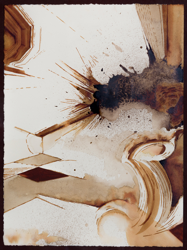
Time is Personal, 2016
Ink on paper
60 x 48 inches
Maya: So here’s the big drawing I did in London. And the other one is here.
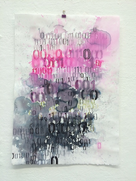
Time is a Substance, 2016
Ink on paper
60 x 45 inches
Articiple: Did you shape the paper purposefully, or just take a piece that was already cut?
Maya: I got the end of a big roll of paper from someone else and I was going to trim it. And then I just decided, it’s fine the way it is, I liked it.
Articiple: It works with the cloud forms.
Maya: So this is when I started working with ink and pen nibs. This text is actually written with a stencil and a pen. I did the stencil and then I dropped water on it, like rain. Awhile back, I noticed that when water got on the drawings made by these pens, the ink would just immediately disperse. They wouldn’t stay at all, and they were really light and delicate. So that became really interesting to me, how that particular ink dispersed on contact with water. I tried to find other kinds of inks that might do that, but nothing does. I couldn’t find anything that was as loose and impermanent.
Articiple: What kind of pen is it?
Maya: They’re called Tombow. They’re from Japan. They’re at every art store.
Articiple: They have a really interesting quality. It’s almost like watercolor pencil.
Maya: There are two ends. There’s a point and another end that’s fat. They’re beautiful pens. I really like how they react with water. So I discovered that awhile ago, and I’ve played with different ways of exploiting that quality. I’ll wash them completely and get these ghostly residual images. And then I can add more line back in. Interesting things happen that you couldn’t get any other way.
So parts of the drawing I can leave, and there’s still the residue of some of the lines in the areas where I washed it away.
Articiple: A lot of layers. And then some pencil too?
Maya: Yeah, sometimes I’ll go on top again and bring out things. If something’s buried I’ll try to bring it back up. It’s a very flexible process and plus it’s fun.
So from there I’ve evolved to do these more formal drawings. I did stenciling and then dropped water on it. Sometimes I’ll move them around to get things to mix. It’s fun when they just melt and do their own thing. And there’s always a surprise, because different papers hold the ink differently.
These were the ones I ended up doing in London. Some went more formal, straight across, and some were more asymmetrical.

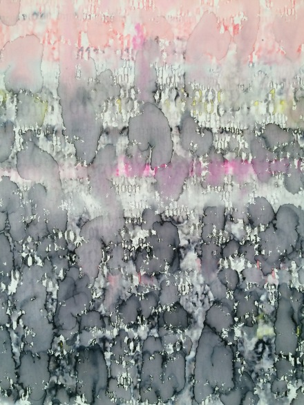
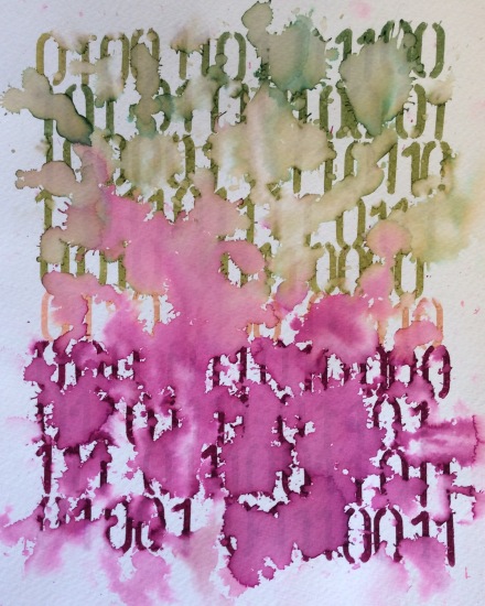
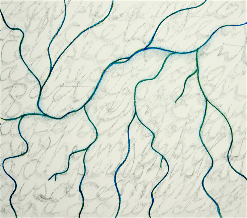
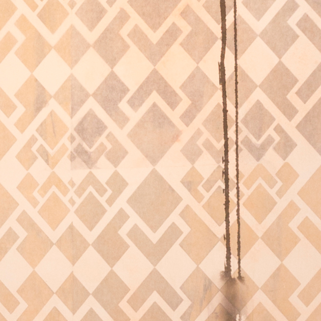
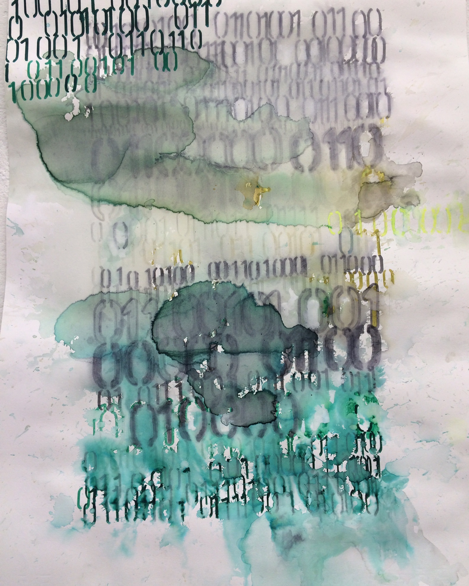
Time is a System, 2016
Ink on paper
30 x 24 inches
Articiple: It really has a textual quality with this repeated pattern.
Maya: And it’s got this grid thing happening, and then the pattern of the language. That’s binary code. The language in them is reflecting on theories of time and different conceptions of time from physics that are impossible for us to understand, because time is linear for us. But time is not really linear. So I was exploring, what would that look like, if time weren’t linear? How would you visually represent that? So this way water spreads and moves is sort of a visual exploration of how time might work.
Articiple: Like stretching and curving and thinning and thickening.
Maya: We all kind of know this feeling that time moves really fast sometimes, and then sometimes it’s just glacial. That sense is not necessarily real, but it might be, right? We don’t know, really, what is happening. Does time move at different speeds?
Articiple: Our physical organisms go in one direction temporally, but our minds can go in all these other directions.
Maya: Absolutely. It’s all relative, so we don’t know. If you’re in space, near a black hole, you can’t tell that time speeds way, way up. And if you were able to get away from that black hole again, everyone would be gone by the time you came back to earth. Maybe those factors affect us, and it’s interesting to think about.
So once I got going I played around a lot with the edges, how much of a border to leave or to have no border at all.
Metamorphosis 1, 2016
Ink on paper
12 x 9 inches
Articiple: And how much color, how much hue to add.
Maya: And the different pens have different intensities. This blue one was super strong. On the later ones I ended up working on top again, playing with the asymmetries, things falling off the page.
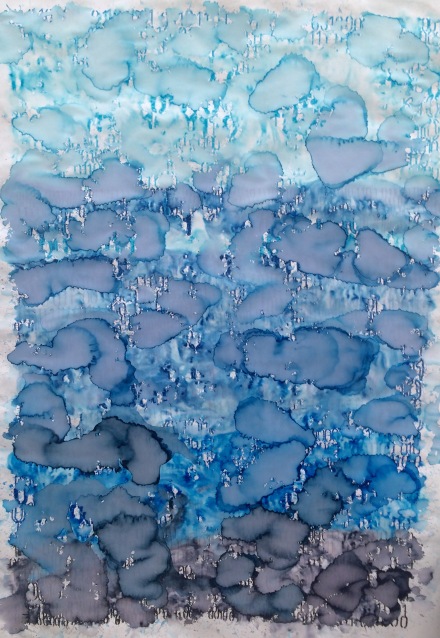
Time Is a Network, 2016
Ink on Paper
30 x 24 inches
Articiple: And so many senses of accretion or dropping away and receding.
Maya: I’m happy with how it came out. So I did a lot of pieces. These were the larger ones. I did those two really large ones at the end.
Articiple: That’s a lot of work for a month.
Maya: It was. And everybody was working like that. A month really isn’t that long to make a whole body of work. At some point I’d really like to take the oil paints on the road and do a residency with the oil paints, and mix in driers so they would dry fast enough for me to be able to take them home at the end. But I haven’t been able to go on residency with the oil paints because they take so long to dry. So for the residency, I focused on drawing, and I created a whole new body of work practically from scratch. Everyone else was continuing work they had been doing before. But for me, this was an entirely new way of working. In hindsight I wish I had just figured out how to do my oil painting there. But it’s a process and I need to spend some time here in my studio investigating how I might take this work on the road.
Articiple: Especially when you have such thick paint applications, it must take months for pieces to dry.
Maya: It takes forever. Which is good, in a way, because when paintings are required for a show, I have to get them done early. I can’t do anything last-minute. But then I can’t fly off to Berlin and paint for a few weeks either.
So that’s what I’ve been up to with the drawing. I’m always drawing and painting at the same time. I’ll do a day of painting and then I’ll rest a day and then I’ll do a couple days of drawing and then back with the painting. It kind of flows in a circle like that. It’s a different kind of energy that is required to do the drawings versus the paintings. And the oil paintings require intense focus and physical stamina. And I just can’t do it every day. I just don’t have the stamina for it anymore.
Articiple: And conceptually, they seem to have really different concerns. The drawings are so spontaneous and malleable—or anyway, you introduce a big element of chance. And the paintings, I know that there’s a lot of improv, but there also seems to be a lot of planning and intention.
Maya: I have to really make decisions and commit with the paintings and decisions in the drawing don’t feel as weighty somehow. The decisions in the paintings can change very quickly, and that’s super intense. I can wipe out half of the painting with one move. I can just destroy it. The pressure to make decisions is exhilarating—sure, I can make small moves, but if I make a big move, it’s a BIG move. And then suddenly it’s an entirely different painting. It’s fun, I like it, as it’s almost like playing sports. You have to process information very quickly to play sports, and it’s all very fast and you have to adjust to other people very quickly. Whatever sport you’re playing, there are these laws of movement and adjustment. And it’s very similar when I’m working on a painting. Things happen very quickly and decisions happen quickly and impact all other parts of the painting and then other things have to adjust to accommodate. I like playing sports, so it makes sense that I see the relationships when I paint.

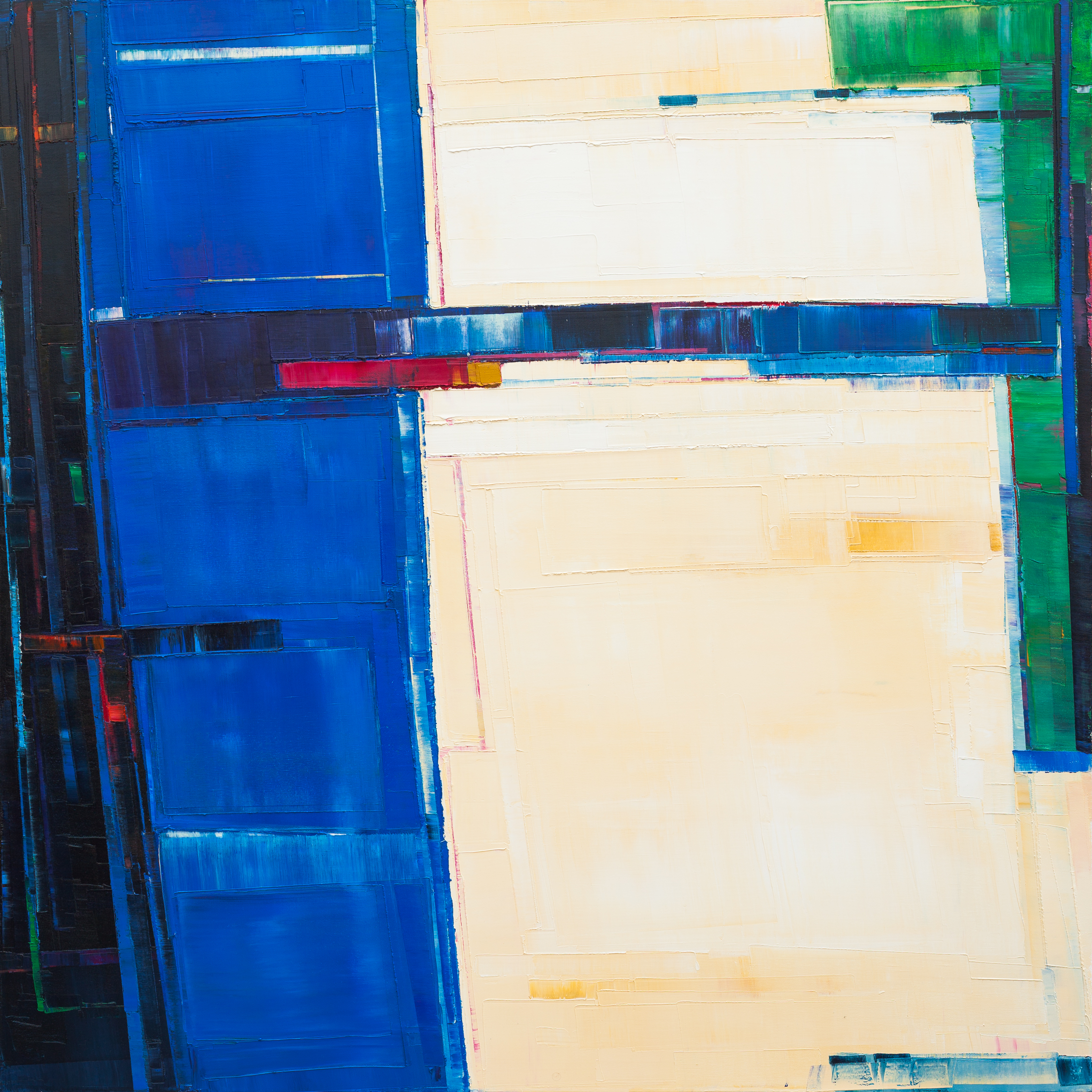
Urban Field 11, 2015
Oil on canvas
60 x 60 inches
Articiple: Your painting technique seems really distinctive. How did it evolve for you?
Maya: I’ll show you the old work I was doing with oil paint from years ago. They’re starting to get destroyed, and I’m starting to paint over them. I was doing these very atmospheric pieces. I did a lot that were larger than this. They’re kind of misty landscape kinds of things. I grew up in Oregon, so, I think they are about growing up in the rain and the clouds and my emotional connection to that place.
Fluxion, 2003
Oil on canvas
48 x 60 inches
Articiple: A lot of thinner paint layers.
Maya: Many thin layers.
Articiple: Are these from years and years ago?
Maya: Yeah. This is from 2000 maybe, 2001 or 2. I did a lot of them and sold some. I just was getting to the end of that body of work around 2003 because I just didn’t have anything else to say. And I had a little scraper, a tiny one like this. I can’t remember what I was using it for. I think I was using it to mix up a color on my palate. I didn’t normally use knives or anything. Anyway, then I realized this tool makes a very interesting mark. That was it, I just started painting that way. The early versions of these paintings were very different. They were almost stippled, but with little squares of paint.
Articiple: More gridded?
Maya: Well, they were more impressionistic, and subdued. I don’t even think I have any of them left. And then they evolved to what I am doing now. I started using bigger tools and it sort of evolved from there. I don’t think that I am going to stop anytime soon.
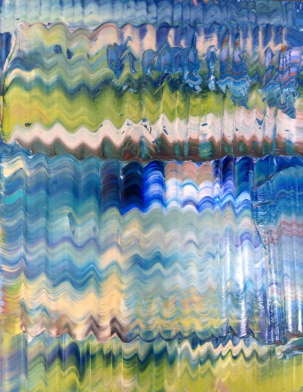
I’ve been experimenting with new methods recently though. These are the works that went into the show, mostly. But I’ve been experimenting with a little more kind of all-over freeform and thick paint. They are slowly getting better. It’s been fun to try something totally different.

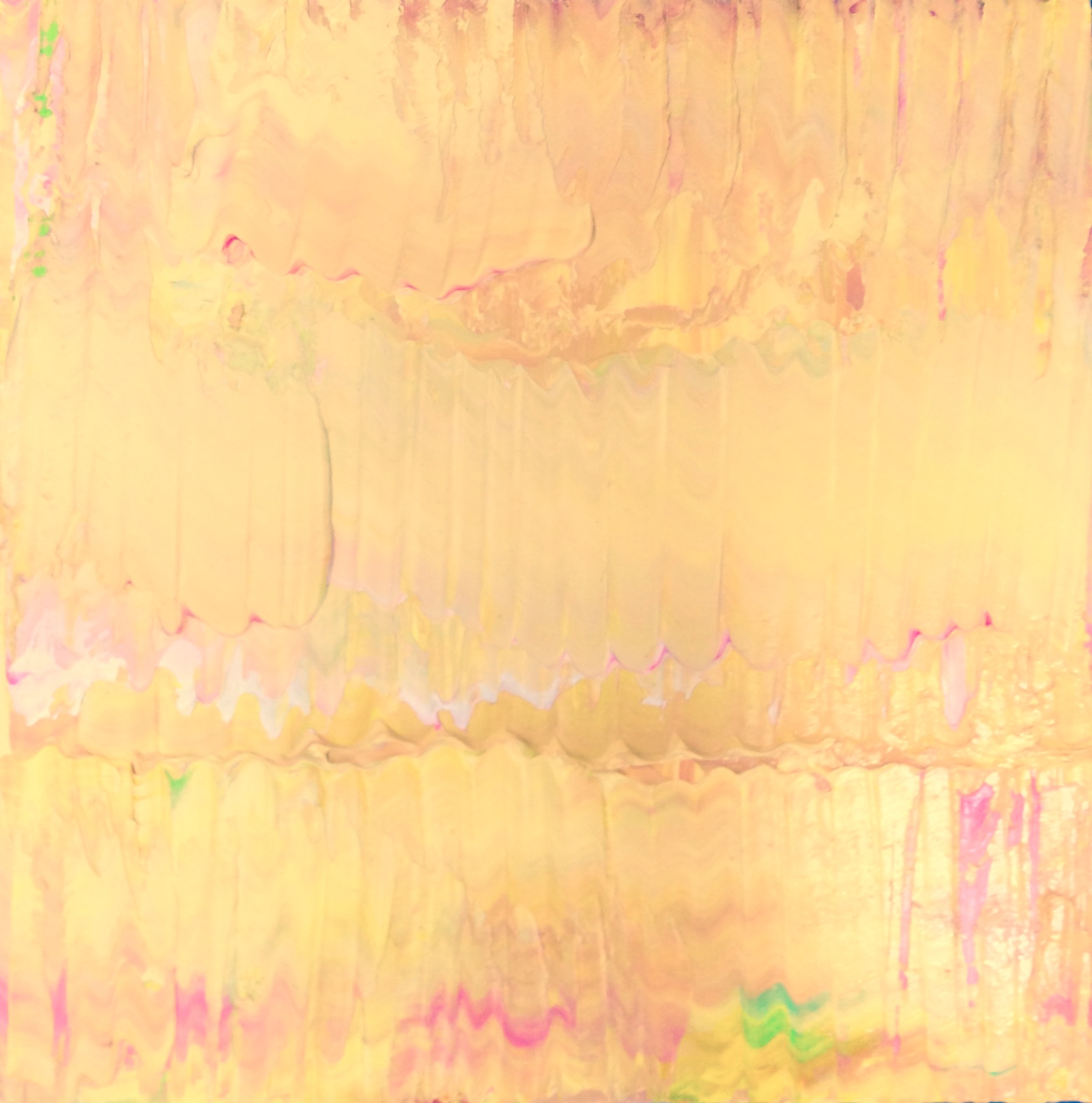
Untitled Yellow, 2016
Oil on board
12 x 12 inches
Articiple: So many of the paintings like the ones from the show have a play between a neutral and a more intense color. But these new ones are really different.
Maya: They’re totally different. I’ve gotten pretty good at manipulating paint. I have a lot of control now, which is really cool.
So these could be really jewel-like and pretty, and they tend to go that way, to be too pretty. And I don’t like that, so I want to keep them sort of gritty in some ways, and messy and more interesting. These are the ones I did first, these wavy patterns. I don’t know, I’m not sure anything is going to come of them, but this feels like a good experiment.
Articiple: It’s a good counterpoint to the more planar pieces.
Maya: And some of that texture might end up coming into the planar pieces at some point. It would be really interesting to play around with it. We’ll see. There’s a big one I did.
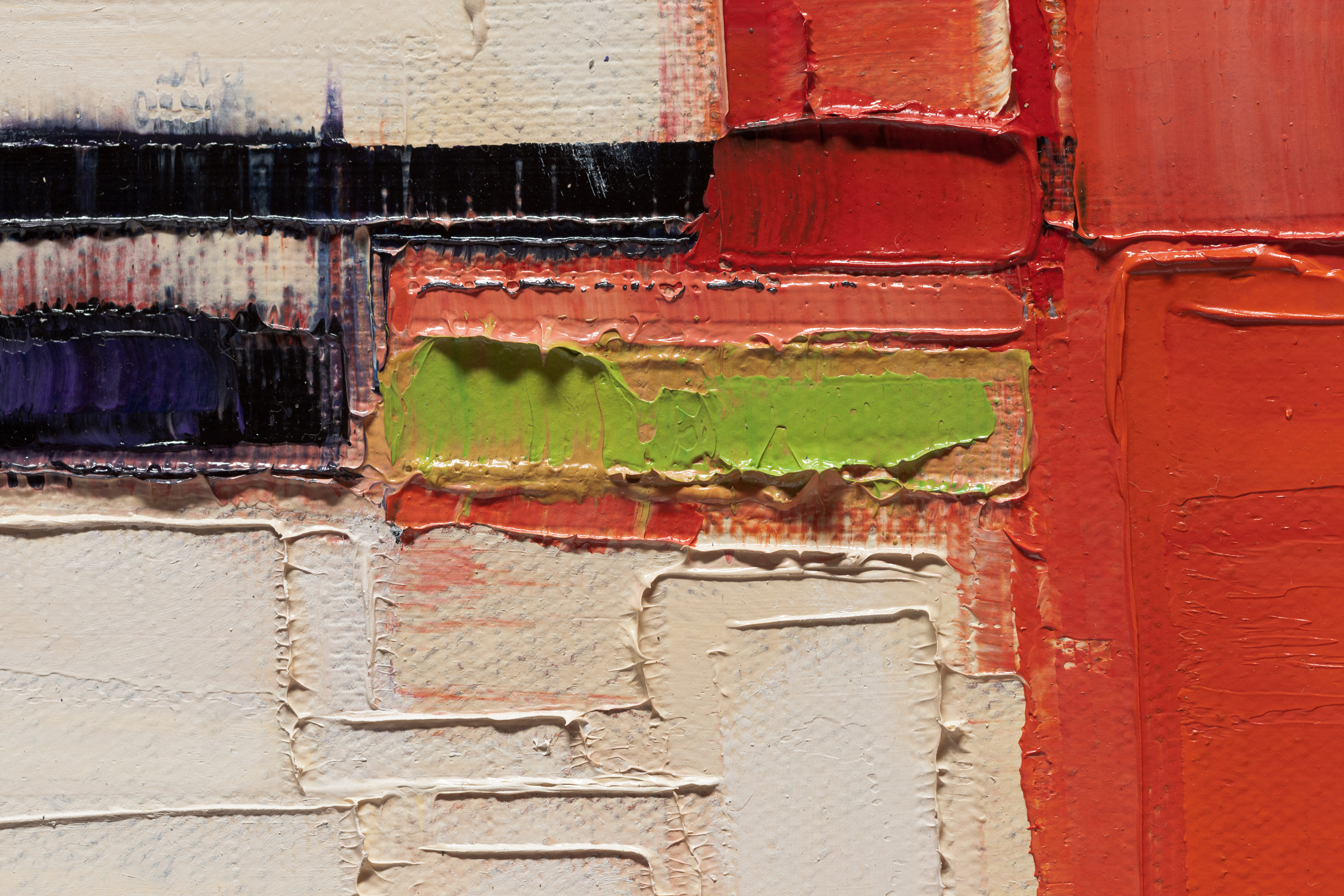
Untitled, , 2016
Oil on canvas
18 x 14 inches
Articiple: It’s like a gathered textile.
Maya: Yeah, it has the grid quality, and almost like a weaving.
Articiple: When you start a piece like this, do you have a palette in mind? Or is it all evolving as you work?
Maya: It definitely evolves as I work. But recently I’ve been just squirting a bunch of color on at once, like a big mess, and just going with it. Normally that would produce a real muddy, messy thing, but somehow I’ll manage it. I’ll add as I go and somehow it seems to be manageable.
Articiple: You can keep them separated.
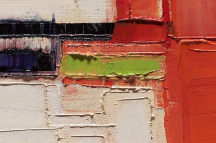
Maya: If you push hard, something else happens than if you push lightly. If there’s stuff underneath, I can play with pulling up what’s underneath it, or if I want to, I can just cover it up. I’m doing them on top of old paintings that have a lot of texture already. I feel like that makes them more interesting. That green was already there from another painting. And then you can go over the bumps and it kind of shatters the consistency, and I like that more.
Articiple: And it looks like stuff chips off, too? Or there are places that don’t get covered as much.
Maya: I think that’s just what’s underneath. You know how with oil paint, if you have a very oily layer underneath and you go over it with something fatter, it will just skid across. I was sort of lucky. The top layer of blue just wouldn’t stick and cover that flesh tone underneath.
So I’ve also been touching up old paintings, slightly adjusting them and reworking some of them right now. So these are in process right now. I haven’t made any new work since my show came down. London happened, and then I cam home and my show went right up. My show was great, but I felt like I needed to take a break. Now I am back in my studio, and I have a bunch of old paintings that were OK, but they weren’t quite there. So it’s worth looking at them again and playing around with them, and going over areas and redoing parts. If I can save them, that’s great. If I can’t, they can just get restretched. But it’s fun to see if I can fix them.
Articiple: What does it mean for you, to feel like something is ‘there’ or finished?
Maya: Well, you know how it is, you do a painting and it’s hard to see it. Sometimes it takes a month or five months or a year to to really see the painting objectively. Often, I wish I had fixed one part or changed a color out. And once they’ve been sitting in my studio awhile and it’s clear that I’m never going to show them, it’s sort of like, I might was well play around with them. They can lose their freshness very easily, so adding to them after they’re done is a little risky. But I have plenty of paintings, so if I can learn something by adjusting things and playing around that way, it’s worth it to me.
Articiple: For sure. Like an ongoing conversation with the piece.
Maya: Yeah. Like, it’s getting there, it needs some work, and let’s see if we can make it really good now.
Articiple: And the pieces you showed, are they all recent?
Maya: Yes, they were all new. I did them all this summer. There were only six pieces in the show. They were substantial. This yellow one and this gray one came back. But they kept the others and a few sold. I pretty much did them all this spring and summer, so it was a lot of focused time. They’re similar to what I was doing before, but they seem more pared down. They’ve got these strips that sort of stop and start and move across, almost like text to me, like little sentences or something.
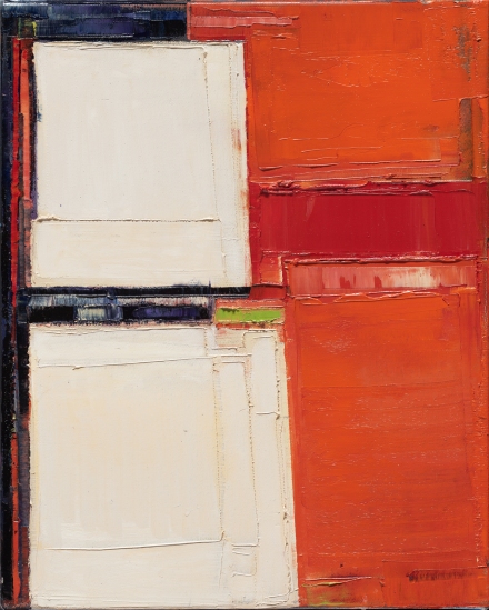
Attempt to Cross 21, 2016
Oil on canvas
72×48 inches
Attempt to Cross 22, 2016
Oil on canvas
72×48 inches
Articiple: These little intrusions of intensity.
Maya: They’re fun to do. I really like the format. They feel really good to make. When I go back to painting I’m sure I’ll do them again. I think I’ll switch the composition around and do some horizontal compositions and see what happens with it.
Articiple: Yeah, these feel really different to me. The horizontal ones you kind of fall into, I think because we’re used to looking side to side, just in our orientation to the landscape.
Maya: Yeah. Obviously, these are like horizon lines, different horizon lines. When they’re square or horizontal, something else happens.
Articiple: And there’s also an aerial quality of looking down at something from above.
Maya: Yeah, I was looking down on farmland when I was flying in an airplane recently, just looking at the patterns and how all of these funny puzzle shapes fit together, and I always find it so fascinating. I also just went to Machu Picchu this spring. I did some paintings for the show before I left for Machu Picchu and the rest of the work when I got back. Being there was like a religious experience for me, because I realized they were doing something with their wall-building that was similar to what I am trying to do with my painting. They were taking these very unusual shapes and fitting them together in a way that is just so perfect and solid and strong and complete and balanced. It’s just mind blowing. Seeing these Inca walls, that are so well-designed and also so organic-looking, and so perfectly integrated into the landscape… It’s just incredible, I can’t imagine how it was done. In fact, no one knows how they did it. But the magic of the puzzle and how it just locks together, like, click, is what I’m going for in my work. I want everything to interlock and be perfectly logical and structurally sound but also completely quirky and utterly unique. I am not into perfect grids or symmetry or perfect balance. Life isn’t like that and perfection isn’t real.
So it was really inspiring for me to see that similar aesthetic in this entirely different medium, architecture. I realized more clearly what it is that I’m trying to do, and it was very helpful. Because sometimes I don’t really understand why I paint. I mean, of course, there are so many reasons why I paint but sometimes I can’t get a firm handle on it. So it’s nice to identify specific ones when they come up. There has got to be more that just a love of color or form. Obviously, I’m interested in color. I love the way colors work and talk to each other, and that’s part of the reason I paint. I like the texture of the paint. But there is also a psychological component, and I think it relates to these realizations about Machu Picchu and how the Inca fit all these huge rocks together to build these incredible structures, and how that’s like me trying to fit the many pieces of my own life together, the disparate parts of myself that are quirky or don’t look like they will fit. How do I get my green part to fit with my blue part? How do I get the structure to balance? It’s a question that’s kind of eternal and existential for me. How do I take all the facets of myself and make sense of them as a concrete whole? How do we take the different elements of our world and fit them all together in a way that makes sense? Maybe it’s not possible, but for me it’s essential to try to get the fragments back and pull them in and fit it all together. So that’s why I do it.
Articiple: It’s sort of the gist of consciousness, I think.
Maya: Yeah. My parents were divorced when I was six, so for me, symbolically, it’s like two parts of myself were separated from a very young age. They still don’t get along after all of these years, and I have come to see that that is still a painful thing and it always will be. It’s not like I am worried about it anymore, but I think I paint this way because I’m trying to get the shattered parts back together and to fit it all back in. And I never really will, but symbolically it’s somehow a necessary thing for me to try to do.
Articiple: It’s so interesting to have architecture as a parallel for that, because architecture starts from the point where everything has to fit or it just doesn’t work.
Maya: Absolutely. And in my own painting, I realized only a couple years ago, I would be painting and I would have a stripe across and I would be like, that just does not work. Nothing’s holding that up. I need something to hold that up visually, whether it’s a darker line underneath, or a fatter line or something. It’s weird, I didn’t realize I was having that dialog with myself and the work. Because of course anything is possible in a painting. Nothing needs to hold anything up. But in my world, this dangling line (in the painting) is very hard for me, but because this little teeny line is there underneath, it manages to keep it structurally complete. And this strong vertical holds it up. If that weren’t there, I would have to do something with that.
Articiple: You’re developing a language that’s specific to this practice, and to each painting. It has to be internally consistent to itself.
Maya: It’s really true. There is a logic to it once I start talking about it, but it’s not a logic that makes sense in any kind of real-world way. It’s just a logic that happens in my own very specific and unique way. It’s a little crazy.
Articiple: It’s not built on any other system. This is the system. That’s the power of good work, it can make up this logic system or this psychological reality.
Maya: I think good art does just that. Good work creates the language that holds itself up. In order for it to be convincing, you have to believe in it. You have to believe in it as the artist. And you can tell when someone doesn’t believe in their own work. You can really tell. You can look at a painting and see, they’re just doing that. They don’t believe it, or they’re mimicking something or someone else. That’s cool, mimicking, that’s part of learning, but it’s not going to be enough. It’s not going to be there yet for me. I do hope I am making that kind of good believable work.
Articiple: Yes, you can tell when work doesn’t have the urgency or the necessity of whatever was behind it.
Maya: It’s just maybe not specific enough yet, or they haven’t taken full ownership of it yet? I’m happy to say that I don’t know anyone who makes work quite like mine, and I’m fine with that. I don’t want my work to look like other people’s work. Obviously there are influences, significant ones, like Diebenkorn and other California painters and other abstractionists.
Articiple: Your work feels really distinctive to me.
Maya: One of the first art classes I took in college was an architectural theory and practice class. It was taught by an architect who was also a theorist. We did things like, we had to take one of the cities from the book Invisible Cities by Italo Calvino, and recreate it in a sculpture.
Articiple: You went to Oberlin, right? I did too. I think I may have taken that same class!
Maya: Stan Matthews taught it. He was Pat Matthews’ husband, from the art history department. Strangely, it was my senior year. I didn’t take any art classes in college. I was doing art history. I was interested in academics. I thought, I can make art later. So this was the first art class I let myself take. We had to take a piece of illustration board and fold it or cut it and make it into a tower, but when you dismantled it, it had to unfurl into that same single solid piece of paper. It had to be intact. You couldn’t cut and paste. So I cut strips and wrapped them around the back and tucked them in. It slowly evolved to become like a flower. At the very end, I cut an extra piece of paper—it was an orange piece of illustration board—and added it to the center of the flower, because I needed something to hold it all in the middle. It was beautiful. I was really proud of it. I was working on it day and night. I just hadn’t been making stuff and I certainly hadn’t been making any sculpture ever before. And there were all these art majors in this class. So I showed up for the crit, and plunked it down with the other towers and couldn’t believe it. There were all of these beautiful elegant folded towers that were engineered very well and were made by talented adept artists, but they all looked pretty similar. Mine just looked so different. It was hysterical how much it was the odd one out with my flower with the orange middle. And I didn’t get approval for the little orange square in the middle. My prof said, “That’s unnecessary.” It wasn’t like I got an A or anything, but it was interesting to me, how different my flower tower was. I think that was because I just hadn’t been trained in the way that all those kids had been trained all through school, and sculpture was this new and very challenging thing for me.
Articiple: So you could come at it in a totally new way.
Maya: And similarly, many years later, I took painting classes to learn about color, but I was only doing that because I was in textiles and I needed to learn about color more. I was really interested in quilts and collage and I was never meant to be only a painter. So I kind of came at painting too from the side. The more I paint, the more I see the relationships to my interest in textiles and quilts. A lot of my works look like weaving because of the interest in the grid and the quality of interlocking vertical and horizontal.
Urban Field 10, 2015
Oil on canvas
20 x 16 inches
Urban Field 10 (detail), 2015
Oil on canvas
Articiple: And the layering working through, like a warp and weft.
Maya: In much of my work, for instance, even if you looked back at the binary code drawings, there’s this warp and weft and then I mess it up and tweak it. So that’s just the way my brain works.
Articiple: Do these paintings start with these large color fields?
Maya: Sometimes I’ll start with a variety of colors all over the canvas, just squirt them out and start working. If I know that I’m going to keep one side light and one side dark, I don’t put a ton of black over on the light side, because then keeping the black out is virtually impossible. But it’s nice to have things come up like little surprises of color from underneath. With these ones, I definitely have a compositional idea in mind. So I will start with a plan, but then I will intentionally try to fuck it up a little bit along the way and change the painting so that it’s not so planned in the end. But usually I know basically what I want to do. And they can change. If it’s not working, I’ll just scrape off a big part of a painting as I go and change it. But the decision to use that green [in that painting] was pretty deliberate. I will often make a painting based on a palette or a color that I want to explore, without having a specific endgame in mind.
Articiple: And the pieces need to have a certain lifespan during the process, to get to that kind of layering.
Maya: If they happen too fast, it can be really fun in a sense, because things just come together and it’s flowing, but they’re often just not interesting enough because the layers haven’t built up, the weird parts haven’t been covered over or adjusted or worked. I mean, in the end you actually can’t really cover anything up. If I don’t like something I will “cover it”, but there’s always a little peek of it sticking out. Something, even if it is barely visible, is always still there. The paintings just get more interesting the more they get worked on. But then, also, I do feel like there’s a point where you can overdo it. The details get too finicky and there’s no reason anymore. When I notice myself sort of picking at the painting, without really doing anything, I realize that that’s the time that it’s over.
Articiple: “Step back!”
Maya: “Step away from the painting!” I can be quite obsessive-compulsive.
Articiple: There’s nothing but your judgment saying when to step back.
Maya: And there are paintings I’ve destroyed because I thought they weren’t working, that I really wish I had waited a night and slept on it. I could have scraped them down in the morning. It’s very hard to see clearly after five hours of painting. You can’t see the painting objectively anymore. I have probably scraped down some fine paintings for no reason over the years.
Articiple: You paint mostly on canvas?
Maya: Pretty much exclusively. I do have a few boards that come into the rotation sometimes. Usually those are small. When painting on wood, the grain of the board never seems to be what I want it to be. Canvas always looks so right and canvas has a nice push and a little spring to it. I find that it works better with the kind of work I’m doing. But small works on board seem to be fine. You can get a very sharp edge when painting on wood in a way that you can’t with a canvas. It’s super precise. But precision is not what interests me, anyway. I still like the sharp edges, but I like the wiggle that happens on canvas, the softness of the edge. With the wood, I can get really perfect, beautiful lines. Sometimes that’s fun, but overall it’s not exactly what I’m going for.
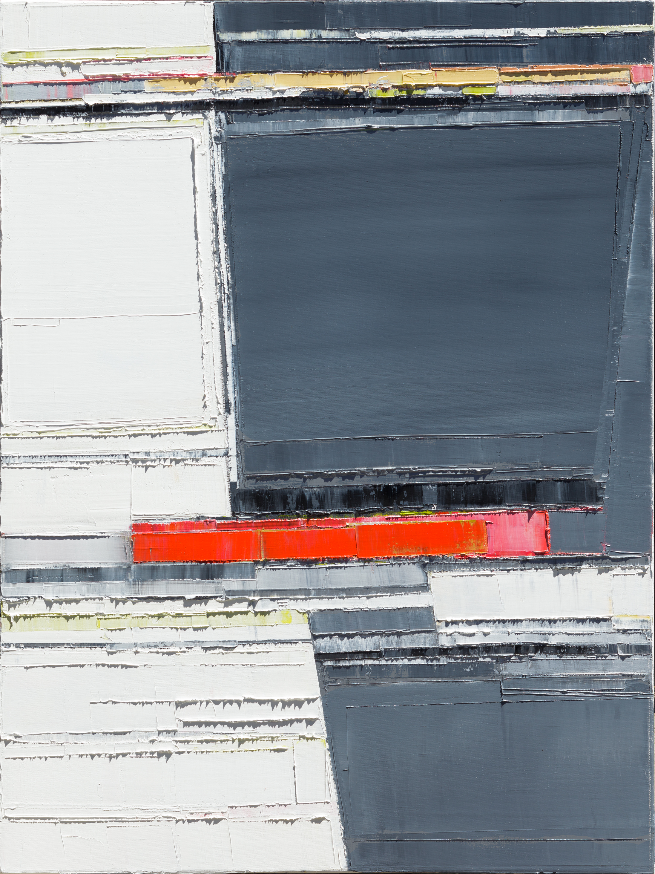
Articiple: I’m interested in what you say in your artist statement, about urban experience and the city as a paradigm. In some ways it’s an image of density, the urban grid. The paintings also have the feeling of being very spacious and open.
Maya: They are definitely like little neighborhoods. There are metaphors of the city all over the place in these paintings but they could be referencing a lot of things. There are elements that look like bridges, or maybe they are streets? There are big open spaces like parks or lakes or empty lots. There are structures and forms that could be buildings, or doors, or possibly you are looking down on a city block from high above. They also look like maps sometimes, or interiors. And then I look and think these new paintings really are something different. The older paintings are neighborhoods, but in these stripe paintings, there is something else going on. It could be the repeated horizon lines, but I think really they’re more about integrating parts, the way we were discussing previously.
Attempt to Cross 26, 2016
Oil on canvas
40 x 30 inches
Articiple: Tell me how you went from textiles to painting. Did you do any painting in grad school?
Maya: There are times when I think I’d love to go back to school to get another MFA in painting. But now I think, “Oh hell, no.” I can’t imagine uprooting my life and putting myself under that kind of stress again. Back when I went to Davis (which was great, by the way), I didn’t want to upheave my life for grad school, and I could commute there from Oakland, where I was living. So it worked out. I wasn’t in the visual art MFA, I was in the textile MFA, which was smaller. I had really good professors, like Gyongy Laky and Barbara Shawcroft, people who are more traditionally in the textile world. So it was a different education. But it was fine, because I learned how to make things my way, and I think that’s what you need to learn in grad school; you need to learn what it is that you do, and how you do it and why and you can’t dabble in that practice or that process. You have to be willing to really investigate yourself and your being as an artist in some very essential ways. And you need to be willing to break yourself down over and over to get at the true essence of what you, as a specific, unique human, do or do not do and why you make those choices.
Articiple: It’s a training ground for developing your process and your judgment. I think it’s almost immaterial what medium you focus on in school.
Maya: I think that’s really true. And in hindsight, I didn’t know that I was going to end up a painter. Sure, if I had to do it again, I’d go get my MFA in painting, because it turns out I’m a painter. But I’m a painter with this certain set of interests that are a little tweaked and there is definitely the textile interest. So it’s all fine, because that’s who I am and I can own it.
Articiple: I don’t think studying textiles instead of painting has set you back!
Maya: But it was tough in grad school, because I really wanted to paint. And they kept pushing me, and saying that I had to do something with fiber.
Articiple: Were you weaving?
Maya: Before grad school I wove professionally out of this small production house in Petaluma. I did a lot of things for them, including hand painting fabrics with stencils and dying, but I also wove these blankets for them on a big loom. It was fun, because I was working with my hands and I like that. But it was pretty boring work.
Articiple: Pretty repetitive, I guess.
Maya: And for me, creatively I just didn’t get into the weaving. With my paintings, I can squeeze out color right onto the canvas or mix something on a palette. There’s an immediacy with painting that you almost can’t get with any fiber art. With quilting, it’s hours of intensive labor sewing pieces of cloth together and layering the batting and hand sewing it. My brain wants the immediate result, and then being able to change it. Having this plastic medium is just required for me at this point. So there wasn’t really a way for me to get at the immediacy that I wanted in fiber. But by the end of grad school I did do collages that I would paint on and sew on top of, so I got to have the kind of play that I needed. But I do my paintings very quickly. My process is very fast, again it’s like playing sports, which you can’t do slowly, because that is just the way my brain works and the way I need to work. So I couldn’t do anything but painting now. I’m just too demanding.
Articiple: I don’t think anything really compares with working in a fluid medium. It responds instantly and it’s almost infinitely malleable. I can see why paint suits your way of working.
Maya: I’m not the kind of person who likes to plan my work. There are artists who think it all through first.
Articiple: I think Amy Ellingson works like that, plans things far in advance. (I interviewed her a few months ago.) She creates digital diagrams with illustration software, then she goes through a really deliberate, painstaking process to translate them into paintings.
Maya: I just can’t work that way. I need a little structure and then I want to be able to improvise. That balance of structure and improvisation is really where it’s at for me. I can’t plan that much. I can’t even follow a recipe when I am cooking because I just want to improvise, I find it so confining to work from a set of rules.
Knitting was great because, on the one hand, I do have an ability to do hours of mindless labor happily, because my brain can space out and it is just singing, “la la la!”. But at the end of the day, it’s not my preferred mode of working creatively when there are a set of rules that you follow and then, boom, it’s all over. What’s the fun in that?
Articiple: It’s interesting that you went through the route of fiber arts, because so much of what you say about your process doesn’t necessarily mesh with that. And I didn’t even mean that as a pun!
Maya: It doesn’t mesh at all. It really doesn’t. But the sensibility was definitely interesting to me. And clearly I have a deep and powerful emotional relationship to texture which drives that interest. And the way that materials can be transformed in that world is very interesting to me, the variety of textures and all the different fabrics and the way they absorb color, transparency. It’s all there. It’s very similar in many ways to painting, but it’s just very slow.
Articiple: And fiber itself is fascinating. I learned a little bit about spinning awhile ago, using a drop spindle. I got very interested in how that works, and how people figured it out thousands of years ago.
Maya: I guess some of the first textiles made were rope, and then they would knot it into nets.
Articiple: That makes sense, to start with some looser structure before getting to fabric.
Maya: It is extraordinary. The line is a thread to me always. With drawing, for me what’s interesting is line. There are just endless possibilities with line.
Articiple: And the small drawings would be beautiful fabrics.
Maya: They could be. I did do some dying too when I was in grad school. But it’s interesting to go back into using ink almost as a dye. But as you can see, it’s all about the line in this body of work—this just makes me so happy.
Articiple: And all those different layers of transparency that you can’t plan, the pools with these different concentrations.
Maya: I’d like to figure out how to work with it more, because things go back and other things come forward. I’d like to make more decisions around controlling and creating that space, so I’m working towards that.
Articiple: So you’re in drawing mode now for awhile?
Maya: I don’t know. This year really wiped me out. I just did too much. And London was kind of the straw that broke the camel’s back. I loved it. You can see how much I produced there. And I produced all the work for my show in the two or three months before I left for London. And I traveled a lot. I was in Europe in January, I have family there. And then I was in Ecuador and Peru in May with my mother. We went to the Galapagos and Machu Picchu. Then I went to London in August, and I had a show.
Articiple: That’s an intense year.
Maya: It was a lot. In 2015 I had major surgery, because I had an autoimmune disease that went undetected and it ravaged my body. I’m really lucky that I was able to get it all under control, but it was years of trying to figure all of it out. No one knew, because you couldn’t tell by looking at me that I was sick. But I was very sick for about 5 years while we cured the autoimmune disease and then waited to see if I could recover. The surgery was in 2015, and it was the end of a long and difficult road where I was really in limbo. I bounced back after the surgery in just a few months, which was really fast.
Articiple: That’s amazing in itself.
Maya: It was amazingly fast. I just lucked out that the surgery worked and that there weren’t any complications. So after that, I really jumped back into life. There were so many years of being in limbo and waiting that I just ran out of the gate, and then after going so fast and being on all of this adrenaline I went to London after all of this other travel and started dating again and making work, and I just felt like I smashed into a wall. I realized I needed to slow down So I’m glad I did all of that traveling and living. It was worth it, but now I feel like I need some time. It’s fun to do some smaller works and experiment, but there are no shows coming up soon and there is nothing I need to do.
But there are some other things going on. My dealer Danielle Fox at SLATE and George Lawson from Lawson Gallery are making a book of 6 images and some essays for me about the recent show. George and Danielle are both going to write a piece for it. So that’s happening. There are some other nice things happening—talking to you, and I have a private student, which I’m really enjoying. And I’m going to curate a little online show for NIAD, Nurturing Independence Through Artistic Development, the Richmond organization for developmentally disabled artists. So there are little things coming up that kind of keep things flowing.
Articiple: It sounds like it’s good to slow the pace a little.
Maya: It was a fun time, but it was a little much. I’m just trying to find my balance again. And it was a really intense time leading up to my surgery in 2015. Anybody who goes through anything like that, there’s a reevaluation that has to happen. It’s just required. Things get really clear really fast. I just don’t have time for drama anymore. I am just so not interested.
Articiple: I was really sick around the time I was at Oberlin, I had Hodgkins Disease. So in my early 20s I went through that feeling of, “Oh, this is how it could end.” Suddenly you just can’t count on your body. It gave me a different perspective.
Maya: I’m sure it did. Fortunately most people don’t have to face that when they’re young. I think about the difference before I found out about my disease and after. It’s like I’m two different people. It was such a game changer. Before the diagnosis, I was just this healthy person and I took it all for granted. I think that’s great though, don’t get me wrong. Young and healthy people should take it for granted. On the other hand, I don’t regret any of the lessons learned. I’m a better person by far for the experience. I’m grateful in that way. But I don’t wish it on anybody and if I had had the choice, I wouldn’t have chosen it.
Articiple: If you can get through it, it’s a really formative experience.
Maya: And that’s all that matters, getting through it. It didn’t take me out. That’s all that matters.
Articiple: Right, you get a second chance.
Maya: It’s definitely just taking me some time to sort through. So it’s going to happen in phases. It’s going to be awhile. But I’m very happy to be on this side of it.
Articiple: Well, you look amazingly healthy! No one would ever know what you’ve gone through.
Maya: I’m grateful that when I was diagnosed and in the years before the surgery, nobody really knew. I don’t think I looked super healthy but I didn’t look ridiculously ill, either. It was kind of a blessing to be given a pass in that way, to be able to go along as if, and deal with it more privately. When you have to deal with stuff like that more publicly, it’s more challenging. I didn’t want to talk to everybody about it.
Articiple: And if you’re able to travel and all of that, it seems like you don’t have any restrictions now. Going to Machu Picchu is pretty intense. It’s over 14,000 feet, right?
Maya: I think Cusco is 12,000 feet. Maybe Machu Picchu is only 10,000. But still, that was a big adjustment. And it wasn’t even a year since my surgery, it was 11 months. And I went to Europe at Christmas, so that was only six months after my surgery. In hindsight, I clearly had a mission. I didn’t quite realize how much I had a mission. It’s understandable, after having to wait and wait and wait for resolution. But now I’m settling back into normal life and not wanting to rush. I went to Peru and Ecuador and I had to make all the work for the show and I got to go to Europe again. It’s enlivening to have activities and a deadline like that. It helps to get things done. But it’s not how I like to live.
Articiple: Then things start feeling more like obligations.
Maya: Things don’t happen as organically. So I’m enjoying the fact that this is a period of quiet. I think I might not push too hard until the new year. I did a lot this year, and it’s fine. I want to be excited about making the oil paintings, particularly. I’ll be messing around with water and drawing and stuff all year, but I might just wait to do more oil paintings. Although at the same time, the experiments with oils feel really necessary and interesting. Experimentation is important. It’s really easy to get stuck in ruts, at least for me. So doing stuff that’s so wildly different is really helpful to push things around in a new way and see what happens. When you’re working for a show or something, you know what you have to produce. You can’t really experiment all that much. For me, it’s like I want to create a body of work that’s interesting and there are new things happening, but they’re all kind of talking to each other in some way, and you have to deliver something that holds together and makes sense.
Articiple: You want it to be coherent.
Maya: Yeah. I try not to plan too much, but usually when I’m interested in something—like I got really interested in grays again. I did a bunch of gray paintings. The gallery didn’t show them, because they get to edit. But there’s only so much planning I’m going to do. It’s nice to have a gallery that picks the work at the end of the day, because they always do something interesting and also something different from what I might have done. That’s what they’re good at. I’m actually really not that good at hanging up shows. I’m good at making the paintings and then it’s nice to have someone else take them and do stuff with them.
Articiple: I like SLATE a lot. All the shows I’ve seen there have been really interesting.
Maya: The new space is really nice, too. And they’re just lovely to work with. I love working with them, so it’s been a nice thing.
Articiple: And are you still working with Mercury 20?
Maya: I left there because SLATE took me on, and I can’t do both. I kind of wanted to figure out a way to do both, because it’s a community I really value, and I helped start it. I still feel like it’s my baby. But it was time. It’s important to let other people have that platform. It’s evolving and changing. It’s really thrilling to see what they do now. I get to hang out still with everybody and be around. It’s a lot less work for me to have someone else hanging my shows and doing all the promoting and marketing.
It was really fun to work with Mercury 20 and help evolve the Art Murmur. The Art Murmur organization, when I first got involved, was so disorganized. People could hardly make a map. But at the same time, nobody really had to do anything or promote it because it was gaining so much momentum on its own. Once the galleries started having openings, people just started coming. It just happened organically, and it didn’t need anybody, really, to push it anywhere. But then once it got big it did need some organization. So it was cool to witness and participate in that process and to help things come together. Now the Art Murmur has got this huge board and they’re fundraising. It’s pretty amazing.
I just saw the Eva Hesse movie, the documentary about her work and her life, last week. It was so interesting. She was in New York, she was in the New York art scene very specifically and she was very ambitious. I hadn’t realized that about her before. She was very deliberate and intentional about her career. Part of me thinks that that’s probably required on some level. I often wonder how much ambition is required, and how much planning needs to go into a career. There are people who push-push and sell themselves in certain ways. I guess that’s fine if it’s natural to you. But if it’s not, forcing it doesn’t feel like it’s really going to help. I feel like if I just take that energy and put it back into my work it’s better for me, and then make the effort to do residencies like the one in London and the one before that in Iceland, and develop my communities. I met a lot of great people at these residencies and made some important contacts. The business person in me is not super excited about forcing those conversations and relationships. And any career is a lot about relationships. There’s only so much I’m willing to do, though, and then I just let the chips fall where they may.
Articiple: I’ve been reading a lot about Agnes Martin. She did work for years in New York, but almost ambivalently, it seems. Or anyway she ended up choosing seclusion over almost anything else. But she definitely got her work out there, she was part of the conversation.
Maya: I think it helps to be there, in the community that you want to be developing. Ultimately it’s about the relationships that you form. Opportunities come in the same way that they do anywhere and in any career, and it’s often based on the communities and the relationships you’re in. I’m fine with being in the community here. I love it. But there are some really interesting things going on in New York. I have good friends there. I try to get there every year and see the shows and keep up with it all. It is such a great city and someday I hope to show there.


![[installation] Variation (blue), 2014 Variation (blue): Artifacts, 2015](https://articiple.com/wp-content/uploads/2016/07/amy_ellingson_variation_blue-and-artifacts.jpg)
![[detail] Variation (three grids), 2016 Oil and encaustic on four panels 66" x 168" x 2"](https://articiple.com/wp-content/uploads/2016/07/ellingson_01_050916_detail.jpg)

![[detail] Variation: purple (dawn), 2016 Oil and encaustic on two panels 50" x 156" x 2"](https://articiple.com/wp-content/uploads/2016/07/ellingson_purple_detail.jpg)
![[detail] Variation (blue), 2014 Oil and encaustic on two panels 78" x 72" x 2"](https://articiple.com/wp-content/uploads/2016/07/amy_ellingson_var_blue_d_02.jpg)
![[detail] Variation (blue): Artifacts, 2015 Cast encaustic forms, wire, encaustic Dimensions variable](https://articiple.com/wp-content/uploads/2016/07/amy_ellingson_variation_blue-artifacts.jpg)

![[installation] Iterations & Assertions, 2014 Site-specific mural, sculptural installation, paintings](https://articiple.com/wp-content/uploads/2016/07/amy_ellingson_ia_install_01.jpg)


![[detail] Untitled (Large Variation), 2015 Ceramic mosaic 10' x 109' San Francisco International Airport](https://articiple.com/wp-content/uploads/2016/07/amy_ellingson_sfo_mural_det_02.jpg)
![[detail] Untitled (Large Variation), 2015 Ceramic mosaic 10' x 109' San Francisco International Airport](https://articiple.com/wp-content/uploads/2016/07/amy_ellingson_sfo_mural_det_07.jpg)