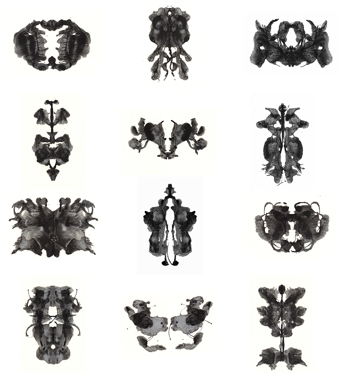
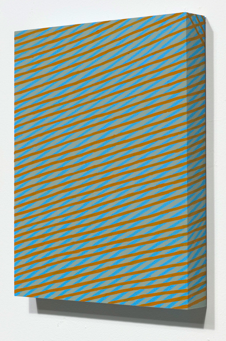
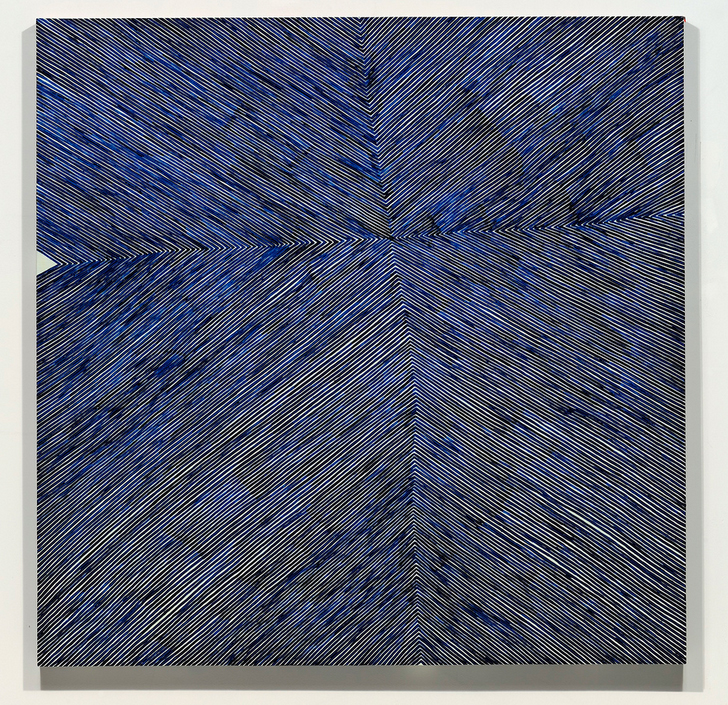
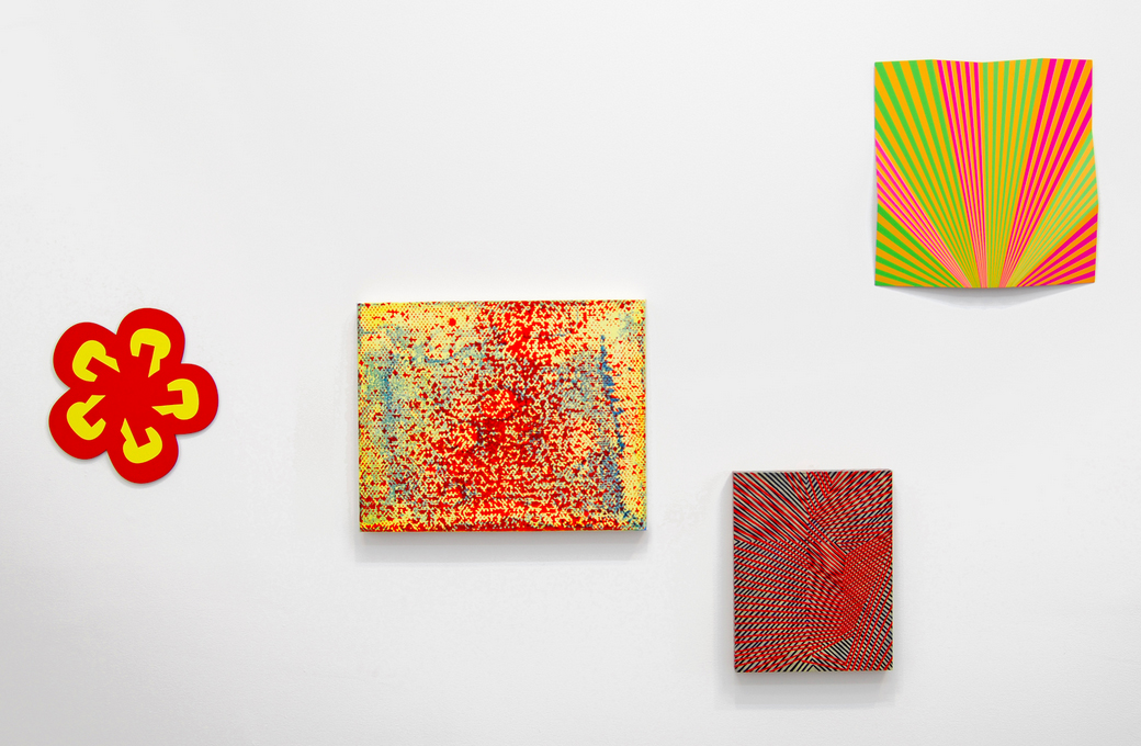
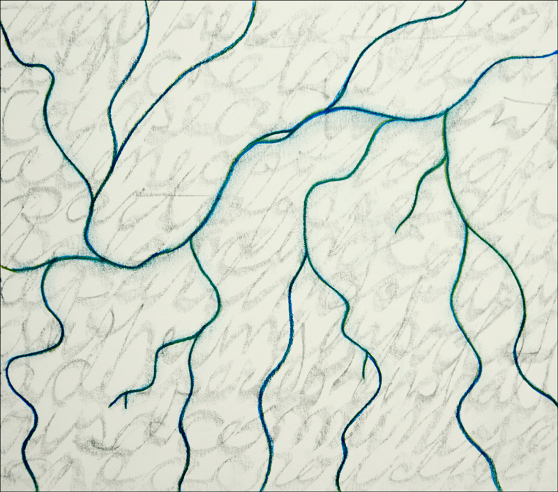
Drawings and Messages from the Confluence Project, 2017
Installation view
Greening Gallery
Marin Headlands Visitor Center
Golden Gate National Recreation Area
In 2015 Todd Gilens began the Confluence project, investigating stream ecology in the Sierra Nevada and developing materials for public installations in cities whose water is provided by these mountain sources. The project explores intersections between the layered, lively dynamics of streams and the perhaps vanishing craft of cursive handwriting. Over the past several years Todd has made extended visits to Sierra ecological field stations to meet with field scientists and take part in observations and data gathering. He has also searched archives for historic handwriting samples that he will convert to digital fonts to create outdoor text installations about stream science and urban water use.
Todd’s exhibition Drawings and Messages, on view at the Marin Headlands Visitor Center from March 4 through May 15, 2017, includes some of the works on paper that he has developed in the course of the Confluence project.
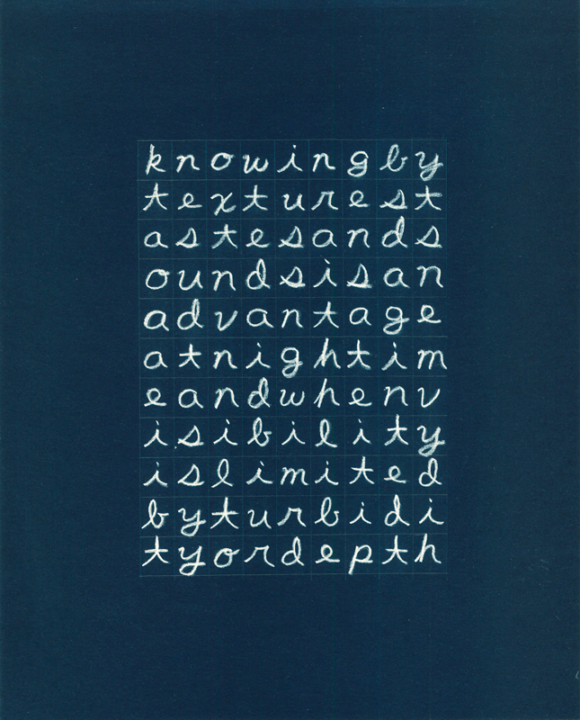
Knowing by,
Berkeley, 2016
Graphite and pastel on colored paper
10 x 8 inches
Micro to Crowding (Truckee at Reno),
Sierra Nevada Aquatic Research Laboratory (SNARL) and Berkeley, 2015
Graphite and pastel on paper
10 x 11 inches
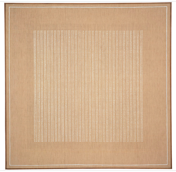
Articiple: Looking at the material for this exhibition and the writings you’ve published about the Confluence Project, I’m intrigued at how the grid becomes the site of convergence for two very ungridlike phenomena, stream ecology and writing. Of course the Cartesian grid is the matrix most often used to represent data about the measurable world, and most forms of writing, from pictograms to digital type, are arranged in some linear, orthogonal format. Still, what you’re exploring seems often to fall outside of what the grid can capture, as you wrote in December 2016:
The process was a study in the tensions between protocol and variability. And it made clear that the bulk of experience lies outside data points, that in leaping from the known to the inferred we set aside most of what goes on before us.
Those tensions and leaps of faith are part of any act of making sense. They’re especially key to this project where you’re looking so closely at how moments and nodes coalesce into complex understandings. How do those tensions motivate or shape this project?

Drawings and Messages from the Confluence Project, 2017
Installation view
Greening Gallery
Marin Headlands Visitor Center
Golden Gate National Recreation Area
Todd: Yes, difference is experience, so it is a question of how to arrange contrasts whether of visual, historical or conceptual origin. In designing this project, I have been looking for the right proportions and contrasts that set associations in motion, that invite the sort of very human experience of engaging through curiosity and being rewarded with discoveries. I’ve piled a lot into it, but each has a good reason to be in the work and is articulated with the other parts. I’m looking at natural systems and in human culture, field science, writing systems and urbanization. These are the content, and also my models for complexity and contrast.
Approximate Landscape,
Valentine Camp, 2014
Lithography crayon on paper
10 x 11 inches
Grids are stable frameworks against which nuance and complexity can be highlighted, whether in data plots or down the lines of a poem. And there is the urban grid, largely facilitating transportation and building technologies, which is laid over another system, the shapes of land and streams. Buildings and roads hide the nuances of the landscape: the tension between the two is built-in.
One of the key experiences in developing the project was being at the experimental stream network at the Sierra Nevada Aquatic Research Laboratory (SNARL) near Mammoth Lakes. Nine identical zigzag channels were constructed in the 1980’s for experimenting with different flow volumes. Mountain streams are so variable and researchers wanted a way to compare effects side by side. I recognized these channels as an intermediate step between mountain streams and urban stormwater systems, which also regularize the flow of water into zigzags in pipes underground. I also sense that science practices are intermediaries, as they translate phenomena to frameworks of understanding something of complexity is shut out and something of control is gained. In good science though, the complexity remains accessible, and the control is light-handed and humble.

Someplace,
SNARL and Berkeley, 2016
Pastel and chalk on paper
11 x 10 inches
Articiple: There’s an interesting variation in relationships to the grid among the different drawings in this series. In the gridded letter pieces, the grid explicitly imposes a non-hierarchy, treating the letters as unplotted data points. Only the letters’ sequential arrangement shows their relationship or their collective meaning. In the drawings of stream paths and other natural patterns, forms are hierarchical but non-sequential. Relationships between points are pronounced, but our eye can take any path we choose through the pieces. The cursive curvilinear drawings are a third thing: we have to follow the linear path of the text to understand its meaning, but the overall images are non-sequential. What were your thoughts or intentions about these various explicit and implicit relationships to the grid as you made these pieces?

Streams receive,
Berkeley, 2016
Charcoal and graphite on clay-coated paper
10 x 8 inches

Not Impossible Pathways,
Berkeley, 2016
Pastel and charcoal on paper
10 x 11 inches
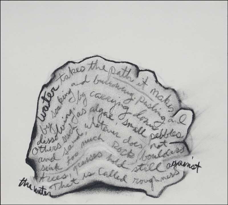
Water takes,
SNARL, 2016
Charcoal on paper
10 x 11 inches
Todd: The gridded letter pieces need to be engaging at the level of what they say as writing, but they also give an overall impression without being read in the conventional sense. In typesetting that overall look is called the ‘color’ of the page – even though it’s black on white.
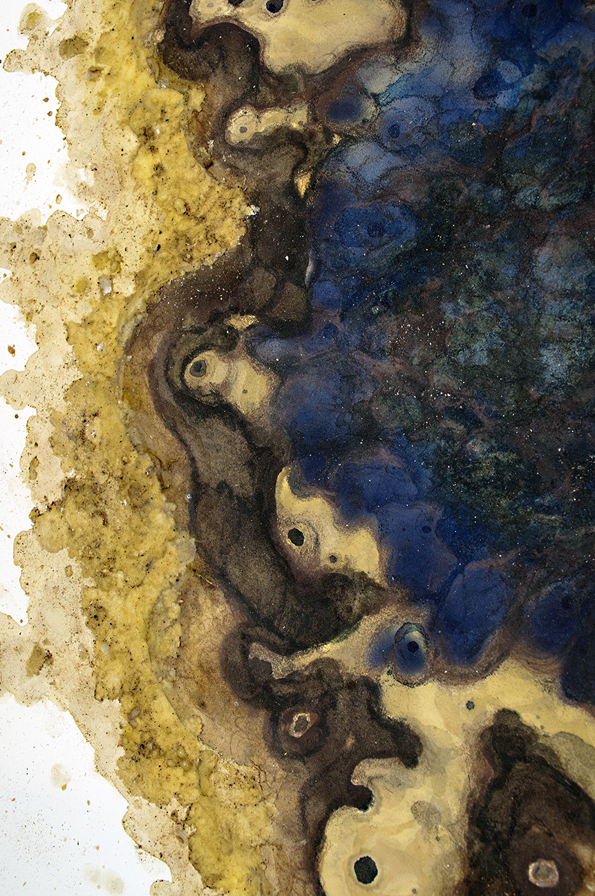
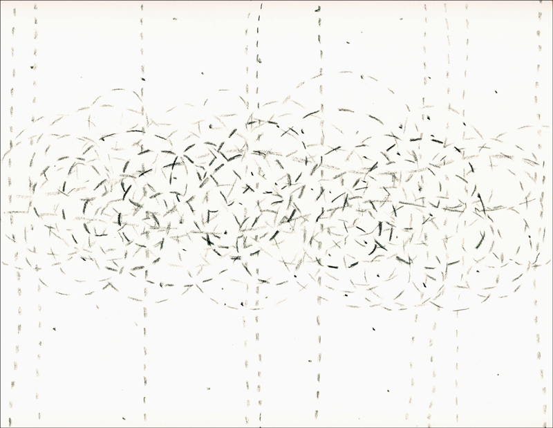
The other pieces play across that spectrum but each one has multiple kinds of meaning. For example, the India ink squiggles (“Ridges and Valleys”), riffs on topographic maps, describing a fundamental condition of high and low land surfaces. The title gives a clue, but the drawing doesn’t say whether black or white is higher – that is left to interpretation, as is the scale. And the pattern can also suggest skin, or undersea forms. So we should be able to move between kinds of hierarchies, different systems of value. There are no limits, and I want to have a range of approaches in the work, and to test my own limits and habits as well. I think it’s an important skill to be able to read things in multiple and often contradictory ways.

Ridgelines/valleys,
Berkeley, 2015
India ink on paper
10 x 11 inches
Articiple: The culmination of the Confluence Project will be the installation of mile-long texts along city curbs, communicating ideas about water and stream science. You’re using handwriting samples from historical archives in the Sierra to design fonts for these texts. What process do you use to create a standardized digital font from an idiosyncratic, even archaic writing sample?

Curb installation prototype
Reno NV, 2016
Todd: The process is simple but fussy. I’ve gone through dozens of examples of historical handwriting at archives all around the West, looking for cursive that is legible and done by a person representing something historically interesting – not famous people but individuals who have had a role in the local culture. There needs to be enough written material so that they will have used all the letters of the alphabet. About ten pages seem to work, though it depends on their vocabulary of course. I’ll photograph the pages, then using Photoshop isolate each letter, trimming the start and end of each stroke to where it will mostly meet up with the beginning of the next letter. Most writers have variants on letters like s’s, whether they are placed at the beginning or in the middle of the word, so I’ll try to capture that too. I look for typical examples, and have to hunt to find letters like z, x and j. It’s an interesting way to read, for letters, rather than for meaning at the level of words and sentences. Once I have an alphabet, including capital letters and some punctuation, I put it into a template, upload it to an online service that assigns the letter images to keyboard keys, and a few seconds later I receive a font file that I can load onto my computer, and type away in the handwriting of that deceased person. The process goes through several iterations to get the letters to connect well, and there is still a lot of fussing with letter spacing and kerning.
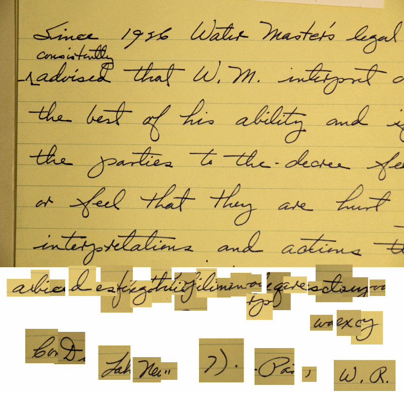
Handwriting sample of Claude Dukes, Federal Water Master for the Truckee and Carson River systems from 1958 to 1984.
Articiple: How does the use of these historically specific and very individual archival materials intersect with the other themes of the project, the interpretation and communication of complex ecology?
Todd: There is an interesting regularization that happens as handwriting becomes a font – it goes from responsive to consistent. The handwriting-to-font process parallels the regularization of urban water flows and the simplification of phenomena for understanding. Since I needed some kind of a font for the project, I wanted to bring in a very personal level, an individual voice, because the work will meet pedestrians one at a time as they read. That sense of individual experience is important to me in crafting work, the audience of one. I wanted a certain intimacy to speak about these vast processes. Cursive was an obvious choice for its continuity and for the way it expresses the unique condition of an individual through the collective medium of writing. It’s another way a material, in this case a font, can have meaning in a work, even if largely hidden. I don’t expect anyone will recognize the handwriting of so-and-so. It will be part of the backstory.
Articiple: You created some of these drawings at the field stations, sometimes using local found materials. How did these site-specific criteria influence the works?

Willows,
SNARL, 2015
Lithography crayon on paper
11 x 10 inches
Todd: As I’m working on understanding our concepts of landscape, working out of field stations has been an enormous advantage. Informal conversations with researchers is really at the base of the project, and I was lucky to cross paths with many interesting people who were also quite generous in talking with me. There are the field stations, and then there is field work out in the landscape, where mostly I was making notes and drawings in a journaling kind of way.
Working this way means bringing the subject and its representation closer. Using site materials is another way to do that: the material becomes another layer in the mix of meanings. Found charcoal is extremely lively. These are pieces left from burn piles where forests are thinned, it doesn’t have an even texture or shape. It’s hard to control so I work with it freely and also carefully; there are always surprises in the marks. I also used rainfall on some of the lithography crayon pieces, just setting them out on the porch and snatching them back at a certain point. Some of the pieces were done in David Herbst’s lab at the Sierra Nevada Aquatic Research Laboratory near Mammoth Lakes. They gave me desk space and I could call Dave or his co-worker Bruce Medhurst over to clarify an idea or discuss a drawing from their point of view. That kind of access is extremely enriching to the work.

Approximate Cobbles,
Valentine Camp, 2014
Lithography crayon on paper
10 x 11 inches
Articiple: Viewing this project, I’m left with a sense of the incommensurate—incommensurate scales of time in geology and biology, incommensurate scales of complexity in natural processes and human comprehension. I think one achievement of this project is to engage with the incomprehensible, even as you measure and interpret and search for order. What, for you, is the place of the incomprehensible or the immeasurable in the quest for scientific integrity and environmental responsibility?
Todd: Actually, I’m not sure human comprehension is so far off the complexities of natural processes – we are a natural process too, after all. I would set ‘comprehension’ against ‘description’ and ‘understanding’, which are limited, whereas comprehension can be synthetic, open, and include contradictions.

Slow Water,
SNARL, 2016
Charcoal on paper
10 x 11 inches
Even though in the big picture we’re tiny, short-term specks of life, the world from our vantage point does revolve around us – it’s even produced by us in the fundamental sense that whatever is out-there registers through our senses and understanding as the thing we call the world. Looking after oneself and looking after the environment align, and that goes for looking after other people too. There is certainly a lot of ignorance and deceit. We have limitations, and our confusions and frustrations get played out in how we imagine and shape our environments. I do have a moral sense for developing my understanding, and a social sense for sharing what I’m doing. Maybe curiosity and responsibility are two sides of having a focus on how things work, not forcing into theory but opening to what comes up.
As for integrity in science practice, science is, in my view, a remarkable discipline, a craft for building understanding. It is meant for circumstances that are measurable. Enlarging the field of measurability has been a big technological effort – lasers, mass spectrometers, data analysis software. It will be interesting to see where human agency moves as automated tools take over more of the sensing tasks in research. It’s one of the reasons I’m interested in field science: what does it mean to engage with a place as a person? One evening last summer when I was out surveying streams with researchers, I suggested that understanding was overrated. Everyone’s jaw dropped and one of them said, “Well then, we may as well go home.” But I feel that both understanding and incomprehensibility together make a picture of experience; and there are other things too, such as hunches, love, lots of human stuff that is happening in parallel. Science is an evolving, collectively defined method or form of inquiry and exchange, just as ballet is a form of training and dance performance. There are a lot of ways to do it.

Path Dependency,
SNARL and Berkeley, 2015-17
Graphite and colored pencil on paper
10 x 11 inches