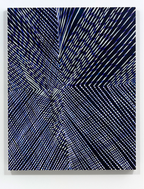
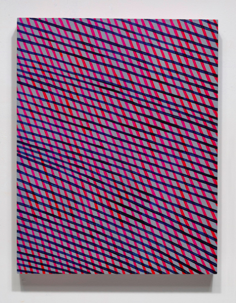
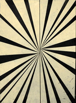
Variation (blue), 2014
Oil and encaustic on two panels
78″ x 72″ x 2″
Amy Ellingson is a Bay Area painter and interdisciplinary artist who has exhibited her work nationally and internationally for more than 20 years. Her signature large-scale paintings in oil and encaustic use abstract patterns generated with digital illustration software, translated to material form in painstaking, deliberative processes. This act of translation from the virtual to the real, investing the ephemeral digital file with the attention and intention befitting an enduring artifact, is central to Amy’s work. Also key is her practice of iterating a concept through different media, such as by interpreting a painting in 3-D sculptural forms.
![[installation] Variation (blue), 2014 Variation (blue): Artifacts, 2015](https://articiple.com/wp-content/uploads/2016/07/amy_ellingson_variation_blue-and-artifacts.jpg)
[installation] Variation (blue), 2014 Variation (blue): Artifacts, 2015
Amy’s upcoming solo exhibition Chopping Wood on the Astral Plane will be on view October 1-29 at Eli Ridgway | Contemporary Art, located at Minnesota Street Project in San Francisco.
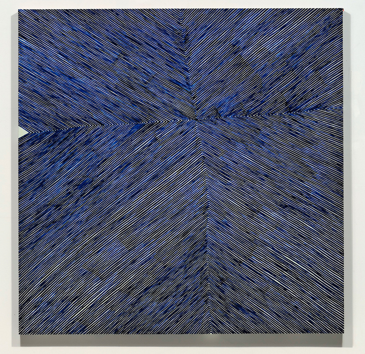
Variation (three grids), 2016
Oil and encaustic on four panels
66″ x 168″ x 2″
Articiple: I’d like to pick up on some thoughts from your interview with Maritza Ruiz-Kim from 2014 (The Loop Of Abstraction: Amy Ellingson at San Jose Institute of Contemporary Art). I’m interested in how you describe the investment of time and labor in your work, and the relationship between the ephemeral digital source imagery and the finished works:
The decision to make a painting based on a flimsy digital file is about commitment, time, labor, effort.
I feel that the imagery is imbued with some power along the way, via the investment of time, attention and physical energy, belying the humble beginnings of the digital imagery.
But I think (hope) the overall effect is one of the hand trying to be perfect, more perfect than the digital, more mediated by processes and materials, more real, more human.
In much of modern and contemporary art it’s often the gestural, the imperfect, or the improvisatory that are credited with being ‘more human’, as if the accidents and idiosyncrasies of individual presence are what rescue the human from the tyranny of technological precision. Your position seems like the inverse of that, instead identifying the human with the pursuit of perfection, the sustained and disciplined effort, the repetitive act of labor. I wonder if you have any more thoughts about that?
![[detail] Variation (three grids), 2016 Oil and encaustic on four panels 66" x 168" x 2"](https://articiple.com/wp-content/uploads/2016/07/ellingson_01_050916_detail.jpg)
[detail] Variation (three grids), 2016
Oil and encaustic on four panels
66″ x 168″ x 2″
Amy: Yes, it’s a bit of a paradox when you put it that way. Certainly, you are right to say that we perceive gestural, improvisatory painting methodologies as being truly human. I suppose that is because we can see and “feel” evidence of the hand and body. Perhaps we think we can “feel” the artist’s impulses and actions. And, perhaps, the further we advance into the information age, the more we will perceive gestural, imperfect things as signifiers of the human condition. However, I’ve been thinking a lot about expression. What is it, exactly? Why do we make assumptions about what is being expressed? Why do we assume that “perfect” things are not necessarily expressive?

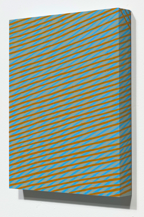
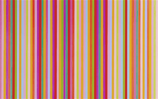
Variation: purple (dawn), 2016
Oil and encaustic on two panels
50″ x 156″ x 2″
For example, I have a nice watch that my parents gave me for my fortieth birthday. It is an automatic, meaning that it winds itself by capturing, storing and utilizing the energy created by the movement of my body. It does this through its design—a mechanism of tiny, compact springs and rotors and gears. Though many people wear Apple and Fitbit watches these days, I still wear my automatic. The only thing it does is tell time. To me, it is one of the ultimate expressions of what it means to be human. The complexity and precision of its design and its singularity of purpose are reminders of what humans are capable of. What’s more human than Swiss watch making? I feel the same about precision in art. Isn’t a Bernini sculpture expressive? To me, repetition, labor and the pursuit of technical mastery are the most human things. Believe me, there are lots of imperfect things in my paintings, but in making them, I try to bring every element to a level of finish that results in a seamless whole. Agnes Martin wrote and spoke of the pursuit of perfection. She said that we have an awareness of perfection in our minds but that perfection is unattainable, and that “the function of the work of art is…the renewal of memories or moments of perfection.” I tend to agree with that.
![[detail] Variation: purple (dawn), 2016 Oil and encaustic on two panels 50" x 156" x 2"](https://articiple.com/wp-content/uploads/2016/07/ellingson_purple_detail.jpg)
[detail]
Variation: purple (dawn), 2016
Oil and encaustic on two panels
50″ x 156″ x 2″
I like your phrase, ‘ tyranny of technological precision’. Yes, computers and the graphic design and photo editing programs I use have their own algorithmic perfection, but I would argue that it is somehow lacking, at least in terms of human esthetic judgement. I remember learning Adobe Pagemaker years ago, in the early nineties. One could adjust the kerning (the space between individual letter forms) to make the text look better. Of course, typesetters have been adjusting kerning with their eyes and hands for hundreds of years, in an effort to make text more legible and more pleasing to the eye. What is that, exactly? Well, we are still physical beings, we still respond to physical stimuli, we still have our mysterious ways of making esthetic and formal choices.
Articiple: I’m curious to know more about your choice of materials and your decision to work in oil and encaustic and gouache. A lot of art that engages with the relationship between the virtual and the real incorporates digital media directly into the work, through video, 3-D printed objects, or such. You’re taking a different approach in generating source material digitally and translating that through the use of more traditional media. Certainly that creates a dialog with the history of abstraction and the larger history of painting. But it seems like there is something more there. I wonder if there’s a phenomenological connection between the material qualities of the media and the qualities of investment and attention that you want to realize in the work? I think what I’m asking is, how do these media, or the ways you’re able to work with them, carry particular qualities of the ‘human’?
![[detail] Variation (blue), 2014 Oil and encaustic on two panels 78" x 72" x 2"](https://articiple.com/wp-content/uploads/2016/07/amy_ellingson_var_blue_d_02.jpg)
[detail] Variation (blue), 2014
Oil and encaustic on two panels
78″ x 72″ x 2″
Amy: We remain physical beings. We are from and of the natural world. Art making is a strange impulse. It connects us to our highest ideals even as it reminds us that we have feet of clay. Throughout most of art history, we humans made art out of natural materials: stone, wood, a bit of charcoal, ground minerals in a vehicle of some sort… even though the imagery in my paintings is the result of keystroke commands, the material reality of the work is very traditional: wood panels, chalk gesso and paint made of ground minerals, turpentine, oil, beeswax and resin. I love the connection to the past. Artists have been using these materials for hundreds of years and we have an intrinsic relationship to them, as we do to an image on a planar surface. When I look at one of my sketches on the computer, or even printed, it really doesn’t look like much. It’s a reference, a starting point. I do believe the computer and the graphics programs I use (Adobe Illustrator and Photoshop) prompt me to design in a particular way, but as you know, the desktop and the palettes are simulacra of real things: a real desk, a real pen and paintbrush, and real actions, such as copying, pasting, scaling, and erasing. I look at the sketch and say, “now I am going to make this real”. There is a bit of the Pinocchio story in play, I suppose; artifice only takes one so far. I find a lot of satisfaction in learning about paint recipes and formulas and I enjoy making my own mediums. I recently began experimenting with making my own gouache, and it is just unbelievably delicious. I experimented a bit and then realized that I probably need a few months to really work out a methodology of testing recipes and mixing and tubing colors, so I set it aside, but I hope to spend more time on it in the next few months.
![[detail] Variation (blue): Artifacts, 2015 Cast encaustic forms, wire, encaustic Dimensions variable](https://articiple.com/wp-content/uploads/2016/07/amy_ellingson_variation_blue-artifacts.jpg)
[detail] Variation (blue): Artifacts, 2015
Cast encaustic forms, wire, encaustic
Dimensions variable
Articiple: You often iterate an idea through different forms, repeating shapes and patterns in a series of related works. In fact your show at SJICA was titled Iterations & Assertions. You explained a little about this in your interview with Maritza:
For many years I have created groups of closely related paintings for exhibitions. Until now, the progression was more literal in a sense. For this show, I wanted to tease out particular qualities, elements, characteristics in a more fragmented way. The diptych is the “mothership”. Everything else relates to it, but in a more exploratory way.
Your use of repetition and variation set up a strong dynamic of constraint and discovery. I’d be interested to hear more about how the practice of iteration works as a generative tool for you.

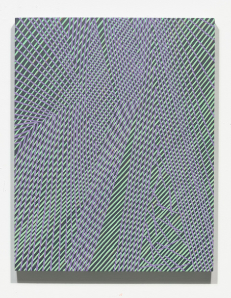
Variation: Apparent Reflectional Symmetry,
Parts I & II, 2014
Oil and encaustic on eight panels
Overall dimensions 69” x 338” x 2”
![[installation] Iterations & Assertions, 2014 Site-specific mural, sculptural installation, paintings](https://articiple.com/wp-content/uploads/2016/07/amy_ellingson_ia_install_01.jpg)
[installation] Iterations & Assertions, 2014
Site-specific mural, sculptural installation, paintings
Amy: I appreciate your putting it in terms of constraint and discovery, because that is exactly how I see it. We must acknowledge that just about everything has been already been done. How does one make a meaningful abstract painting these days? How can I participate in and advance the discourse of abstract painting? I decided some years ago to limit the imagery in the works to elements that I designed in Illustrator: simple lines, arcs and grids. The oblong, or straight-sided oval, is the matrix of many of my forms. This very basic, simple language gives me a lot of flexibility. By piling it all up in layers and using simple commands to alter these forms, I have been able to create a vernacular that allows me to explore abstraction without worrying about generating new imagery—the imagery is self-generating, in a sense. I think that most artists find a set of parameters that allows them to be free, to explore, to seek and find answers.

Variation: Large Delineation, 2014
Site-specific mural, acrylic
13’ x 40’
Some of my imagery has been altered so many times that I truly cannot remember how I arrived at it. I wouldn’t be able to replicate it if I tried. But it’s here, in my computer. I can grab it and paste it into a new file, stretch it a bit, pile a bunch of things on top of it, and hopefully arrive at something that I want to spend a few months recreating by hand. My hope is that the paintings will transcend this simple language of shapes, through deep exploration, and even exploitation. The iterations allow me to push the boundaries I create for myself. Over time, this language of simple forms (some of which are akin to letterforms, while others appear to be mere digital noise) has taken on a life of its own. It is perceived as ‘personal’ somehow. The shapes are recognizable signifiers, in the same way that another painter’s gestures or paint handling become personal signifiers.

Variation: Large Delineation, 2014
Site-specific mural, acrylic
13’ x 40’
Articiple: For Untitled (Large Variation), your ceramic mosaic installation at the San Francisco International Airport, you adapted your visual vocabulary to a much larger format than your previous work. What were the conceptual challenges that this posed? Or the technical challenges, if you’d like to go into that. I’m sure there were many!
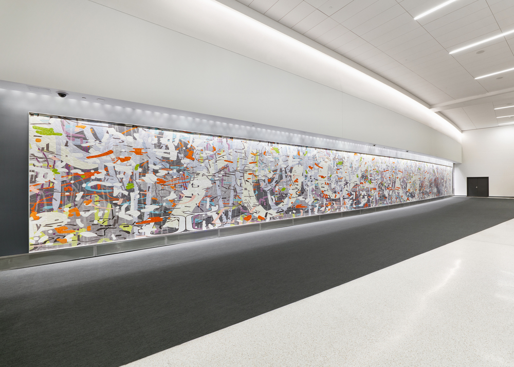
Untitled (Large Variation), 2015
Ceramic mosaic
10′ x 109′
San Francisco International Airport
Amy: Untitled (Large Variation) presented real, unexpected challenges. The design is based on a painting I was making at the time. My basic forms are designed in Illustrator, but my final sketches are Photoshop files. So, the first challenge was taking my working file back into Illustrator and redrawing it as a vector file that could be scaled up to 10 x 109 feet. I redrew it all manually, since I didn’t feel I could get what I wanted using the Live Trace command. It took a couple hundred hours to do that. I literally pored over every single form, adjusting anchor points and arcs. Then, I sent it to Mosaika, the mosaic fabricator in Montreal. The owner informed me that I was out of my mind and that the mosaic would cost well over a million dollars to produce. So, I asked what I needed to do to get it within budget. She gave me some simple guidelines such as, “no shape can be narrower than a finger’s width,” and “you may only use one layer that gives the illusion of transparency.” These restrictions were terrific, as I had absolutely no idea what was possible, what it would cost, what the pitfalls were, etc.

Untitled (Large Variation), 2015
Ceramic mosaic
10′ x 109′
San Francisco International Airport
So, I went back through the file. Keep in mind, it is very difficult to work on something so large on a relatively tiny computer monitor. I “touched” each shape, each arc, a thousand times, much in the way that I do when I make a painting, refining and adjusting until the image was simplified enough to be viable as a mosaic. The next challenge had to do with the nature of the digital file. Usually, Mosaika starts with a finished work, such as a painting, which is scanned, enlarged and then interpreted in mosaic. It was surprising to me, but the Illustrator file’s “flatness” and lack of directional detail posed problems. The first material samples that were made were awful, as the fabricators assumed that I wanted to convey a similar flatness in the mosaic. However, once I visited Mosaika in person and shared my work with them, there was a collective “oh…” in the studio. We realized that we had to give the forms some direction. How do you break them up in to small fragments? What are the shapes of those fragments? How do shapes overlap to create the illusion of space? How would we address gradients and transparency? There was a lot of collaboration at this stage. Mosaika excels at this, since they work with a lot of artists who have no experience with mosaic.
![[detail] Untitled (Large Variation), 2015 Ceramic mosaic 10' x 109' San Francisco International Airport](https://articiple.com/wp-content/uploads/2016/07/amy_ellingson_sfo_mural_det_02.jpg)
[detail] Untitled (Large Variation), 2015
Ceramic mosaic
10′ x 109′
San Francisco International Airport
The scale of the piece is just…impossible. There was really no way to envision the mural until it was complete and installed on the wall at SFO. A leap of faith was required. It’s a bit scary and an incredible challenge to work at this scale. I was not entirely sure if the piece worked until the final reveal. As an image that relates to my paintings, the mosaic is interesting because each shape is fragmented into multiple tiles, in some cases hundreds or thousands of them. The overall effect is one of simultaneous fragmentation and unification of form. The faceting effect is very interesting to me. There are tens of thousands of small planar forms, and a million little edges that catch the eye.
![[detail] Untitled (Large Variation), 2015 Ceramic mosaic 10' x 109' San Francisco International Airport](https://articiple.com/wp-content/uploads/2016/07/amy_ellingson_sfo_mural_det_07.jpg)
[detail] Untitled (Large Variation), 2015
Ceramic mosaic
10′ x 109′
San Francisco International Airport
Articiple: I’m looking forward to your solo show at Eli Ridgway this fall (October 1-29, 2016). Is there anything you’d like to share about this new work or how it furthers your project?

Variation (thicket), 2016
Oil and encaustic on two panels
36″ x 144″ x 2″
Amy: I have been working on my forthcoming exhibition, Chopping Wood on the Astral Plane, since December. It has been entirely immersive. The show will include 10 new paintings, all created in 2016. As a rule, I create works for exhibition in a specific space, so I have a scale model of the gallery that I have been working with. I’m so deep in it at the moment that it is difficult to talk about, but I will say that I’ve tried some new things with color. There have been some mind-boggling color challenges within this body of work. The paintings are very dense and complicated, even more so than usual.

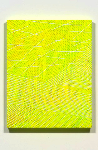
L: Variation: yellow (dusk), 2016
R: Variation: purple (dawn), 2016
Another thing that viewers familiar with my work will notice is that the title of the exhibition (and the titles of the some of the individual works) is a bit more whimsical than usual. I usually tend toward titles that are basic, descriptive identifiers. But something has taken hold of me as of late; I feel the weight of time and temporality. The title for the exhibition started as a bit of a joke at first, but it perfectly describes the relationship of hands-on, consistent labor to more philosophical things. It addresses the relationship between the quotidian and the esoteric, and the relationship between time and timelessness. The great thing about preparing for a show is that I’m in my own little bubble of reality. I make the rules, I follow them or I break them, and the consequences are mine alone to grapple with. I’m going to savor these last couple of months of intensive work, before the paintings enter the public realm. It’s a magical time. As Agnes Martin said, “Sometimes through hard work the Dragon is weakened.”

Identical/Variation No. 2 (blue, black), 2016
Oil and encaustic on panel
36″ x 36″ x 2″