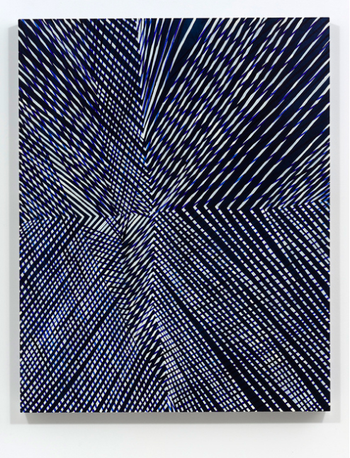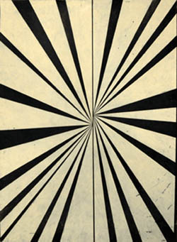
Required Skimming (based on Forgetting the Art World by Pamela M. Lee). 2014, video still.
Kate Rhoades’ video Artist Statement opens with the line “My current work is an exploration of the role of the artist, the institution of art, and its discourse,” but only after taking us through the hair pulling, swearing, and second-guessing that go with trying to jam an artistic practice into a few sentences. The video is buried inconspicuously on Rhoades’ website, but as a capsule summary of her practice it’s on point. Rhoades makes videos, paintings, performances, and other work that jostle the institutional complacencies of the art world through humor, sly guilelessness, and a cheerful willingness to include herself in the joke. I saw Kate’s mixed media exhibition at the Mills College 2014 MFA Exhibition and immediately wanted to talk to her.
Kate also co-hosts a podcast, Congratulations Pine Tree, with Maysoun Wazwaz (Program Manager at the Mills College Art Museum.) It’s a serious and entertaining and very listenable take on the same things we talk about here.
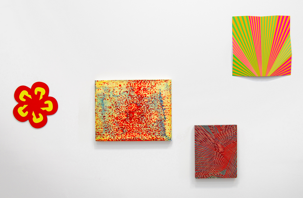
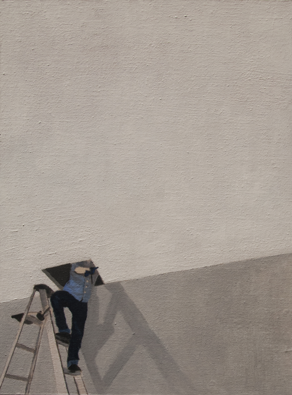
Articiple: Your MFA exhibition made me want to ask you questions that can’t really be answered, even though they need to be talked about over and over. Like: how can artists resist the cooptation of the market and work for communities based on self-determination? In particular I wanted to talk to you about—well, pretty much everything in the exhibition, and how things all played off each other. Such as: those precise, mostly small paintings of the behind-the-scenes operations of the art institution—a copy machine, somebody on a scissors lift, the back (once front) door of the Mills Museum—all with a lot of blank space, like the gallery walls had been sucked into the paintings.
Daisy in the Ceiling. 2014, 0il on muslin on panel. 9″ x 12″.
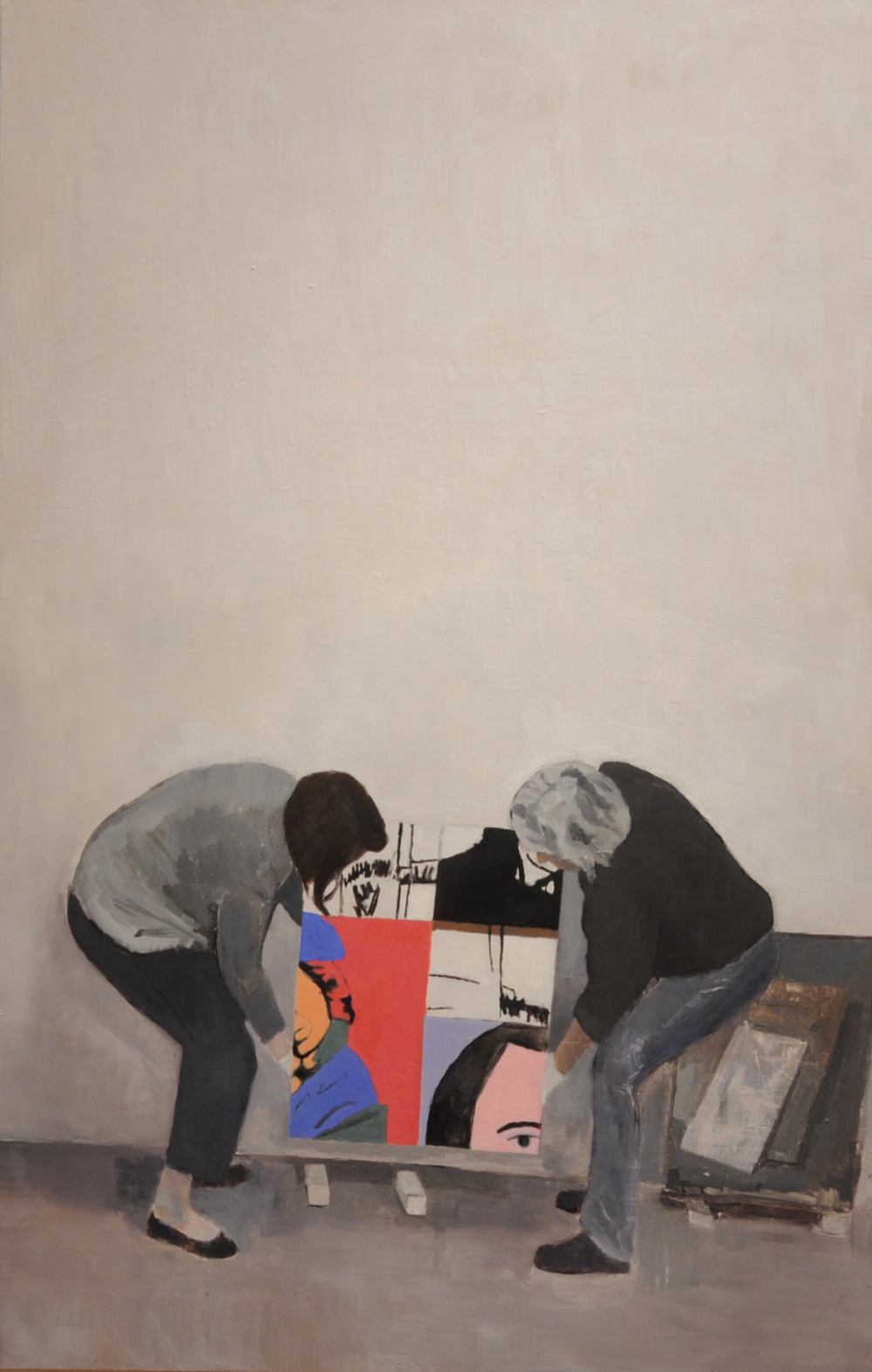
Lawler Installers. 2014, oil on linen on panel. 48″ x 36″.
Kate: All those paintings are based on things and people that were around me when I worked at the Mills College Art Museum. When I was working on them, I was also taking a class taught by Julia Bryan-Wilson and Darcy Grigsby at UC Berkeley on the histories of photography. One of the readings I did for that class was an essay by Rosalind Krauss called Photography’s Discursive Spaces. She talks about the gallery wall as a charged space which lends new meaning to whatever is displayed on it. Many of those little paintings that I made have large swaths of white, empty wall. The white cube is supposed to be a void where art work can speak for itself without interference, but we know now that the white wall has its own significance, and is no longer a totally neutral space, if it ever was. Also when I was making those paintings I was thinking about color field paintings, and then putting the figures in some of them was making it as though they had wandered into an abstraction to do their work.
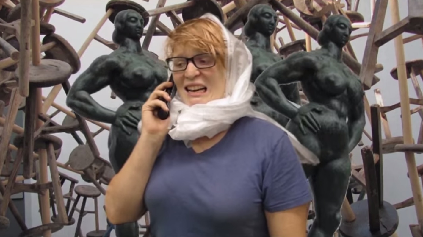
Articiple: The Required Skimming videos are like spoofy Cliff Notes for art theory, especially theory about the codes of power that control art institutions and perceptions of art and perceptions of artists themselves.

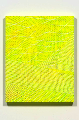
Required Skimming (based on 9.5 Theses on Art and Class by Ben Davis), 2014. Video still.
Kate: I wish they were proper cliff notes, so I could actually understand anything Hal Foster has written. His were the hardest texts for me to make videos from, because I can’t fucking understand them at all. I tried to get some of the art historians I know to talk to me about them. I would ask them if they could sum up The Return of the Real for me in a couple sentences. Everyone declined, and I couldn’t tell if it was offensive for me to ask people to sum up important work like that, or if no one could do it because his work is so inscrutable or complicated. I think the people that appreciate that series the most are people who feel they’re getting revenge on the readings after having to grapple with them in school. For me, that series is an excuse to force myself to at least casually familiarize myself with those texts. I had been reading Andrea Fraser‘s essays since I was in college, but her writing is also very dense and references a lot of these other writers, like Krauss, Benjamin Buchloh, and Pierre Bourdieu. I thought if I could just immerse myself in this kind of theoretical writing I would be able to understand Fraser’s writing more. It turns out her writing is pretty easy to understand compared to some of these other writers.
Anyway, yes, most of the writing I’m interested in has to do with art and power, or art and class. These are the issues that I think are most important to the field of art right now. I gave a lecture recently about my work to a college class, and I talked about the idea (this is also something Andrea Fraser always talks about) of the artist as a rebel who speaks truth to power versus the reality of the artist as a producer of luxury goods for the super wealthy. That contradiction is something I try to address and work through in my practice. After I said that, one of the students told me he didn’t have that conflict at all. He thinks of himself as basically a glorified wall decorator. It seems that this is becoming the standard attitude for contemporary artists now. I think artists don’t expect as much from art as they used to, say during Dada or Surrealism. I don’t know too many young artists interested in “the art which has been visibly shattered by the explosions of the last week, which is forever trying to collect its limbs after yesterday’s crash.” Not that I think my work is so earth-shatteringly radical, but I am interested in art that contends with the conflicts happening in the places where it’s shown and in the audience engaging with it.
Articiple: Outside Jokes, the zine about the exhibition, made it seem like you’d be friendly and funny to talk to.

Outside Jokes. 2014, photocopied zine. 8-1/2″ x 5-1/2″, 12 pages.
Thanks, I love talking to people. I hoped for the zines to give some explanation or context to people that might not be art-world regulars, people like my mom.
Articiple: The furniture you used to display the videos and zines looked like it was made of plywood from old art packing crates.

Installation view, Mills College 2014 MFA Exhibition. 2014, mixed media.
I decided on housing the video screens in actual crates that had been used to ship work to the museum, because I was thinking of the essay, Why Does Fred Sandback’s Work Make Me Cry by Andrea Fraser (published in Grey Room, 2006.) She talks about the museum as a source of indoctrination. We go to the museum, and then we become the museum. We replicate the values and hierarchies that the museum represents. So in my show the crates are shipping information to the museum in your head. That might be kind of a stretch, though. Here’s my favorite part from that Andrea Fraser essay:
We are all here members of cultural fields. We carry, each of us, our institutions inside ourselves. There’s a museum in here, inside of me, with the Corinthian columns, the grand staircase, and the mezzanine. There’s a system of organization: the way I see things. There are objects and images, and there are texts, and there are voices explaining. There’s an archive that also contains my memories. And there’s a basement where I keep the things I don’t want to show.
Just as art cannot exist outside of the field of art, I cannot exist outside of the field of art, at least not as what I am, which is an artist. And this is also the limit of institutional critique. I can attack those internal objects. I can rip at the walls of my institutional body. But I can’t tear it down completely, and I can’t leave it, because I would then not only cease to have an effect within the field; I would also cease to exist.
Articiple: You’re shining a light on some of the whitewashing and cooptation that goes on in the art world, the ways that art is used to shore up wealth (financial capital) or status (cultural capital), and the ways art is contained within elite or esoteric social strata.
Kate: Again, I want to direct people’s attention to another reading that talks about all these things way better than I can: 9.5 Theses on Art and Class by Ben Davis.
Articiple: Punks, Guerrilla Girls, 70s downtown performance artists all confronted this in their way, but every era has to reinvent the wheel of autonomy or community. So… how does it work in 2014? How do we make art right now that can’t be immediately co-opted for wealth or status?
Kate: I don’t know if art alone is going to reverse neo-liberalism, but one thing that I think will help make art less dependent on wealth disparity is paying artists fees for showing in non-profit institutions. If artists weren’t totally reliant on selling their (very expensive) work they might be more inclined to make work that is challenging to the ideology of the ruling class. W.A.G.E., Working Artists and the Greater Economy, has been pushing for this and is actually having a fundraiser right now to help jump start their certification process to establish standardized fee payments to artists for their labor. If anyone wants to donate, here’s where you can do it: www.wageforwork.com/coalition/3/donate.
Articiple: A big part of your practice is about online media and popular, accessible formats like YouTube. Is the user-curated internet the portal to artist autonomy and self-governing communities?
Kate: The internet has definitely made artists rely less on galleries and museums to create a viewership for their work. However, I also get called a douchebag more on the internet than I do in galleries, so it’s kind of a trade-off.
Articiple: Institutions and money are so much a part of getting the art out into the world—on a very basic level, like the way so many galleries rely on MFA graduate programs to deliver the next crop of artists to them, and artists rely on gallery support to have a living. So…where is that sweet spot where artists can get the resources and support they need to do their work, without colluding with an art market that exists mainly to expand wealth in the hands of the wealthy?
Kate: I’m just going to plug W.A.G.E. again here: www.wageforwork.com.
Articiple: And about the state of art and artists in San Francisco: independent galleries and all the artist support that goes with them are being priced out of the city center. At the same time, SFMOMA is expanding at a cost of over half a billion dollars, in part to showcase the Fisher Collection of mostly midcentury American blue chip artists. So I guess my question here is, what do institutions like SFMOMA have to offer artists who are working against the cooptation of art as an investment commodity? Is there a useful way for artists to be in dialogue with places like SFMOMA? Guerrilla exhibitions in the restrooms?
Kate: There are still many independent art spaces in the Bay Area, though their positions are more and more precarious. As we were talking about before there will always be artists finding alternative channels for distributing their work, like through the internet, zines, etc. My friend Eli Thorne did a guerilla performance at SFMOMA a couple years ago where he had a loud spiritual communion with a Jay DeFeo painting. I videotaped it secretly, which was one of the most stressful moments I’ve ever had in an art museum.
I’m not sure what the best practice is for dealing with a museum that has Charles Schwab on its board of trustees. Of course we also have to realize that most non-profits, arts-related or not, are getting money from places that we may not want to think about. It is particularly problematic, though, when you’re making work about the life-threatening working conditions of sweat-shop laborers in Bangladesh and the venue where your work is being shown is sponsored by the Gap. I don’t have solutions for these problems, because to be totally honest if Janet Bishop or Rudolph Frieling came knocking down my door (highly unlikely) tomorrow asking me to be in a show at SFMOMA it would be very hard for me to turn them down. I think highly-publicized withdrawals from shows have been effective for sparking dialog about the injustices that institutions perpetuate. For example, when the YAMS collective withdrew from the 2014 Whitney Biennial over Joe Scanlan being one of the other exhibiting artists. Or when artists involved in Creative Times’ Living as Form exhibition boycotted over the show touring in Israel. These aren’t easy decisions to make, though, and it’s hard for me to begrudge any artist for taking whatever scant opportunities are coming their way. Again, I think these problems are rooted in neo-liberal capitalism and until we address that, not just in art discourse but in larger conversation, I don’t think much will change.