Jamie Brunson

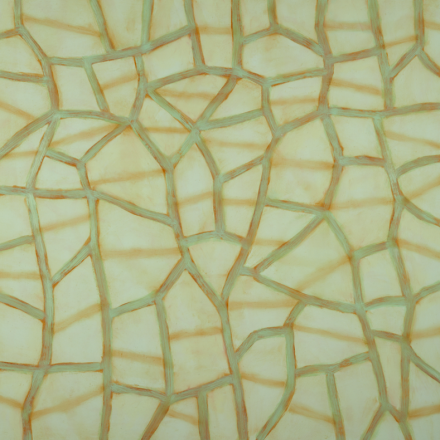
Rajni, 2017
Oil and alkyd on polyester over panel
66 x 66 inches


Painter and mixed-media artist Jamie Brunson is well known in the San Francisco Bay Area, where she lived and worked for many years. Jamie relocated to New Mexico in 2014, but continues to exhibit in the Bay Area. Her current show at Andrea Schwartz Gallery is on view through July 21.

In our conversation Jamie shares thoughts on the significance of meditation for her art practice, the influence of the New Mexican landscape on her new work, and the pleasure of revisiting earlier investigations.

Articiple: Your art is closely connected to your practice of Kundalini meditation. You’ve described your art practice as the process of translating the perceptual states of meditation into a formal visual language. The relationship between meditation and art seems intuitively evident in some ways, but very elusive in others. Could you explain a bit about Kundalini meditation, and how that ancient practice came to have such relevance for your life as a contemporary artist?

Jamie: The sitting meditation practice I follow is based on a form of controlled, “circular” breathing. It’s an active “fire method” practice with a complex esoteric, philosophical, and ideological history. My teacher has written extensively about it, but I might make the analogy that you don’t need to know the principles of the combustion engine to know that if you put gas and oil into your car, and turn the key, it will go.

The practice might be seen as a near-cousin to Buddhist mindfulness/breathing meditation: by breathing through a circuit of chakras, you open, expand and link the chakras while burning away accumulated negative energies.

As with Buddhist practice, over time you gain the capacity to put space around certain reflexive reactions as they arise. With continued practice, you eventually enter the Void body, an expansive unbounded state that’s hard to describe, except to say that it’s a palpable sensory experience with specific qualities that most practitioners collectively agree upon. So it’s not arbitrary or imaginary, it’s somatic and specific. It has color qualities, spatial qualities, visual attributes, yet those qualities might be regarded simply as indications of having entered a state of being and awareness, which is the true goal. But, I do bring some of the visual and sensate information from the practice into the studio.

My Kundalini teacher, Dr. Mark Levy, is also an art historian who has written extensively about the relationship between metaphysical states and art practice, going back to primary shamanic rituals done for the benefit of healing communities. His research and writing have been a profound influence on my studio work. Perhaps I gravitated to his ideas because I’ve always intuitively understood the relationship between formalism and physical, sensate experiences? I’ve always experienced art making as a transcendental process that can lead to altered perceptions of time, deep engagement with the present moment, and a sense of affinity with the materials. Psychologist Mihaly Csikszentmihalyi describes this sense of engagement as a “flow state”. I see a strong correspondence between meditation practice and studio practice because they both require full participation and presence to enter that state.

Articiple: The term “translation” suggest several interesting possibilities: maybe a process of visually rendering perceptions that you’ve experienced during meditation, or a process of recreating a meditative state of mind as you work on a painting. How do you characterize the process of translation in your work?

Jamie: I think your question contains the answer—both ideas are true.

I should say that because I’m a formally trained visual artist, of course I learned the academic principles of color, composition and design: contrast, harmony, rhythm, surface qualities, distribution across a picture plane, the illusion of spatial depth, et cetera. These principles are an important part of my studio work because they’re the elements that make any artwork function well.

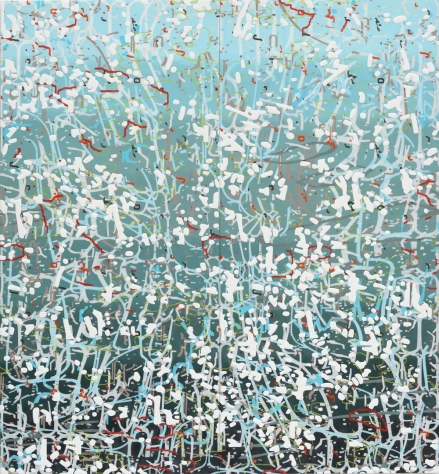
Long Way Around, 2017
Oil and alkyd on polyester over panel
60 x 72 inches


The boundless qualities of the Void body I mentioned earlier are the qualities I’m working to evoke with formal visual language and with the inherent properties of materials and what they can suggest. My work is partly an attempt to create an image-object that might serve as a threshold, for anyone who sees it. Several artists I know—Squeak Carnwath and Tracy Rocca, to name just two— have talked about the capacity of art to slow people down, to give them a moment to pause. That’s something I intend in my work as well. For me, a big question is: by investing time, presence, craft, and curiosity—can my engagement get embedded into my work? Can I give a viewer a glimpse into the transcendental phenomena I’ve experienced, both as a painter and as a meditator? Part of the compelling power of formal elements like color and surface rendered in a fluid medium like paint is that they mimic elements in the world that we’ve experienced bodily, tactilely. That’s how I apply the formal aspects of materials to my work.

The Lattice paintings lean a little more towards the formal realm—while they’re also based on visual experiences in meditation, I’m more conscious of using what I know formally and intellectually when I’m making them. I think of them as a form of improvisational drawing, even a drawing exercise that demands careful decision-making with full attention. While they’re completely improvisational, they also incorporate careful evaluation and a kind of courageous decisiveness and immediacy. The end result is a trace of a thought process. Perhaps that could be said of any work of art?

Articiple: Since your move from the Bay Area to New Mexico several years ago, you’ve written that your work is increasingly influenced by elements from the environment, including the expansive sky and dramatic atmospheric conditions. I’m interested in the conversation that emerges between an immersive meditation practice and an immersive experience of landscape. What are the confluences or the generative contradictions that happen as you draw from these two phenomena for your work?

Jamie: That idea of the Void body and spaciousness comes into play—when you’re outside here in New Mexico, the sky seems larger. You become physically attuned to the low horizontal band of the ground plane against a vast, animated, celestial backdrop. Seasonal atmospheric phenomena are an insistent part of everyday life and have a kind of presence. The land and the seasons penetrate your body and your consciousness. If you’ve had the interior experience of the Void body in meditation, you can connect immediately to the external phenomenon, because they are such similar somatic experiences. You’re both dwarfed by the scale of the environment, and expanding to fill it and participate in it.

Articiple: In regard to immersion in the landscape, you wrote in a recent Instagram post, “Beginning to understand why Agnes Martin used reduction, vertical lines and the grid to capture the vast space of the New Mexico sky/land.” (Pieces of Sky, posted April 9, 2017).

Martin herself offered intriguing reflections about the place of landscape in her work. From a statement published in 1966:

Nature is like parting a curtain, you go into it. I want to draw a certain response like this…that quality of response from people when they leave themselves behind.

My paintings [are] about merging, about formlessness. A world without objects, without interruption.

Joan Mitchell, roughly a contemporary of Martin, also found impetus in landscape. Critic Irving Sandler wrote of Mitchell in 1957,

…a recollected landscape provided the initial impulse, but the representational image was transformed in the artist’s imagination.

The object disappears in the exultation of the act of painting, and Miss Mitchell ends up with almost pure emotion. 

This act of creating a work that is in sympathy with landscape, rather than a representation of it, holds so much possibility. What can you tell us about how you experience landscape as part of your process?”

Jamie: Your choice of quotes is very astute—that quality of “formlessness” that Martin cited feels very familiar. Material handling and scale can evoke the qualities of immersive landscapes and atmospheric phenomena. I’ve started working larger, on supports that demand full body gestures to draw bands of paint horizontally across the panel surface in some of my work, the Veil paintings. That larger scale can become “environmental” so that a viewer might step into it the same way you step into the landscape and become a part of it.


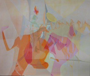
Swirl, 2017
Oil and alkyd on polyester over panel
60 x 60 inches


I can also relate to what Sandler wrote about Mitchell making work that’s sympathetic with landscape, rather than literally representing it. In the work I’m making now, I’m consciously committed to formalism over narrative or representational imagery. I wouldn’t call myself a “landscape painter” by any means—it’s more about an extra-linguistic, physical relationship to the land and to space.

The collage work you mentioned is something new—I’ve been making collages for a long time, but the earlier Practice collages were pretty much a series of formal exercises, a kind of game using deconstructed calligraphic letterforms from a language I couldn’t read and could only appreciate as shape and line. I was laying geometric forms on top of grounds made with “deconstructed calligraphy”, to create compositions that were dynamic and driven by movement, using forms that were in part associative or memory-based.


Blackbird, 2011 Collage and mixed media on polyester over panel
14 x 14 inches


I mention this work because I’m curious about all kinds of ideas and sometimes go off on tangents to investigate. Sometimes I lean towards pure geometry and color, but the act of moving an eye through arrangements on a flat plane still has its roots in a physical experience. I feel that exploration and experimentation open the way to new information and new processes. If you look back through my work there are series that shade into other series or arise as offshoots that become their own bodies of work. Sometimes one series falls away and the other takes over, sometimes they merge, sometimes they diverge. To me, this is the beauty of art-making as a tool for consciousness: that “play “ can lead to discovery and understanding. The best part is just suspending judgment and observing something as it unfolds.

Articiple: You’ve written about how important the physical qualities of materials are in your practice. In paintings of oil, alkyd, and wax, and in collages of vintage paper, sometimes including ink and other media, you explore the sensual and associative properties of the materials. How did you arrive at your choice of materials for these respective practices? What is their significance for you, in terms of the perceptual phenomena you express in the work?

Jamie: The new found-paper collages are related to work I was making, and ideas I was pursuing, quite a while ago. I love the idea that you can seemingly reach the end of an investigation for a period of time, and suddenly wake up to a new way of working or a way to carry an idea further after having set it aside.

Vecchio Citta, 2017
Vintage found paper collage and acrylic medium on 400 lb. rag Fabriano paper
Paper Size: 15 x 12 inches
Image size: 9.25 x 6.25 inches


I’ve been collecting vintage paper for many years, in part because, since the 1990s when I worked on pattern-based abstraction, I’ve been interested in worn physical surfaces marked by the passage of time and history. I had been fortunate to travel in Europe, North Africa, and Asia for most of that decade, visiting historic monuments, churches, shrines and temples. I really responded to the tactile, haptic, patinated surfaces of these ancient places. The ruined beauty enacted by time and the elements added something that was beyond the control of human intent. It was purely phenomenal, time made visible. So portions of my work have always been focused on trying to create/recreate that kind of surface through an almost “devotional”, time-based, additive-and-subtractive method. A certain kind of surface is an inevitable product of working that way; I still get a lot of comments about the surfaces of my paintings, which are the direct result of glazing, sanding, layering, and reworking.

That aura of age and wear is another big part of living here in New Mexico—Santa Fe dates back to the 1500’s—although even when I had a studio on the Oakland waterfront and lived in Dogpatch in the City, I was always shooting details of “found compositions” on industrial, urban surfaces with my iPhone. So these new horizontally banded found-paper collages come from the synthesis of several ongoing fascinations—my interest in tactile surfaces produced by wear and use; my interest in linear, architectonic structure and in pattern, which came out of travelling to different world cultures; and my interest in getting the greatest impact from the simplest and most direct means. Working with found-paper collage let me reintroduce some of the pattern-based elements that I used in my earlier work, but used differently as rhythmic placement of geometric fragments. Trove, one of the collage studies I made from the smallest scraps of found materials, led me to paint one of the very large paintings in the exhibition at Andrea Schwartz Gallery (Rajni, shown at the beginning of the interview). I was surprised to make something that went in that more architectural /patterned direction, but I had to make it in order to know what it would look and feel like.

Trove, 2017
Vintage found paper and block print collage, acrylic medium on 400 lb. rag Fabriano paper
Paper size: 12.25 x 10.25 inches
Image size: 8.25 x 7.25 inches


A lot of it is really about paying attention to what the materials want to be, recognizing them for their innate character, then re-arranging and reconfiguring them until they converge into something greater than the individual parts. This is incidental, but there’s also something to be said about making “beauty” from materials that are discarded for being no longer useful. It is a metaphor. At the heart of it, this is the gift of being an art-maker: the capacity to find the arresting qualities in anything, through small acts of arrangement, recognition, or juxtaposition.

Articiple: You’re an active curator and you were an art instructor for many years. I often meet artists in the Bay Area who’ve studied with you and who name you as an influence (and of course, I was your student). How do your curation and teaching experiences inform your own art practice?    

 Jamie: The thing I miss after moving from the Bay Area is teaching. I’m still connected to and correspond with many of the people who took classes with me or worked with me. Some of them have come out to visit—and when they’re here, they really understand why Walter and I picked this place to live, as a way to sustain our work.

I feel an almost parental pride in the successes of the artists who’ve studied with me, or whom I coached—although honestly, I can’t take credit for their accomplishments! So many have worked hard and worked fearlessly, and have gone on to develop work that’s thoughtful, authentic and skillful. All the printmaking investigations you’ve done over the past several years are a great case in point—teaching yourself through a process of determined inquiry.

Amanda Williams, who took classes with me at CCA, is opening a solo show at the MCA in Chicago this month. She developed a powerful color-and-materials-based body of work that deals with the Southside community where she grew up, and the relationship between physical structures and cultural value and status.

Adrienne Heloise, who studied with me at UC Berkeley Extension, has her narrative cut-paper pieces installed at the Morris Graves Museum right now.

I love these artists for their passion and determination. There’s excitement in helping people develop their vision and technique, and the confidence to trust it and pursue it. And then I just have to stand back and get out of their way!

I believe in the idea of giving service in the community you inhabit, and for me, teaching was a way of doing that. It was also a way of modeling generosity, the idea of sharing information and resources, which I feel is an important part of building community in the arts, when you’re so often engaged in a practice that can be isolating.

To become a good teacher, I had to organize what I knew in order to transmit it effectively. And, if I didn’t know the answer to something technical, I had to be able to research it and assimilate it for my own understanding so that I could share it and explain it. Through preparation for classes, I built a tremendous amount of technical knowledge that has served me as much as the people who were taking the classes.

Both the curatorial projects and the ability to give solid critical feedback in classes were informed by the travel I mentioned earlier, and also time I spent writing art criticism and later, writing manuscripts for didactic audio guides for museum exhibitions. Those jobs were exercises in description and analysis, and in contextualizing concepts in the framework of visual and general history. That helped me to develop the ability to do solid research and to explain things to people: in class, I could refer people to historical and contemporary precedents for the work or the ideas that interested them, so they could add to the ongoing dialogue around these ideas and approaches.

Curating has given me the opportunity to do something else that was very important to me—defining developing currents in the local art scene, recognizing ideological connections that drive people’s work. That kind of naming or defining, dealing with work taxonomically, was a way of explaining, to myself, the emerging approaches that I was seeing. But curating exhibitions also allowed me to pair established and emerging artists. That was a way of showing affinities as well as equivalencies, of creating opportunities and removing some of the hierarchies in the art world.

I lived in the Bay Area for so long—went to undergraduate and graduate school there, showed at different galleries, taught at different institutions, wrote for different publications, sat on some curatorial boards, had work acquired by some of the museums—that I built connections in the community that allowed me to make curatorial proposals that had some credibility. I’m still interested in curatorial projects; I’ve been here in New Mexico for three years now, just long enough to start meeting artists and understanding which regional institutions I might approach with a proposal, and where I might apply for funding for proposals.

I’m still very interested in the category that I put my own work in—what I call “Metaphysical Abstraction”, formal work that’s motivated by encounters with the ineffable.

There are a significant number of artists here, as well as in the Bay Area, whose work moves along those lines, or has been directly informed by meditation practice: Michelle Theberge in Berkeley and Lisa Espenmiller in Oakland, who both use a kind of ritual repetition, with form and line respectively, in producing their work. Pegan Brooke in Bolinas makes beautiful, shimmering paintings of repetitive marks, but natural forces indirectly inform her work, perhaps in the same way Sandler described Joan Mitchell’s work. I’d like to combine their work with related work by Southwestern-based artists—like my Veil paintings, or Susan York’s masterful, reductive lead pieces. Raphaelle Goethals and Tracy Rocca are both making exquisitely crafted, atmospheric paintings that produce that sense of an environment that I talked about earlier. Raphaelle works with encaustic, so the materiality of her work contributes to that sense of depth and mystery.

I think that these artists’ work, seen in relationship to each other, will make a persuasive case for a mode of perception, and a way of working, that emphasizes a more thoughtful set of values. The overlay of excess—in media, in consumption, in the political situation where we find ourselves—feels emotionally and psychologically corrosive.  We’d all benefit from the presence of a slower, measured, illuminating, and less sensational approach to work.

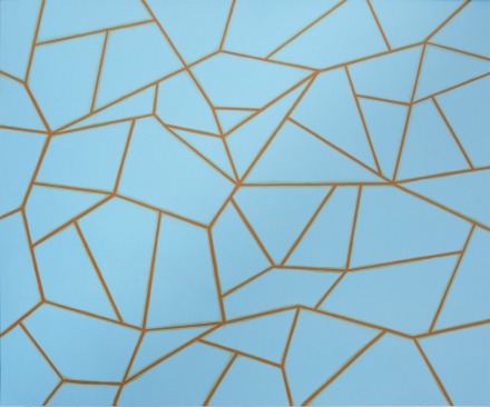
 

Prop, 2010
Oil, alkyd and wax on polyester over panel
24 x 24 inches

Amy Ellingson

Variation (blue), 2014 Oil and encaustic on two panels 78" x 72" x 2"

Variation (blue), 2014
Oil and encaustic on two panels
78″ x 72″ x 2″


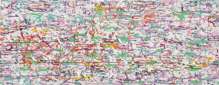
Amy Ellingson is a Bay Area painter and interdisciplinary artist who has exhibited her work nationally and internationally for more than 20 years. Her signature large-scale paintings in oil and encaustic use abstract patterns generated with digital illustration software, translated to material form in painstaking, deliberative processes. This act of translation from the virtual to the real, investing the ephemeral digital file with the attention and intention befitting an enduring artifact, is central to Amy’s work.  Also key is her practice of iterating a concept through different media, such as by interpreting a painting in 3-D sculptural forms.

[installation] Variation (blue), 2014 Variation (blue): Artifacts, 2015

[installation] Variation (blue), 2014 Variation (blue): Artifacts, 2015


Amy’s upcoming solo exhibition Chopping Wood on the Astral Plane  will be on view October 1-29 at Eli Ridgway | Contemporary Art, located at Minnesota Street Project in San Francisco.

Variation (three grids), 2016 Oil and encaustic on four panels 66" x 168" x 2"

Variation (three grids), 2016
Oil and encaustic on four panels
66″ x 168″ x 2″


Articiple: I’d like to pick up on some thoughts from your interview with Maritza Ruiz-Kim from 2014 (The Loop Of Abstraction: Amy Ellingson at San Jose Institute of Contemporary Art). I’m interested in how you describe the investment of time and labor in your work, and the relationship between the ephemeral digital source imagery and the finished works:

The decision to make a painting based on a flimsy digital file is about commitment, time, labor, effort.

I feel that the imagery is imbued with some power along the way, via the investment of time, attention and physical energy, belying the humble beginnings of the digital imagery.

But I think (hope) the overall effect is one of the hand trying to be perfect, more perfect than the digital, more mediated by processes and materials, more real, more human.

In much of modern and contemporary art it’s often the gestural, the imperfect, or the improvisatory that are credited with being ‘more human’, as if the accidents and idiosyncrasies of individual presence are what rescue the human from the tyranny of technological precision. Your position seems like the inverse of that, instead identifying the human with the pursuit of perfection, the sustained and disciplined effort, the repetitive act of labor. I wonder if you have any more thoughts about that?

[detail] Variation (three grids), 2016 Oil and encaustic on four panels 66" x 168" x 2"

[detail] Variation (three grids), 2016
Oil and encaustic on four panels
66″ x 168″ x 2″


Amy: Yes, it’s a bit of a paradox when you put it that way.  Certainly, you are right to say that we perceive gestural, improvisatory painting methodologies as being truly human.  I suppose that is because we can see and “feel” evidence of the hand and body.  Perhaps we think we can “feel” the artist’s impulses and actions.  And, perhaps, the further we advance into the information age, the more we will perceive gestural, imperfect things as signifiers of the human condition. However, I’ve been thinking a lot about expression. What is it, exactly?  Why do we make assumptions about what is being expressed?  Why do we assume that “perfect” things are not necessarily expressive?


Variation: purple (dawn), 2016 Oil and encaustic on two panels 50" x 156" x 2"

Variation: purple (dawn), 2016
Oil and encaustic on two panels
50″ x 156″ x 2″


For example, I have a nice watch that my parents gave me for my fortieth birthday.  It is an automatic, meaning that it winds itself by capturing, storing and utilizing the energy created by the movement of my body. It does this through its design—a mechanism of tiny, compact springs and rotors and gears.  Though many people wear Apple and Fitbit watches these days, I still wear my automatic.  The only thing it does is tell time.  To me, it is one of the ultimate expressions of what it means to be human.  The complexity and precision of its design and its singularity of purpose are reminders of what humans are capable of.  What’s more human than Swiss watch making?  I feel the same about precision in art.  Isn’t a Bernini sculpture expressive?  To me, repetition, labor and the pursuit of technical mastery are the most human things.  Believe me, there are lots of imperfect things in my paintings, but in making them, I try to bring every element to a level of finish that results in a seamless whole. Agnes Martin wrote and spoke of the pursuit of perfection.  She said that we have an awareness of perfection in our minds but that perfection is unattainable, and that “the function of the work of art is…the renewal of memories or moments of perfection.”  I tend to agree with that.


[detail] Variation: purple (dawn), 2016 Oil and encaustic on two panels 50" x 156" x 2"

[detail]
Variation: purple (dawn), 2016
Oil and encaustic on two panels
50″ x 156″ x 2″


I like your phrase, ‘ tyranny of technological precision’.  Yes, computers and the graphic design and photo editing programs I use have their own algorithmic perfection, but I would argue that it is somehow lacking, at least in terms of human esthetic judgement.  I remember learning Adobe Pagemaker years ago, in the early nineties.  One could adjust the kerning (the space between individual letter forms) to make the text look better.  Of course, typesetters have been adjusting kerning with their eyes and hands for hundreds of years, in an effort to make text more legible and more pleasing to the eye.  What is that, exactly?  Well, we are still physical beings, we still respond to physical stimuli, we still have our mysterious ways of making esthetic and formal choices.

Articiple: I’m curious to know more about your choice of materials and your decision to work in oil and encaustic and gouache. A lot of art that engages with the relationship between the virtual and the real incorporates digital media directly into the work, through video, 3-D printed objects, or such. You’re taking a different approach in generating source material digitally and translating that through the use of more traditional media. Certainly that creates a dialog with the history of abstraction and the larger history of painting. But it seems like there is something more there. I wonder if there’s a phenomenological connection between the material qualities of the media and the qualities of investment and attention that you want to realize in the work? I think what I’m asking is, how do these media, or the ways you’re able to work with them, carry particular qualities of the ‘human’?


[detail] Variation (blue), 2014 Oil and encaustic on two panels 78" x 72" x 2"

[detail] Variation (blue), 2014
Oil and encaustic on two panels
78″ x 72″ x 2″


Amy: We remain physical beings. We are from and of the natural world.  Art making is a strange impulse. It connects us to our highest ideals even as it reminds us that we have feet of clay. Throughout most of art history, we humans made art out of natural materials: stone, wood, a bit of charcoal, ground minerals in a vehicle of some sort… even though the imagery in my paintings is the result of keystroke commands, the material reality of the work is very traditional: wood panels, chalk gesso and paint made of ground minerals, turpentine, oil, beeswax and resin.  I love the connection to the past.  Artists have been using these materials for hundreds of years and we have an intrinsic relationship to them, as we do to an image on a planar surface. When I look at one of my sketches on the computer, or even printed, it really doesn’t look like much.  It’s a reference, a starting point.  I do believe the computer and the graphics programs I use (Adobe Illustrator and Photoshop) prompt me to design in a particular way, but as you know, the desktop and the palettes are simulacra of real things: a real desk, a real pen and paintbrush, and real actions, such as copying, pasting, scaling, and erasing.  I look at the sketch and say, “now I am going to make this real”.  There is a bit of the Pinocchio story in play, I suppose; artifice only takes one so far.  I find a lot of satisfaction in learning about paint recipes and formulas and I enjoy making my own mediums.  I recently began experimenting with making my own gouache, and it is just unbelievably delicious.  I experimented a bit and then realized that I probably need a few months to really work out a methodology of testing recipes and mixing and tubing colors, so I set it aside, but I hope to spend more time on it in the next few months.


[detail] Variation (blue): Artifacts, 2015 Cast encaustic forms, wire, encaustic Dimensions variable

[detail] Variation (blue): Artifacts, 2015
Cast encaustic forms, wire, encaustic
Dimensions variable


Articiple: You often iterate an idea through different forms, repeating shapes and patterns in a series of related works. In fact your show at SJICA was titled Iterations & Assertions. You explained a little about this in your interview with Maritza:

For many years I have created groups of closely related paintings for exhibitions. Until now, the progression was more literal in a sense. For this show, I wanted to tease out particular qualities, elements, characteristics in a more fragmented way. The diptych is the “mothership”. Everything else relates to it, but in a more exploratory way.

Your use of repetition and variation set up a strong dynamic of constraint and discovery. I’d be interested to hear more about how the practice of iteration works as a generative tool for you.


Variation: Apparent Reflectional Symmetry, Parts I & II, 2014 Oil and encaustic on eight panels Overall dimensions 69” x 338” x 2”

Variation: Apparent Reflectional Symmetry,
Parts I & II, 2014
Oil and encaustic on eight panels
Overall dimensions 69” x 338” x 2”


[installation] Iterations & Assertions, 2014 Site-specific mural, sculptural installation, paintings

[installation] Iterations & Assertions, 2014
Site-specific mural, sculptural installation, paintings


Amy: I appreciate your putting it in terms of constraint and discovery, because that is exactly how I see it.  We must acknowledge that just about everything has been already been done.  How does one make a meaningful abstract painting these days?  How can I participate in and advance the discourse of abstract painting?  I decided some years ago to limit the imagery in the works to elements that I designed in Illustrator: simple lines, arcs and grids.  The oblong, or straight-sided oval, is the matrix of many of my forms.  This very basic, simple language gives me a lot of flexibility.  By piling it all up in layers and using simple commands to alter these forms, I have been able to create a vernacular that allows me to explore abstraction without worrying about generating new imagery—the imagery is self-generating, in a sense.  I think that most artists find a set of parameters that allows them to be free, to explore, to seek and find answers.


Variation: Large Delineation, 2014 Site-specific mural, acrylic 13’ x 40’

Variation: Large Delineation, 2014
Site-specific mural, acrylic
13’ x 40’


Some of my imagery has been altered so many times that I truly cannot remember how I arrived at it.  I wouldn’t be able to replicate it if I tried.  But it’s here, in my computer.  I can grab it and paste it into a new file, stretch it a bit, pile a bunch of things on top of it, and hopefully arrive at something that I want to spend a few months recreating by hand.  My hope is that the paintings will transcend this simple language of shapes, through deep exploration, and even exploitation.  The iterations allow me to push the boundaries I create for myself.  Over time, this language of simple forms (some of which are akin to letterforms, while others appear to be mere digital noise) has taken on a life of its own.  It is perceived as ‘personal’ somehow.  The shapes are recognizable signifiers, in the same way that another painter’s gestures or paint handling become personal signifiers.


Variation: Large Delineation, 2014 Site-specific mural, acrylic 13’ x 40’

Variation: Large Delineation, 2014
Site-specific mural, acrylic
13’ x 40’


Articiple: For Untitled (Large Variation), your ceramic mosaic installation at the San Francisco International Airport, you adapted your visual vocabulary to a much larger format than your previous work. What were the conceptual challenges that this posed? Or the technical challenges, if you’d like to go into that. I’m sure there were many!

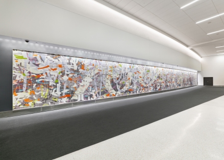
Untitled (Large Variation), 2015 Ceramic mosaic 10' x 109' San Francisco International Airport

Untitled (Large Variation), 2015
Ceramic mosaic
10′ x 109′
San Francisco International Airport


AmyUntitled (Large Variation) presented real, unexpected challenges.  The design is based on a painting I was making at the time.  My basic forms are designed in Illustrator, but my final sketches are Photoshop files.  So, the first challenge was taking my working file back into Illustrator and redrawing it as a vector file that could be scaled up to 10 x 109 feet.  I redrew it all manually, since I didn’t feel I could get what I wanted using the Live Trace command.  It took a couple hundred hours to do that.  I literally pored over every single form, adjusting anchor points and arcs.  Then, I sent it to Mosaika, the mosaic fabricator in Montreal.  The owner informed me that I was out of my mind and that the mosaic would cost well over a million dollars to produce.  So, I asked what I needed to do to get it within budget.  She gave me some simple guidelines such as, “no shape can be narrower than a finger’s width,” and “you may only use one layer that gives the illusion of transparency.”  These restrictions were terrific, as I had absolutely no idea what was possible, what it would cost, what the pitfalls were, etc.


Untitled (Large Variation), 2015 Ceramic mosaic 10' x 109' San Francisco International Airport

Untitled (Large Variation), 2015
Ceramic mosaic
10′ x 109′
San Francisco International Airport


So, I went back through the file.  Keep in mind, it is very difficult to work on something so large on a relatively tiny computer monitor.  I “touched” each shape, each arc, a thousand times, much in the way that I do when I make a painting, refining and adjusting until the image was simplified enough to be viable as a mosaic.  The next challenge had to do with the nature of the digital file.  Usually, Mosaika starts with a finished work, such as a painting, which is scanned, enlarged and then interpreted in mosaic.  It was surprising to me, but the Illustrator file’s “flatness” and lack of directional detail posed problems.  The first material samples that were made were awful, as the fabricators assumed that I wanted to convey a similar flatness in the mosaic.  However, once I visited Mosaika in person and shared my work with them, there was a collective “oh…”  in the studio.  We realized that we had to give the forms some direction.  How do you break them up in to small fragments?  What are the shapes of those fragments? How do shapes overlap to create the illusion of space?  How would we address gradients and transparency?  There was a lot of collaboration at this stage. Mosaika excels at this, since they work with a lot of artists who have no experience with mosaic.


[detail] Untitled (Large Variation), 2015 Ceramic mosaic 10' x 109' San Francisco International Airport

[detail] Untitled (Large Variation), 2015
Ceramic mosaic
10′ x 109′
San Francisco International Airport


The scale of the piece is just…impossible.  There was really no way to envision the mural until it was complete and installed on the wall at SFO.  A leap of faith was required.  It’s a bit scary and an incredible challenge to work at this scale. I was not entirely sure if the piece worked until the final reveal.  As an image that relates to my paintings, the mosaic is interesting because each shape is fragmented into multiple tiles, in some cases hundreds or thousands of them. The overall effect is one of simultaneous fragmentation and unification of form.  The faceting effect is very interesting to me. There are tens of thousands of small planar forms, and a million little edges that catch the eye.


[detail] Untitled (Large Variation), 2015 Ceramic mosaic 10' x 109' San Francisco International Airport

[detail] Untitled (Large Variation), 2015
Ceramic mosaic
10′ x 109′
San Francisco International Airport


Articiple: I’m looking forward to your solo show at Eli Ridgway this fall (October 1-29, 2016). Is there anything you’d like to share about this new work or how it furthers your project?


 Variation (thicket), 2016 Oil and encaustic on two panels 36" x 144" x 2"


Variation (thicket), 2016
Oil and encaustic on two panels
36″ x 144″ x 2″


Amy: I have been working on my forthcoming exhibition, Chopping Wood on the Astral Plane, since December.  It has been entirely immersive.  The show will include 10 new paintings, all created in 2016. As a rule, I create works for exhibition in a specific space, so I have a scale model of the gallery that I have been working with.  I’m so deep in it at the moment that it is difficult to talk about, but I will say that I’ve tried some new things with color.  There have been some mind-boggling color challenges within this body of work.  The paintings are very dense and complicated, even more so than usual.


L: Variation: yellow (dusk), 2016 R: Variation: purple (dawn), 2016

L: Variation: yellow (dusk), 2016
R: Variation: purple (dawn), 2016


Another thing that viewers familiar with my work will notice is that the title of the exhibition (and the titles of the some of the individual works) is a bit more whimsical than usual.  I usually tend toward titles that are basic, descriptive identifiers.  But something has taken hold of me as of late; I feel the weight of time and temporality.  The title for the exhibition started as a bit of a joke at first, but it perfectly describes the relationship of hands-on, consistent labor to more philosophical things.  It addresses the relationship between the quotidian and the esoteric, and the relationship between time and timelessness.  The great thing about preparing for a show is that I’m in my own little bubble of reality.  I make the rules, I follow them or I break them, and the consequences are mine alone to grapple with. I’m going to savor these last couple of months of intensive work, before the paintings enter the public realm.  It’s a magical time.  As Agnes Martin said, “Sometimes through hard work the Dragon is weakened.”

Identical/Variation No. 2 (blue, black), 2016 Oil and encaustic on panel 36" x 36" x 2"

Identical/Variation No. 2 (blue, black), 2016
Oil and encaustic on panel
36″ x 36″ x 2″


Kate Rhoades

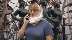
Required Skimming (based on Forgetting the Art World by Pamela M. Lee). 2014, video still.

Required Skimming (based on Forgetting the Art World by Pamela M. Lee). 2014, video still.

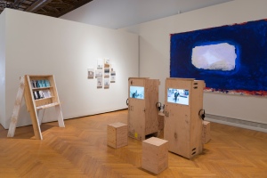
Kate Rhoades’ video Artist Statement opens with the line “My current work is an exploration of the role of the artist, the institution of art, and its discourse,” but only after taking us through the hair pulling, swearing, and second-guessing that go with trying to jam an artistic practice into a few sentences.   The video is buried inconspicuously on Rhoades’ website, but as a capsule summary of her practice it’s on point. Rhoades makes videos, paintings, performances, and other work that jostle the institutional complacencies of the art world through humor, sly guilelessness, and a cheerful willingness to include herself in the joke. I saw Kate’s mixed media exhibition at the Mills College 2014 MFA Exhibition and immediately wanted to talk to her.

Kate also co-hosts a podcast, Congratulations Pine Tree, with Maysoun Wazwaz (Program Manager at the Mills College Art Museum.)  It’s a serious and entertaining and very listenable take on the same things we talk about here.

Articiple: Your MFA exhibition made me want to ask you questions that can’t really be answered, even though they need to be talked about over and over. Like: how can artists resist the cooptation of the market and work for communities based on self-determination?  In particular I wanted to talk to you about—well, pretty much everything in the exhibition, and how things all played off each other.  Such as: those precise, mostly small paintings of the behind-the-scenes operations of the art institution—a copy machine, somebody on a scissors lift, the back (once front) door of the Mills Museum—all with a lot of blank space, like the gallery walls had been sucked into the paintings.

Daisy in the Ceiling. 2014, 0il on muslin on panel. 9″ x 12″.


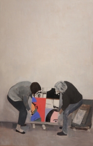
Lawler Installers.  2014,  oil on linen on panel.  48" x 36".

Lawler Installers. 2014, oil on linen on panel. 48″ x 36″.

Kate: All those paintings are based on things and people that were around me when I worked at the Mills College Art Museum. When I was working on them, I was also taking a class taught by Julia Bryan-Wilson and Darcy Grigsby at UC Berkeley on the histories of photography. One of the readings I did for that class was an essay by Rosalind Krauss called Photography’s Discursive Spaces. She talks about the gallery wall as a charged space which lends new meaning to whatever is displayed on it. Many of those little paintings that I made have large swaths of white, empty wall. The white cube is supposed to be a void where art work can speak for itself without interference, but we know now that the white wall has its own significance, and is no longer a totally neutral space, if it ever was. Also when I was making those paintings I was thinking about color field paintings, and then putting the figures in some of them was making it as though they had wandered into an abstraction to do their work.

Articiple: The Required Skimming videos are like spoofy Cliff Notes for art theory, especially theory about the codes of power that control art institutions and perceptions of art and perceptions of artists themselves.

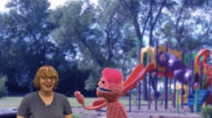
Required Skimming (based on 9.5 Theses on Art and Class by Ben Davis), 2014.  Video still.

Required Skimming (based on 9.5 Theses on Art and Class by Ben Davis), 2014. Video still.

Kate: I wish they were proper cliff notes, so I could actually understand anything Hal Foster has written. His were the hardest texts for me to make videos from, because I can’t fucking understand them at all. I tried to get some of the art historians I know to talk to me about them. I would ask them if they could sum up The Return of the Real for me in a couple sentences. Everyone declined, and I couldn’t tell if it was offensive for me to ask people to sum up important work like that, or if no one could do it because his work is so inscrutable or complicated. I think the people that appreciate that series the most are people who feel they’re getting revenge on the readings after having to grapple with them in school. For me, that series is an excuse to force myself to at least casually familiarize myself with those texts. I had been reading Andrea Fraser‘s essays since I was in college, but her writing is also very dense and references a lot of these other writers, like Krauss, Benjamin Buchloh, and Pierre Bourdieu. I thought if I could just immerse myself in this kind of theoretical writing I would be able to understand Fraser’s writing more. It turns out her writing is pretty easy to understand compared to some of these other writers.

Anyway, yes, most of the writing I’m interested in has to do with art and power, or art and class. These are the issues that I think are most important to the field of art right now. I gave a lecture recently about my work to a college class, and I talked about the idea (this is also something Andrea Fraser always talks about) of the artist as a rebel who speaks truth to power versus the reality of the artist as a producer of luxury goods for the super wealthy. That contradiction is something I try to address and work through in my practice. After I said that, one of the students told me he didn’t have that conflict at all. He thinks of himself as basically a glorified wall decorator. It seems that this is becoming the standard attitude for contemporary artists now. I think artists don’t expect as much from art as they used to, say during Dada or Surrealism. I don’t know too many young artists interested in “the art which has been visibly shattered by the explosions of the last week, which is forever trying to collect its limbs after yesterday’s crash.” Not that I think my work is so earth-shatteringly radical, but I am interested in art that contends with the conflicts happening in the places where it’s shown and in the audience engaging with it.

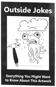
Articiple:  Outside Jokes, the zine about the exhibition,  made it seem like you’d be friendly and funny to talk to.

Outside Jokes.  2014, photocopied zine.  8-1/2" x 5-1/2", 12 pages.

Outside Jokes. 2014, photocopied zine. 8-1/2″ x 5-1/2″, 12 pages.

Thanks, I love talking to people. I hoped for the zines to give some explanation or context to people that might not be art-world regulars, people like my mom.

 Articiple: The furniture you used to display the videos and zines looked like it was made of plywood from old art packing crates.

Installation view, Mills College 2014 MFA Exhibition.  2014, mixed media.

Installation view, Mills College 2014 MFA Exhibition. 2014, mixed media.

I decided on housing the video screens in actual crates that had been used to ship work to the museum, because I was thinking of the essay, Why Does Fred Sandback’s Work Make Me Cry by Andrea Fraser (published in Grey Room, 2006.) She talks about the museum as a source of indoctrination. We go to the museum, and then we become the museum. We replicate the values and hierarchies that the museum represents. So in my show the crates are shipping information to the museum in your head. That might be kind of a stretch, though. Here’s my favorite part from that Andrea Fraser essay:

We are all here members of cultural fields. We carry, each of us, our institutions inside ourselves. There’s a museum in here, inside of me, with the Corinthian columns, the grand staircase, and the mezzanine. There’s a system of organization: the way I see things. There are objects and images, and there are texts, and there are voices explaining. There’s an archive that also contains my memories. And there’s a basement where I keep the things I don’t want to show.

Just as art cannot exist outside of the field of art, I cannot exist outside of the field of art, at least not as what I am, which is an artist. And this is also the limit of institutional critique. I can attack those internal objects. I can rip at the walls of my institutional body. But I can’t tear it down completely, and I can’t leave it, because I would then not only cease to have an effect within the field; I would also cease to exist.

Articiple: You’re shining a light on some of the whitewashing and cooptation that goes on in the art world, the ways that art is used to shore up wealth (financial capital) or status (cultural capital), and the ways art is contained within elite or esoteric social strata.

Kate: Again, I want to direct people’s attention to another reading that talks about all these things way better than I can: 9.5 Theses on Art and Class by Ben Davis.

Articiple: Punks, Guerrilla Girls, 70s downtown performance artists all confronted this in their way, but every era has to reinvent the wheel of autonomy or community.  So… how does it work in 2014?  How do we make art right now that can’t be immediately co-opted for wealth or status?

Kate: I don’t know if art alone is going to reverse neo-liberalism, but one thing that I think will help make art less dependent on wealth disparity is paying artists fees for showing in non-profit institutions. If artists weren’t totally reliant on selling their (very expensive) work they might be more inclined to make work that is challenging to the ideology of the ruling class. W.A.G.E., Working Artists and the Greater Economy, has been pushing for this and is actually having a fundraiser right now to help jump start their certification process to establish standardized fee payments to artists for their labor. If anyone wants to donate, here’s where you can do it: www.wageforwork.com/coalition/3/donate.

 Articiple: A big part of your practice is about online media and popular, accessible formats like YouTube.  Is the user-curated internet the portal to artist autonomy and self-governing communities?

Kate: The internet has definitely made artists rely less on galleries and museums to create a viewership for their work. However, I also get called a douchebag more on the internet than I do in galleries, so it’s kind of a trade-off.

Articiple: Institutions and money are so much a part of getting the art out into the world—on a very basic level, like the way so many galleries rely on MFA graduate programs to deliver the next crop of artists to them, and artists rely on gallery support to have a living.   So…where is that sweet spot where artists can get the resources and support they need to do their work, without colluding with an art market that exists mainly to expand wealth in the hands of the wealthy?

Kate: I’m just going to plug W.A.G.E. again here: www.wageforwork.com.

Articiple: And about the state of art and artists in San Francisco: independent galleries and all the artist support that goes with them are being priced out of the city center.  At the same time, SFMOMA is expanding at a cost of over half a billion dollars, in part to showcase the Fisher Collection of mostly midcentury American blue chip artists.  So I guess my question here is, what do institutions like SFMOMA have to offer artists who are working against the cooptation of art as an investment commodity?  Is there a useful way for artists to be in dialogue with places like SFMOMA?  Guerrilla exhibitions in the restrooms?

Kate: There are still many independent art spaces in the Bay Area, though their positions are more and more precarious. As we were talking about before there will always be artists finding alternative channels for distributing their work, like through the internet, zines, etc. My friend Eli Thorne did a guerilla performance at SFMOMA a couple years ago where he had a loud spiritual communion with a Jay DeFeo painting. I videotaped it secretly, which was one of the most stressful moments I’ve ever had in an art museum.

I’m not sure what the best practice is for dealing with a museum that has Charles Schwab on its board of trustees. Of course we also have to realize that most non-profits, arts-related or not, are getting money from places that we may not want to think about. It is particularly problematic, though, when you’re making work about the life-threatening working conditions of sweat-shop laborers in Bangladesh and the venue where your work is being shown is sponsored by the Gap. I don’t have solutions for these problems, because to be totally honest if Janet Bishop or Rudolph Frieling came knocking down my door (highly unlikely) tomorrow asking me to be in a show at SFMOMA it would be very hard for me to turn them down. I think highly-publicized withdrawals from shows have been effective for sparking dialog about the injustices that institutions perpetuate. For example, when the YAMS collective withdrew from the 2014 Whitney Biennial over Joe Scanlan being one of the other exhibiting artists. Or when artists involved in Creative Times’ Living as Form exhibition boycotted over the show touring in Israel. These aren’t easy decisions to make, though, and it’s hard for me to begrudge any artist for taking whatever scant opportunities are coming their way. Again, I think these problems are rooted in neo-liberal capitalism and until we address that, not just in art discourse but in larger conversation, I don’t think much will change.


Mel Prest

MIrror Zigg+.  2013, acrylic and metallic acrylic on panel.  28" x 22" x 2".

MIrror Zigg+. 2013, acrylic and metallic acrylic on panel. 28″ x 22″ x 2″.


Mel Prest is a San Francisco-based painter whose geometric-patterned works of charged color create such energy, they almost seem audible.

Mel’s past exhibitions include solo shows at Gregory Lind Gallery in San Francisco and B Sakara Garo in Sacramento.  In October 2014 her solo show MoonBrightChime/Portmanteau will open at Galleri Urbane in Dallas.  Mel is also a curator and art instructor working with numerous arts organizations in the Bay Area and throughout the world.

Articiple: The color relationships in your paintings carry so much energy—colors chase each other around the surface, reverberating in one area and then another, changing with the lighting, the viewer’s position, or even a tilt of the head. Of course color is inseparable from pattern in these pieces.  The basic elements of the patterns seem simple at first—diagonal lines in parallel, intersecting and overlapping—but they get more complex the longer one looks.  The patterns create alternating areas of density and openness, rest and activity, that move around the paintings.   The color/pattern dynamics continually animate the paintings and undo any fixed sense of composition.

Crossed Arrows

Crossed Arrows. 2013, acrylic and phosphorescent acrylic on panel. 14″ x11″ x2″.


crossed.arrows.side

Crossed Arrows. Side view.


Music for Limbo. 2014, acrylic and phosphorescent acrylic on panel. 14" x 11" x 2".

Music for Limbo. 2014, acrylic and phosphorescent acrylic on panel. 14″ x 11″ x 2″.


Music for Limbo.  Side view.

Music for Limbo. Side view.


Mel: Even though I stick to color and line in painting I feel like I’m constantly being surprised by what can happen. I don’t think it shows so well in the photograph but this piece with the fluorescent yellow so bright that makes the white look gray/ beige/ violet made me really excited. Just something so simple can be sort of magical—sneaking up on me while I work.

More Thought Work. 2014, acrylic on panel, 14″ x 11″ x 2″.


I painted in sets of parallel lines for many years, and allowing the lines to cross and meet has made the work much more alive. I’m most excited by glitches and where the pattern starts to break down—subtle things like reloading the brush with paint or a momentary jitter become visible and affect the work immediately.

Crossed Arrows Apocalypse OK.  2014, 28" x 22" x 2".

Crossed Arrows Apocalypse OK. 2014, 28″ x 22″ x 2″.


RF Arrows. 2013, acrylic and phosphorescent acrylic on panel.  12" x 12" x 2".

RF Arrows. 2013, acrylic and phosphorescent acrylic on panel. 12″ x 12″ x 2″.


Reverb.  2013, acrylic , interference, metallic and phosphorescent acrylic on panel.  14" x 11" x 2".

Reverb. 2013, acrylic , interference, metallic and phosphorescent acrylic on panel. 14″ x 11″ x 2″.


Articiple: A few years ago you shifted from oil to acrylic paint, and recently you’ve been including phosphorescent and metallic paint in some works. What has that shift meant for you?

Mel: Now, using acrylic, I feel I can do anything. I paint over things all the time and can get much stranger colors and physical effects. The glow in the dark is the most fun—it’s something that’s culturally attached to 70s black light posters and crafts, so using it feels naughty. I mean I was trained very classically and so things like metallics or fluorescents weren’t available in oil paint, or if they were they weren’t found on the “Master’s palette.” The best thing about these paints is that they shift with lighting conditions and proximity. It’s weird but I think working with acrylic has reaffirmed that nature is one of my strongest reference points—I’m looking and finding the effects of late afternoon sunlight flooding through a stand of trees by using silver, for example. It flashes at you when you walk by silver lines—goes from light to shadow instantly—like the sun going behind a cloud.

Falling Indigo Diamonds.  2013, acrylic and phosphorescent acrylic on panel.  14" x 11" x 2".

Falling Indigo Diamonds. 2013, acrylic and phosphorescent acrylic on panel. 14″ x 11″ x 2″.


Falling Indigo Diamonds.  Side view.

Falling Indigo Diamonds. Side view.


SF Radiation.  2013, acrylic and phosphorescent acrylic on panel.  36" x 36" x 2".

SF Radiation. 2013, acrylic and phosphorescent acrylic on panel. 36″ x 36″ x 2″.


SF Radiation.  Lights off.

SF Radiation. Lights off.


Articiple: The British artist Bridget Riley seems like a sort of artistic soul mate—your engagement with perception, your use of rhythm and variation, overlap in a lot of interesting ways.  I’ve also been thinking about Ellsworth Kelly, Frank Stella, the Hard-edge work of Helen Lundeberg, even  Agnes Martin, as possible influences or co-travelers. Do any of these resonate for you?

Bridget Riley, "Cataract 3."  1967, PVA on canvas.  87" x 87-3/4".

Bridget Riley, “Cataract 3.” 1967, PVA on canvas. 87″ x 87-3/4″.


Bridget Riley, "In Attendance."  1994, oil on linen.  89" x 65".

Bridget Riley, “In Attendance.” 1994, oil on linen. 89″ x 65″.


Mel: I like Ellsworth Kelly, Bridget Riley and Agnes Martin! But I was profoundly influenced by Robert Irwin—I remember walking into Dia:Chelsea and seeing his Excursus: Homage to the Square3 installation and being transported.  And his book Seeing Is Forgetting the Name of the Thing One Sees. It was a book I read annually for a while and it got me super un-stuck in grad school. I like his approach—still—to his work, to phenomena, and to seeing. For me, he is the most important artist in my life.

Robert Irwin, "Excursus: Homage to the Square(3)."   1998.  Installation, dimensions variable.

Robert Irwin, “Excursus: Homage to the Square(3).” 1998. Installation, dimensions variable.


Agnes Martin, her stubborn kindness in discussing work, and her own work, is exciting. I relate to her focus with line, and to the very direct work—no mediation with a straightedge or representation. The quality of the work being that it is what it is—how it is what you bring to it—that there is no story, only what you see. I also appreciate her writings and how they speak so directly, plus address Zen Buddhism.

Agnes Martin, "The Islands."  1961, acrylic and graphite on canvas.  72" x 72".

Agnes Martin, “The Islands.” 1961, acrylic and graphite on canvas. 72″ x 72″.


I like how Ellsworth Kelly uses shapes, and also the possibility of chance, like Dada poetry, cutting and re-forming the image/work. La Combe is based on a photograph of light and shadow on a Parisian stairway that inspired a wellspring of paintings (like these and these.) This seriality that he uses—mining an image or an idea over and over again—is also something I hold close, admire and relate to.

Ellsworth Kelly, “La Combe I.”  1950, oil on canvas.  38" × 63-3/4".

Ellsworth Kelly, “La Combe I.” 1950, oil on canvas. 38″ × 63-3/4″.


Josef Albers’ work is thrilling too—the idea that color is always deceiving and must be in relationship (to other color) to be truly seen makes me think of color as phenomena and experiential. His book Interaction of Color reads like poetry.

Joseph Albers, from "Interaction of Color."  Published in 1963.

Joseph Albers, from “Interaction of Color.” Published in 1963.


I love Bridget Riley—and I so appreciate that you picked up on her in relation to me/my work. I like that much of her color relates to viewing nature and phenomena. Also that her iterations are visible—I see different versions of similar works and imagine I can see what she was seeing.

Bridget Riley, "Saraband."  1985, oil on linen.  54" x 65".

Bridget Riley, “Saraband.” 1985, oil on linen. 54″ x 65″.


And I have really fallen for Katarina Grosse’s work lately.  I feel like her work is always about to fall apart and that the color holds it together. Her large-scale pieces on erratic and non-traditional surfaces have been rolling around in my mind so much lately. I like that they feel too big to understand somehow.

Katharina Grosse.  2009, from exhibition at Temporare Kunsthalle, Berlin.

Katharina Grosse. 2009, from exhibition at Temporare Kunsthalle, Berlin.


I also like Mark Grotjahn, because he pushes the work till it becomes kind of ugly and also kind of like a ceremonial object—like it’s been carved or woven or somehow “built.” Also El Anatsui—how all the small objects add to a whole, creating different viewings/ perceptions based on distance; how all the small parts flow together rather than create so much pressure or feel picky. I think I could go on for a long time thinking about artists I like and for all different reasons.

Mark Grotjahn, "Untitled (Black and Cream Butterfly."  2006, crayon and mixed media on board.  48" x 35".

Mark Grotjahn, “Untitled (Black and Cream Butterfly.” 2006, crayon and mixed media on board. 48″ x 35″.


El Anatsui, "Gravity and Grace."  2010, aluminum and copper wire.  145-5/8" x 441".

El Anatsui, “Gravity and Grace.” 2010, aluminum and copper wire. 145-5/8″ x 441″.


I’ve also become interested in space or spatial relationships within 2D works that create and crush spaces. On a personal level I think this comes from the way I see, which, like many artists, is non-stereoscopic. I also see this in looking at West African fabrics from Senegal and at Japanese landscape painting. And living in San Francisco, where you are constantly looking At, Through, and Around layers of things—space contracting with fog, folded by hills and unfathomable at the ocean’s edge. Looking at nature has become a really important part of seeing—that it is constant and at the same time always changing—seeing trees that bloom, dry up, drop their leaves and those veils of leaves removed revealing an altered space.

I feel like there is a big push by artists within this space now. I’ve curated a couple of shows that dealt with this strange space between 2D and 3D, and having these contemporary artist colleagues and friends whose work relates helps me stay on my path (details here and here.)

Doppler.  2013, group exhibition curated by Mel Prest.  Parallel Art Space, Brooklyn.

Doppler. 2013, group exhibition curated by Mel Prest. Parallel Art Space, Brooklyn.


Sara Dykstra

Dykstra_Rift

Rift. 2014, oil on linen. 60″ x 72″.

I first saw Sara Dykstra‘s paintings at the California College of the Arts 2013 MFA Thesis Exhibition, and again at the Root Division Introductions 2013 Exhibition.  I was struck by her subtle mastery of color–seemingly achieved without glazing–and by her mysterious, tissuey forms that were neither completely opaque nor transparent.  

Sara’s solo exhibition Revolving Around You is on view at Patricia Sweetow Gallery in San Francisco from May 6 through June 21, 2014. The artist’s reception is Saturday, May 31, from 3 to 5 p.m.

I asked Sara about her process, her color palettes, and the space between things.

Articiple: In your current painting process, you create fragile sculptural installations that serve as models or points of departure for the paintings.   The paintings’ diaphanous shapes hold a tension between precision and ambiguity.  Can you talk about your interest in that space “between”—between life painting and abstract painting, between resolved and unresolved forms?

Dykstra_4

Arnolfini. 2013, oil on linen. 60″ x 50″.

Sara:  The space between things emerges in many ways. One way is, as you mentioned, the space between abstraction and representation. My installations are abstract, yet the paintings allude to the light and space of the set. So I don’t know where the work ultimately lies, and that is welcome in my practice.

Once the painting is done, there is a tension between knowing that I’m looking at something that exists, because it’s resting in space and its form is illuminated by light, but not knowing what it is. This is the space of ambiguity that interests me—the uncanny—something which is foreign, yet oddly familiar.

Dykstra_2

Revolving Around You #2. 2013, oil on linen. 40″ x 40″.

Articiple:  In recent paintings such as the Revolving Around You Series (2013), there’s an overall effect of controlled exuberance.  Colors are complexly layered yet distinct.  Shapes have ragged but discernible edges.  The paintings have unified, soft matte surfaces.  There’s a quiet certainty to each composition that I’m sure belies the effort behind it.  What can you tell us about your process that is not visible in the final paintings—the dilemmas or struggles that go into the work?

Sara:  Each painting begins with a process of discovery that takes place while I’m making the still-life. I never really know how it will turn out. I sometimes have an idea or a color in mind that I want to begin with, but they always end up looking completely different than imagined. This part of the work is done intuitively, so it seems as though the set-ups have a life of their own and a direction they follow outside of what I think will happen, or try to make happen.

The still-life, the subject-matter of the painting, is then painted from life. It’s never ready until there’s something unusual about the light, color or sense of space that makes me want to paint it. My still-lives are almost completely made of translucent material. I layer transparent color or form upon form so they can be seen through to the back of the set-up, then they are lit from various angles.

Dykstra_7

Chroma Key. 2013, oil on linen. 50″ x 60″.

Ultimately, I want the work to emerge unbidden. This is a difficult task because it’s easy to get caught up in the mechanics of the process, such as getting the values and hues of the painting right in order to create the illusion of transparency. Sometimes I spend hours struggling to get one color right, painting it in and wiping it out. The color I think I see in the still-life and on the palette might not necessarily work in the painting. An optical illusion takes place on the canvas once the color is surrounded by other colors. So, the color that doesn’t necessarily make sense to me optically on the palette, might actually make sense in the painting. There is a lot of trial and error in undoing one optical illusion in order to make another one work. I’m amazed every time this happens and think a lot about Josef Albers.

Articiple:  The dis-Integration Series (2012) includes portraits with faces partially concealed by aluminum leaf.  The decision to step away from fully figurative work is pretty clear.  What lay behind that decision?  How did the dis-Integration Series set the stage for your recent work using sculptural installations as models?

dykstra.dis-integration

dis-Integration 1. 2012, oil and aluminum leaf on canvas. 20″ x 20″.

Sara:  The dis-Integration Series marks a clear transition in my work. It was an important series of paintings to go through. I’d been painting the figure for quite some time and sensed I was getting ready to move on to something different, but didn’t know what or how to get there. During periods of transition I tend to work serially, painting the same thing over and over again in the hopes that I will discover something new about it that I hadn’t seen before, or a new way of painting it. In this instance, I was working from a model. I did several paintings of her from the same vantage point and in the same pose to the point where I could not go on without making a change. I then built a screen made out of scrim fabric and situated her chair behind it. I did paintings of her looking through one, then two, then three layers of fabric. I wanted to create a situation with the screen such that each time I painted her it was as if I was painting her for the first time. The fabric visually altered her, so every painting was a new challenge. When it became impossible to see her, I began to cut holes in the fabric. I became interested in how the paintings were about my experience of sitting with her, my own subjectivity, and what I thought I was learning about her even though we were mostly silent during our sittings. Ironically, the more difficult it became to see her, the more the portraits began to resemble myself. After a few months, I began placing objects behind the screen. I made small still-lives of things found laying around my studio. From here, the screen expanded into a large theater and the possibilities became endless.

Articiple:  In the Revolving Around You Series and many of your works from 2013, there’s a unified color palette—neutral mid-tones are set against assertive hues of cyan, orange, or magenta that feel almost like geological intrusions.  The palette derives from the materials you used in the sculptural still-lives.  It seems to have a connection to the skin tones in the dis-Integration series and earlier work.  What motivated your color choices in these 2013 works?

Dykstra.revolvling.1

Revolving Around You #1. 2014, oil on linen. 40″ x 40″.

Sara:  I try to allow my color choices to be unconscious. Perhaps because I’d been working from a model six months prior, various skin tones stayed with me. In making the Revolving Around You series, I was still thinking about subjectivity and the idea of looking at the same subject matter, but from multiple vantage points and how different and complex it can be as a whole.

I’m sure living in San Francisco also has an impact. The vibrancy and color of the city becomes part of you, as does the incredible geology of this part of the world.

Articiple:  In some of your recent work, like Cave (2014), there’s a color shift to deeper blue tones.  A “cave” suggests a retreat or shelter, but also an exploration into the unknown.   Is this new palette motivated by any of those associations?  What else does this palette mean for you?

Dykstra_Cave

Cave. 2014, oil on linen. 30″ x 30″.

Sara:  Some of the paintings are beginning to look like places or landscapes to me. I see the figure in others. However, I never pre-plan any of my installations. The installations unravel on their own and are in a constant state of change for about a week. There were probably three different versions of this one. This piece took on the feeling of a shelter or cave and the colors came about naturally.

Articiple:  For your pieces in the recent exhibit SURVEILLANCE: Everyday (at Studio 110 Projects), you said that you were thinking about the experience of being surveilled—the emotions of vulnerability or even shame that arise when we realize we’re being watched.  It seems like these paintings, and the installations that preceded them, take on an almost narrative quality—characters (however slight or minimal) respond to something in their environment.  Do these new works feel like a shift to something more story-like in your work?  Or, has there been an implicit narrative element there all along? 

Exposure

Exposure. 2014, oil on linen. 20″ x 16″.

Sara:  The works all have the suggestion of a narrative running through them, but the SURVEILLANCE: Everyday exhibit was different because the entire show had a theme and the work was made with that in mind. I was asked to make works which respond to the idea of transparency and being watched. So, I began these pieces differently than I normally do. I wondered, how would I show an element of curiosity, secrecy and intimacy between two things? What would it look like if they suddenly realized someone was watching them? As a response, I made two paintings, “Exposure” and “Cover Up,” which create a mini-narrative. The forms in these paintings are figurative and much more emotive and animated than in previous works. Body language was on my mind. This was an interesting and fun way to work.

Cover Up

Cover Up. 2014, oil on linen. 20″ x 16″.


To learn more about Sara Dykstra’s work, see her website at saradykstra.com.