Mel Prest

MIrror Zigg+.  2013, acrylic and metallic acrylic on panel.  28" x 22" x 2".

MIrror Zigg+. 2013, acrylic and metallic acrylic on panel. 28″ x 22″ x 2″.


Mel Prest is a San Francisco-based painter whose geometric-patterned works of charged color create such energy, they almost seem audible.

Mel’s past exhibitions include solo shows at Gregory Lind Gallery in San Francisco and B Sakara Garo in Sacramento.  In October 2014 her solo show MoonBrightChime/Portmanteau will open at Galleri Urbane in Dallas.  Mel is also a curator and art instructor working with numerous arts organizations in the Bay Area and throughout the world.

Articiple: The color relationships in your paintings carry so much energy—colors chase each other around the surface, reverberating in one area and then another, changing with the lighting, the viewer’s position, or even a tilt of the head. Of course color is inseparable from pattern in these pieces.  The basic elements of the patterns seem simple at first—diagonal lines in parallel, intersecting and overlapping—but they get more complex the longer one looks.  The patterns create alternating areas of density and openness, rest and activity, that move around the paintings.   The color/pattern dynamics continually animate the paintings and undo any fixed sense of composition.

Crossed Arrows

Crossed Arrows. 2013, acrylic and phosphorescent acrylic on panel. 14″ x11″ x2″.


crossed.arrows.side

Crossed Arrows. Side view.


Music for Limbo. 2014, acrylic and phosphorescent acrylic on panel. 14" x 11" x 2".

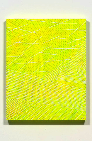
Music for Limbo. 2014, acrylic and phosphorescent acrylic on panel. 14″ x 11″ x 2″.


Music for Limbo.  Side view.

Music for Limbo. Side view.


Mel: Even though I stick to color and line in painting I feel like I’m constantly being surprised by what can happen. I don’t think it shows so well in the photograph but this piece with the fluorescent yellow so bright that makes the white look gray/ beige/ violet made me really excited. Just something so simple can be sort of magical—sneaking up on me while I work.

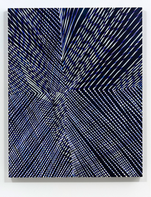
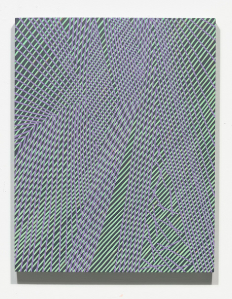
More Thought Work. 2014, acrylic on panel, 14″ x 11″ x 2″.


I painted in sets of parallel lines for many years, and allowing the lines to cross and meet has made the work much more alive. I’m most excited by glitches and where the pattern starts to break down—subtle things like reloading the brush with paint or a momentary jitter become visible and affect the work immediately.

Crossed Arrows Apocalypse OK.  2014, 28" x 22" x 2".

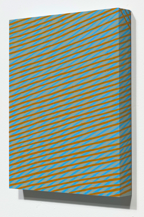
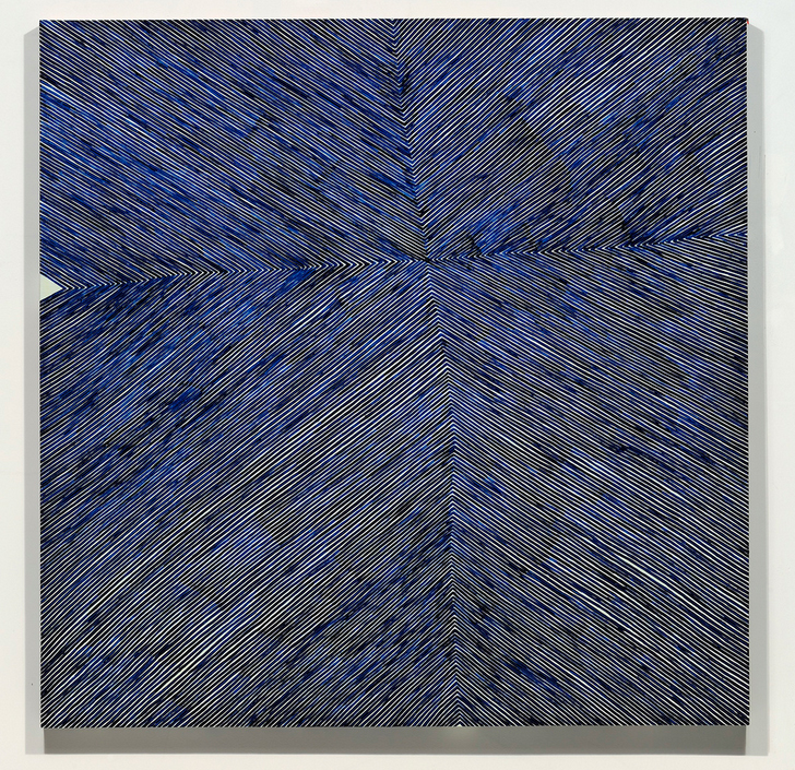
Crossed Arrows Apocalypse OK. 2014, 28″ x 22″ x 2″.


RF Arrows. 2013, acrylic and phosphorescent acrylic on panel.  12" x 12" x 2".

RF Arrows. 2013, acrylic and phosphorescent acrylic on panel. 12″ x 12″ x 2″.


Reverb.  2013, acrylic , interference, metallic and phosphorescent acrylic on panel.  14" x 11" x 2".

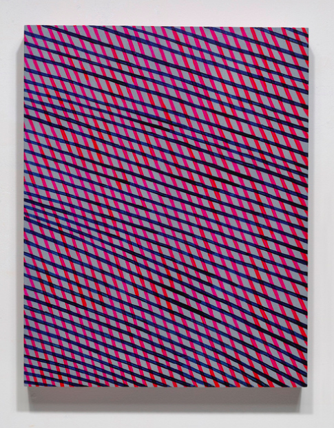
Reverb. 2013, acrylic , interference, metallic and phosphorescent acrylic on panel. 14″ x 11″ x 2″.


Articiple: A few years ago you shifted from oil to acrylic paint, and recently you’ve been including phosphorescent and metallic paint in some works. What has that shift meant for you?

Mel: Now, using acrylic, I feel I can do anything. I paint over things all the time and can get much stranger colors and physical effects. The glow in the dark is the most fun—it’s something that’s culturally attached to 70s black light posters and crafts, so using it feels naughty. I mean I was trained very classically and so things like metallics or fluorescents weren’t available in oil paint, or if they were they weren’t found on the “Master’s palette.” The best thing about these paints is that they shift with lighting conditions and proximity. It’s weird but I think working with acrylic has reaffirmed that nature is one of my strongest reference points—I’m looking and finding the effects of late afternoon sunlight flooding through a stand of trees by using silver, for example. It flashes at you when you walk by silver lines—goes from light to shadow instantly—like the sun going behind a cloud.

Falling Indigo Diamonds.  2013, acrylic and phosphorescent acrylic on panel.  14" x 11" x 2".

Falling Indigo Diamonds. 2013, acrylic and phosphorescent acrylic on panel. 14″ x 11″ x 2″.


Falling Indigo Diamonds.  Side view.

Falling Indigo Diamonds. Side view.


SF Radiation.  2013, acrylic and phosphorescent acrylic on panel.  36" x 36" x 2".

SF Radiation. 2013, acrylic and phosphorescent acrylic on panel. 36″ x 36″ x 2″.


SF Radiation.  Lights off.

SF Radiation. Lights off.


Articiple: The British artist Bridget Riley seems like a sort of artistic soul mate—your engagement with perception, your use of rhythm and variation, overlap in a lot of interesting ways.  I’ve also been thinking about Ellsworth Kelly, Frank Stella, the Hard-edge work of Helen Lundeberg, even  Agnes Martin, as possible influences or co-travelers. Do any of these resonate for you?

Bridget Riley, "Cataract 3."  1967, PVA on canvas.  87" x 87-3/4".

Bridget Riley, “Cataract 3.” 1967, PVA on canvas. 87″ x 87-3/4″.


Bridget Riley, "In Attendance."  1994, oil on linen.  89" x 65".

Bridget Riley, “In Attendance.” 1994, oil on linen. 89″ x 65″.


Mel: I like Ellsworth Kelly, Bridget Riley and Agnes Martin! But I was profoundly influenced by Robert Irwin—I remember walking into Dia:Chelsea and seeing his Excursus: Homage to the Square3 installation and being transported.  And his book Seeing Is Forgetting the Name of the Thing One Sees. It was a book I read annually for a while and it got me super un-stuck in grad school. I like his approach—still—to his work, to phenomena, and to seeing. For me, he is the most important artist in my life.

Robert Irwin, "Excursus: Homage to the Square(3)."   1998.  Installation, dimensions variable.

Robert Irwin, “Excursus: Homage to the Square(3).” 1998. Installation, dimensions variable.


Agnes Martin, her stubborn kindness in discussing work, and her own work, is exciting. I relate to her focus with line, and to the very direct work—no mediation with a straightedge or representation. The quality of the work being that it is what it is—how it is what you bring to it—that there is no story, only what you see. I also appreciate her writings and how they speak so directly, plus address Zen Buddhism.

Agnes Martin, "The Islands."  1961, acrylic and graphite on canvas.  72" x 72".

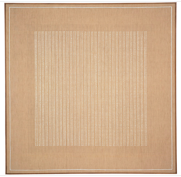
Agnes Martin, “The Islands.” 1961, acrylic and graphite on canvas. 72″ x 72″.


I like how Ellsworth Kelly uses shapes, and also the possibility of chance, like Dada poetry, cutting and re-forming the image/work. La Combe is based on a photograph of light and shadow on a Parisian stairway that inspired a wellspring of paintings (like these and these.) This seriality that he uses—mining an image or an idea over and over again—is also something I hold close, admire and relate to.

Ellsworth Kelly, “La Combe I.”  1950, oil on canvas.  38" × 63-3/4".

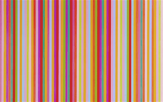
Ellsworth Kelly, “La Combe I.” 1950, oil on canvas. 38″ × 63-3/4″.


Josef Albers’ work is thrilling too—the idea that color is always deceiving and must be in relationship (to other color) to be truly seen makes me think of color as phenomena and experiential. His book Interaction of Color reads like poetry.

Joseph Albers, from "Interaction of Color."  Published in 1963.

Joseph Albers, from “Interaction of Color.” Published in 1963.


I love Bridget Riley—and I so appreciate that you picked up on her in relation to me/my work. I like that much of her color relates to viewing nature and phenomena. Also that her iterations are visible—I see different versions of similar works and imagine I can see what she was seeing.

Bridget Riley, "Saraband."  1985, oil on linen.  54" x 65".

Bridget Riley, “Saraband.” 1985, oil on linen. 54″ x 65″.


And I have really fallen for Katarina Grosse’s work lately.  I feel like her work is always about to fall apart and that the color holds it together. Her large-scale pieces on erratic and non-traditional surfaces have been rolling around in my mind so much lately. I like that they feel too big to understand somehow.

Katharina Grosse.  2009, from exhibition at Temporare Kunsthalle, Berlin.

Katharina Grosse. 2009, from exhibition at Temporare Kunsthalle, Berlin.


I also like Mark Grotjahn, because he pushes the work till it becomes kind of ugly and also kind of like a ceremonial object—like it’s been carved or woven or somehow “built.” Also El Anatsui—how all the small objects add to a whole, creating different viewings/ perceptions based on distance; how all the small parts flow together rather than create so much pressure or feel picky. I think I could go on for a long time thinking about artists I like and for all different reasons.

Mark Grotjahn, "Untitled (Black and Cream Butterfly."  2006, crayon and mixed media on board.  48" x 35".

Mark Grotjahn, “Untitled (Black and Cream Butterfly.” 2006, crayon and mixed media on board. 48″ x 35″.


El Anatsui, "Gravity and Grace."  2010, aluminum and copper wire.  145-5/8" x 441".

El Anatsui, “Gravity and Grace.” 2010, aluminum and copper wire. 145-5/8″ x 441″.


I’ve also become interested in space or spatial relationships within 2D works that create and crush spaces. On a personal level I think this comes from the way I see, which, like many artists, is non-stereoscopic. I also see this in looking at West African fabrics from Senegal and at Japanese landscape painting. And living in San Francisco, where you are constantly looking At, Through, and Around layers of things—space contracting with fog, folded by hills and unfathomable at the ocean’s edge. Looking at nature has become a really important part of seeing—that it is constant and at the same time always changing—seeing trees that bloom, dry up, drop their leaves and those veils of leaves removed revealing an altered space.

I feel like there is a big push by artists within this space now. I’ve curated a couple of shows that dealt with this strange space between 2D and 3D, and having these contemporary artist colleagues and friends whose work relates helps me stay on my path (details here and here.)

Doppler.  2013, group exhibition curated by Mel Prest.  Parallel Art Space, Brooklyn.

Doppler. 2013, group exhibition curated by Mel Prest. Parallel Art Space, Brooklyn.


Kimberly Rowe

Dots in Other Spots.  2014, acrylic on canvas.  60" x 48".

Dots in Other Spots. 2014, acrylic on canvas. 60″ x 48″.


I took a painting class with Kimberly Rowe this past spring, when I was feeling it was time to get my hands back on some brushes after a couple of years of printmaking.  I discovered a personality as energetic and irrepressible as her art.  So I corralled her briefly to find out where all that energy comes from.

Articiple: Something apparent to anyone who sees your art is the sheer exuberance.  You seem to really stay in the moment as you work with a color, a form, a gesture.  There’s a sense of immediacy and unrestrained expressiveness.  At the same time, there’s structure, balance, symmetry–or purposeful asymmetry—in the finished pieces.  I’d like to hear about how that all works for you.  How do you move back and forth between the need for sustained thought and concentration, and the need for immediacy?  This is a question about process—but the answer might also have to do with what music you’re listening to or what coffee you’re drinking as you work!

Old Brown Show.  2014, acrylic on canvas.  60" x 48".

Old Brown Shoe. 2014, acrylic on canvas. 60″ x 48″.

Kimberly: It’s funny that at the end of this question you mention what music I’m listening to.  I have heard some people say that the music they listen to or environment that they are in does not influence their work.  Both do for me, for sure.

I love music and it is an important factor both directly and indirectly in my work.  I am a big proponent of silence, too, because I believe that we have to allow ourselves to hear ourselves think.  But often I end up realizing that I am singing some crazy made-up songs even in the presumed silence so I have come to force myself to stop and turn on music just to give myself a break from my own voice!  It’s a relief!  And that is a true strategy, both in creating a certain mood, but also to get myself out of my head and stop thinking too hard.

I used to act, and I used to play the piano and violin, and I still love to dance.  All of those things can be similar to painting.  I study and research and look and think about art (and music, and theater, and literature, and all sorts of inspiring things in the world) much of my waking (and probably sleeping) life.  By doing that it is sort of like rehearsing.  Whenever I perform I cannot spend time thinking too hard while I am “on”.  The piece comes through me as though I am a channel or conduit.  I fill myself with possibilities but I do not plan my paintings and do not know what combination of elements will appear.  A painting is not as fresh if it is stop-started throughout the process.  Rather, like in acting with memorizing lines and creating a backstory that provides a sense “memory” from which to drive my responses, I have to go into the making with the confidence that I will know what to do when I come to it and then allow that to happen.

Kiss.  2014, acrylic on canvas.  20" x 16".

Kiss. 2014, acrylic on canvas. 20″ x 16″.

I listen to a lot of different types of music, but in the last year or so I have become a huge fan of the Beatles.  I had never heard whole albums of theirs before.  I am in total awe of what amazing innovators they were and how their work shifted over a short period of time.  I am blown away by their musicality and the complexity of many of their songs, yet how simple they can seem.  They are structured, but the structures change, breaking things up in ways that can be perplexing, which is the Beatles’ genius.

I think deconstructing music influences my work.  I constantly think about challenging myself to mix things up and take risks, to do things that surprise even myself.  I have been told several times that a lot of my work “feels” musical.  I am really into rhythm, repetition, rhyme, pattern, scale, and, of course, color.  I dance while I paint.  I hope that shows!

Articiple:  I know you resist representation or resemblance in your work.  I’ve heard you say that you’ll paint something out if it starts looking like a painting “of” something.  I think that’s an interesting insistence, that the painting needs to exist fully in a space by itself.  Of course abstraction is as old as art, and we could talk for days about what abstraction means or where it comes from.  But I’d like to hear, for you, why abstraction is compelling.  What are the particular problems or possibilities that keep you interested in this genre?  

If I Fell.  2014, acrylic on panel.  60" x 48".

If I Fell. 2014, acrylic on panel. 60″ x 48″.

Kimberly:  Hmmmmm.  I think I may have been saying that, for me, it is important to know how something may be read even if it was arrived at unintentionally.  That is not to say that I am a proponent of censoring my work, nor that representation per se is bad, nor that I need to control what the viewer may think they see in it.  However, if I inadvertently put two eyes a nose and a mouth in the middle of what I have meant to be a nonobjective painting and I don’t want it there I would likely choose to paint some or all of it out.  On the other hand, never say never.  I have a wry sense of humor and have been known to stick something trompe l’oiel, like tape (pun intended), on top of a perfectly nonobjective surface and turn things on their head.  I am not a purist, especially if messing things up makes a better painting.

Abstraction is compelling to me, because it makes me think in a certain way.  Of course there are incredible representational paintings as well as amazing conceptual works that move me.  And I used to make both representational and conceptual work.  But when I think through the annals of my art memory, nonobjective work has been something that is not too sentimental nor too clinical but is just right for me.  And within that realm, I tend to favor painterly abstraction, even if it is very structured and not gestural.

Tomorrow Never Knows.  2014, acrylic on panel.  12" x 9".

Tomorrow Never Knows. 2014, acrylic on panel. 12″ x 9″.

Pulling apart layers and edges, sinking into color, reading a piece as if it is poetry or a song, makes my heart sing.  Perhaps I am a more abstract thinker and that is why I studied Psychology, Philosophy, and Religion, particularly eastern teachings.  I want to dig deeply, but the answers are always elusive.  There are no cut and dried answers. It’s like the adage that “What I am searching for I am searching with.”  My own mind peels away at this thing that is really just paint on a substrate and comes back with new discoveries every time.  It’s like reading a book or seeing a movie or listening to an album and finding out that I understand it more deeply this time than the last.  And the thing about a nonobjective, visual surface is that there are no real clues.  A great abstract painting serves as a mirror; I am like a parakeet pecking at my own distorted image.

Articiple:  You’ve said Allison Miller is an important influence.   I see a number of similar concerns in your work and hers: patterns masked by more dominant shapes, a purposeful disorientation in the figure-ground relationship, an overall energizing of the surface.  What else can you tell us about why Allison’s work is important to you?  What other artists have been formative in your work?  [Thinking of ‘If I Fell’, and Allison’s ‘Lean’ or ‘Repeater.’]

Allison Miller, "Repeater."  2013, oil and acrylic on canvas.  66" x 60".

Allison Miller, “Repeater.” 2013, oil and acrylic on canvas. 66″ x 60″.

Kimberly:  Well, first let me address your question about other influences:  besides Allison’s work, there are several other artists whose work has informed mine, but there are a few key ones.  It began with Robert Rauschenberg.  I love his intellect and humor and profundity and rawness all rolled into one.  His use of materials is amazing.  I love Richard Diebenkorn, too.  His layers and edges and angles have taught me invaluable lessons.  And Keltie Ferris is a contemporary favorite.  Her work is big and powerful and layered and super colorful.  Luckily for me, she has become a friend, but even before that I loved her personality.  She was the first artist I had ever heard giggle and bask in the glory of her own work while she gave a lecture, without sounding egotistical.  She genuinely loves making her work and I celebrate her audacity and generosity of spirit.  It makes me want to be a better artist and person.

Allison Miller’s work has changed a lot since I first discovered it.  The older paintings seemed much thinner in their material quality.  They were more like drawings and looked a lot like they were made with markers.  She used to use small brushes on large panels or canvases, resulting in marks that recalled the coloring posters I used to buy as a teenager.  I spent hours filling those in with felt tipped pens.  Her paintings were playful and that really spoke to me.

I think Allison’s work affects me on many different levels.  The older work didn’t have so many layers, but it often revealed residue from below while also remaining direct.  It was simple but not easy.  It was abstract, but felt like it had personality and a non-narrative “story”.  It tackled space without, for the most part, using perspective or illusion.  It was super colorful and fresh.  And it was formal but not merely formal.  Plus it was made mostly of acrylic paint.

Over time, Allison’s work has become more painterly and more dense, with a greater variation in texture and pattern and paint application.  The  more I paint and try to do certain things with paint, the more I appreciate and learn from what she has done as she further develops her work.  Looking at her paintings, especially in person, is like taking a master class.  I have become a better painter by studying her work.

Castaway. 2013, acrylic on canvas.  30" x 24".

Castaway. 2013, acrylic on canvas. 30″ x 24″.

I am very fortunate to have become friends with Allison in the past few years.  Not long ago, she told me something while we were talking about another artist’s work that I think is a recipe for success.  After having seen photographs of an artist’s paintings and imagining what they might really be like, Allison was very disappointed in their actual quality when she visited a gallery and saw them in an exhibition.  These aren’t her exact words, but she said something to the effect of this:  As a painter, you have to give viewers something to look at; you owe it to them.

I understood what she meant and took it to heart.  In other words, it’s not enough to just make a cool composition.  As a painter, I have to really make a painting!  Give it body; give it life!  Really use the paint and build the surface.  Make viewers have to look, again and again; cause them to want to keep coming back.  It’s an edge next to a pattern, hidden by an opaque patch, set against a thick glob.  It’s three different blacks, one made of several mixed colors, two from the tube, one glossy, one matte, one in-between.  Why is there dirt in Allison’s paint? Because it pushes the envelope and makes yet another texture.  Remember the Beatles’ songs that I mentioned in the first question?  It’s a little like those.  The way to remain unfailingly fresh is to give viewers enough to allow them to keep experiencing something new and wanting to come back for more.

Articiple:  You teach painting, and your teaching style is as energized as your art.  In a class I took with you, you really pushed students to stay in the moment, take risks, let go of anything “precious” to take the work somewhere unexpected.  It was almost like having an aerobics coach!  You’re generous with your energy and your insight.  How does teaching feed your practice?  What’s your vision of an ideal teaching or mentoring situation?

John and Yoko (diptych.)  2013, acrylic and acrylic spray paint on panel.  Each 14" x 11".

John and Yoko (diptych.) 2013, acrylic and acrylic spray paint on panel. Each 14″ x 11″.

Kimberly: I taught high school art for six years.  I quit teaching in 2007, after my first year of graduate school.  This year I began teaching classes again, but at the adult level.  And I love it!  Not because of the adult part, but because the students really care about painting.  They are coming to the right person if they want someone to cheer them on.  I know what you mean about my being almost like an aerobics coach.  And that’s not far from the truth.

I take group yoga and dance classes, because I find it to be more fun to let go of some of the responsibility of pushing myself so that I can become immersed in the moment.  And that is what I am offering in my studio classes.

I want to help my students to become fearless.  I want them to be able to let go while they are working, rather than making constant, consciously calculated decisions the entire time, which can literally stunt their growth.  I can’t always do it myself, but I know what it’s like to throw caution to the wind and what amazing things can happen when I do.

When I was a freshman in college, my drama teacher gave us a motto to live by: Dare to be bad.  Sometimes when we are left to our own devices we kill all the spark by thinking too much and trying to do things perfect and right.  In my studio classes I try to take the pressure off my students and get them to take risks.  Like my dad says, “Do something, even if it’s wrong.”  It’s so easy to stop short of an epiphany just by trying too hard.

I am ravenous when it comes to learning.  I am one of those kinds of people who takes loads of classes and reads and researches constantly.  I figure I have enough information to share.  Why not give it away?  It gratifies me so much to help others and watch them bloom.

I want to see my students succeed.  So I offer the opportunity to come into my classes and have a chance to be pushed past one’s comfort zone.  The best way to get better fast is to drop our control and just “do”.  It’s so exciting for me to watch my students let their guards down and make paintings that surprise them.

Recently a student came to my studio and we worked together for about eight hours straight.  I taught her how to make a really extensive palette and use lots of new colors and unexpected combinations.  I pushed her to be fearless and ruin her precious marks and be responsive over and over again until her paintings felt good to her, not overworked, but fresh and exciting.  In eight hours she made two awesome paintings.  I worried that maybe I had driven her too hard, but she was elated to have moved beyond her paralyzing fears to where she could paint on her own with a new perspective.

Of course, teaching isn’t only about being in a full-blown production mode.  I get as much out of listening while my students discuss ideas and concerns, as I do coaching them in the studio.  I love every aspect of mentoring, and hope to get to continue to do it both in groups and one-on-one.

In July (2014), I am teaching a two-Saturday intensive at CCSF’s Fort Mason campus.  And in the fall I am teaching a semester-long course through SFAI’s Public Education program, at its Chestnut campus.  I’m really excited to see what my students will make!  I learn at least as much from them about painting as they do from me.  And that’s a big thrill!

Sara Dykstra

Dykstra_Rift

Rift. 2014, oil on linen. 60″ x 72″.

I first saw Sara Dykstra‘s paintings at the California College of the Arts 2013 MFA Thesis Exhibition, and again at the Root Division Introductions 2013 Exhibition.  I was struck by her subtle mastery of color–seemingly achieved without glazing–and by her mysterious, tissuey forms that were neither completely opaque nor transparent.  

Sara’s solo exhibition Revolving Around You is on view at Patricia Sweetow Gallery in San Francisco from May 6 through June 21, 2014. The artist’s reception is Saturday, May 31, from 3 to 5 p.m.

I asked Sara about her process, her color palettes, and the space between things.

Articiple: In your current painting process, you create fragile sculptural installations that serve as models or points of departure for the paintings.   The paintings’ diaphanous shapes hold a tension between precision and ambiguity.  Can you talk about your interest in that space “between”—between life painting and abstract painting, between resolved and unresolved forms?

Dykstra_4

Arnolfini. 2013, oil on linen. 60″ x 50″.

Sara:  The space between things emerges in many ways. One way is, as you mentioned, the space between abstraction and representation. My installations are abstract, yet the paintings allude to the light and space of the set. So I don’t know where the work ultimately lies, and that is welcome in my practice.

Once the painting is done, there is a tension between knowing that I’m looking at something that exists, because it’s resting in space and its form is illuminated by light, but not knowing what it is. This is the space of ambiguity that interests me—the uncanny—something which is foreign, yet oddly familiar.

Dykstra_2

Revolving Around You #2. 2013, oil on linen. 40″ x 40″.

Articiple:  In recent paintings such as the Revolving Around You Series (2013), there’s an overall effect of controlled exuberance.  Colors are complexly layered yet distinct.  Shapes have ragged but discernible edges.  The paintings have unified, soft matte surfaces.  There’s a quiet certainty to each composition that I’m sure belies the effort behind it.  What can you tell us about your process that is not visible in the final paintings—the dilemmas or struggles that go into the work?

Sara:  Each painting begins with a process of discovery that takes place while I’m making the still-life. I never really know how it will turn out. I sometimes have an idea or a color in mind that I want to begin with, but they always end up looking completely different than imagined. This part of the work is done intuitively, so it seems as though the set-ups have a life of their own and a direction they follow outside of what I think will happen, or try to make happen.

The still-life, the subject-matter of the painting, is then painted from life. It’s never ready until there’s something unusual about the light, color or sense of space that makes me want to paint it. My still-lives are almost completely made of translucent material. I layer transparent color or form upon form so they can be seen through to the back of the set-up, then they are lit from various angles.

Dykstra_7

Chroma Key. 2013, oil on linen. 50″ x 60″.

Ultimately, I want the work to emerge unbidden. This is a difficult task because it’s easy to get caught up in the mechanics of the process, such as getting the values and hues of the painting right in order to create the illusion of transparency. Sometimes I spend hours struggling to get one color right, painting it in and wiping it out. The color I think I see in the still-life and on the palette might not necessarily work in the painting. An optical illusion takes place on the canvas once the color is surrounded by other colors. So, the color that doesn’t necessarily make sense to me optically on the palette, might actually make sense in the painting. There is a lot of trial and error in undoing one optical illusion in order to make another one work. I’m amazed every time this happens and think a lot about Josef Albers.

Articiple:  The dis-Integration Series (2012) includes portraits with faces partially concealed by aluminum leaf.  The decision to step away from fully figurative work is pretty clear.  What lay behind that decision?  How did the dis-Integration Series set the stage for your recent work using sculptural installations as models?

dykstra.dis-integration

dis-Integration 1. 2012, oil and aluminum leaf on canvas. 20″ x 20″.

Sara:  The dis-Integration Series marks a clear transition in my work. It was an important series of paintings to go through. I’d been painting the figure for quite some time and sensed I was getting ready to move on to something different, but didn’t know what or how to get there. During periods of transition I tend to work serially, painting the same thing over and over again in the hopes that I will discover something new about it that I hadn’t seen before, or a new way of painting it. In this instance, I was working from a model. I did several paintings of her from the same vantage point and in the same pose to the point where I could not go on without making a change. I then built a screen made out of scrim fabric and situated her chair behind it. I did paintings of her looking through one, then two, then three layers of fabric. I wanted to create a situation with the screen such that each time I painted her it was as if I was painting her for the first time. The fabric visually altered her, so every painting was a new challenge. When it became impossible to see her, I began to cut holes in the fabric. I became interested in how the paintings were about my experience of sitting with her, my own subjectivity, and what I thought I was learning about her even though we were mostly silent during our sittings. Ironically, the more difficult it became to see her, the more the portraits began to resemble myself. After a few months, I began placing objects behind the screen. I made small still-lives of things found laying around my studio. From here, the screen expanded into a large theater and the possibilities became endless.

Articiple:  In the Revolving Around You Series and many of your works from 2013, there’s a unified color palette—neutral mid-tones are set against assertive hues of cyan, orange, or magenta that feel almost like geological intrusions.  The palette derives from the materials you used in the sculptural still-lives.  It seems to have a connection to the skin tones in the dis-Integration series and earlier work.  What motivated your color choices in these 2013 works?

Dykstra.revolvling.1

Revolving Around You #1. 2014, oil on linen. 40″ x 40″.

Sara:  I try to allow my color choices to be unconscious. Perhaps because I’d been working from a model six months prior, various skin tones stayed with me. In making the Revolving Around You series, I was still thinking about subjectivity and the idea of looking at the same subject matter, but from multiple vantage points and how different and complex it can be as a whole.

I’m sure living in San Francisco also has an impact. The vibrancy and color of the city becomes part of you, as does the incredible geology of this part of the world.

Articiple:  In some of your recent work, like Cave (2014), there’s a color shift to deeper blue tones.  A “cave” suggests a retreat or shelter, but also an exploration into the unknown.   Is this new palette motivated by any of those associations?  What else does this palette mean for you?

Dykstra_Cave

Cave. 2014, oil on linen. 30″ x 30″.

Sara:  Some of the paintings are beginning to look like places or landscapes to me. I see the figure in others. However, I never pre-plan any of my installations. The installations unravel on their own and are in a constant state of change for about a week. There were probably three different versions of this one. This piece took on the feeling of a shelter or cave and the colors came about naturally.

Articiple:  For your pieces in the recent exhibit SURVEILLANCE: Everyday (at Studio 110 Projects), you said that you were thinking about the experience of being surveilled—the emotions of vulnerability or even shame that arise when we realize we’re being watched.  It seems like these paintings, and the installations that preceded them, take on an almost narrative quality—characters (however slight or minimal) respond to something in their environment.  Do these new works feel like a shift to something more story-like in your work?  Or, has there been an implicit narrative element there all along? 

Exposure

Exposure. 2014, oil on linen. 20″ x 16″.

Sara:  The works all have the suggestion of a narrative running through them, but the SURVEILLANCE: Everyday exhibit was different because the entire show had a theme and the work was made with that in mind. I was asked to make works which respond to the idea of transparency and being watched. So, I began these pieces differently than I normally do. I wondered, how would I show an element of curiosity, secrecy and intimacy between two things? What would it look like if they suddenly realized someone was watching them? As a response, I made two paintings, “Exposure” and “Cover Up,” which create a mini-narrative. The forms in these paintings are figurative and much more emotive and animated than in previous works. Body language was on my mind. This was an interesting and fun way to work.

Cover Up

Cover Up. 2014, oil on linen. 20″ x 16″.


To learn more about Sara Dykstra’s work, see her website at saradykstra.com.